Summary
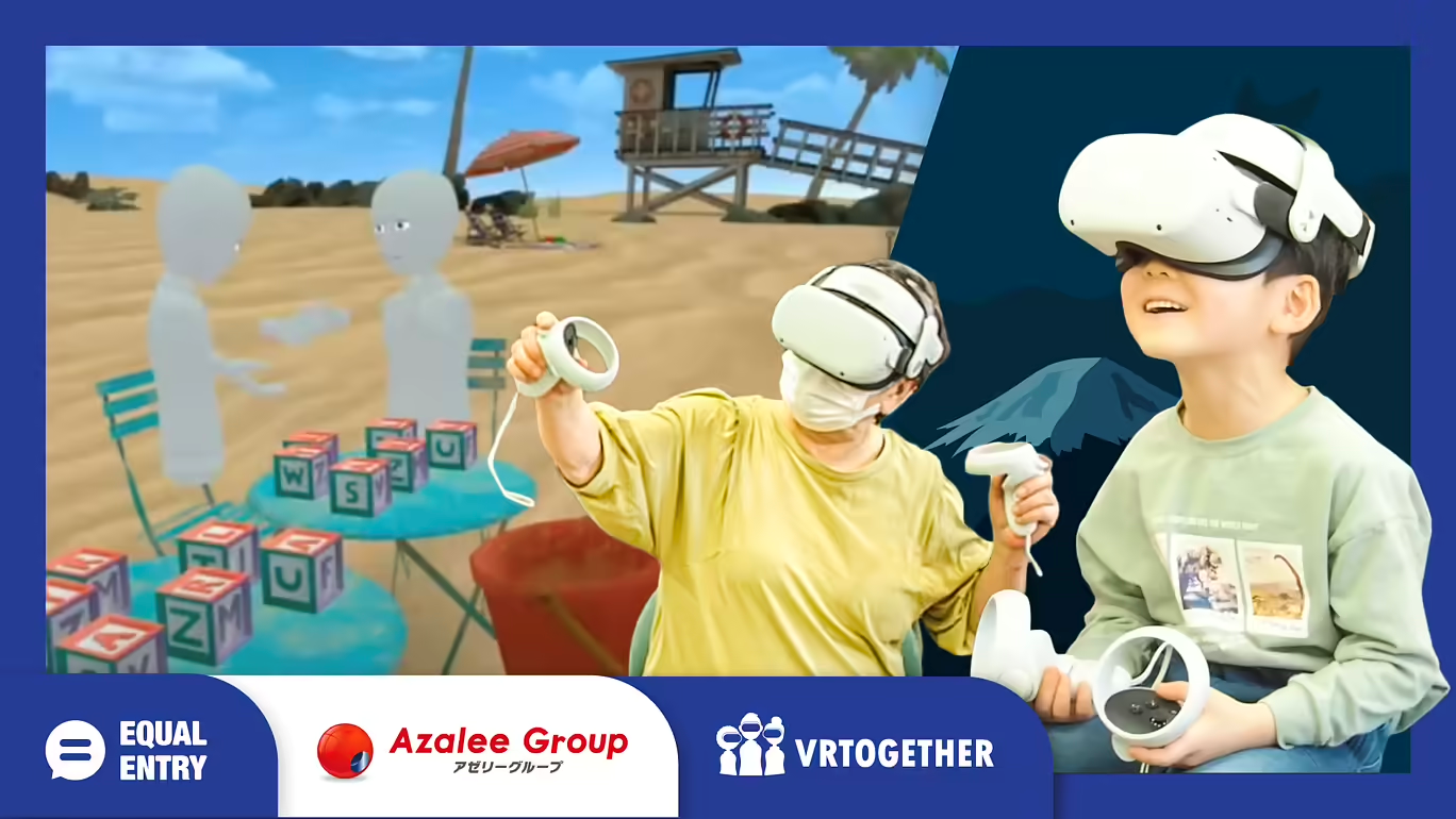
Technology solutions often overlook children and seniors. So, Equal Entry worked with VRTogether and Azalee Group to design a user study to understand how children and seniors can connect in a virtual reality (VR) world. In the study, participants play games, travel the world, and connect with others.
VRTogether is a virtual reality social games platform built from the ground up with accessibility and inclusion at the forefront of its design. It’s a powerful tool for a person’s well-being, socialization, and health. It’s built for everyone to combat loneliness in our everyday lives.
Azalee Group combines the three essential services of nursing care, education, and medicine, to create a unique solution to meet the multi-generational needs of Japan’s community.
This post looks at how we did the study and what we learned from it. Equal Entry is seeking funding to do a large-scale research project on how VR experiences can reduce loneliness by having seniors and children interact with each other.
Pilot Test Goals
- Evaluate the feasibility of VRTogether as a tool to improve the quality of life and health through intergenerational shared VR experiences.
- Establish a clear and repeatable way of doing VR user testing with seniors and children.
- Document the study and its outcome
Hypothesis
Before proceeding with the test, we formed the following hypotheses.
- Children and seniors will struggle with how to use VR hardware and software.
- Children might get bored if the activity is too simple.
- Seniors are more successful with simple activities.
- A VR headset may not fit on a child’s head.
User Personas
We also created two personas to help us understand the users.
Seniors (Azalee Rehabilitation Club)
Due to aging and related conditions and illnesses, the physical and cognitive functions of seniors are prone to decline. It could result in limiting their activities, staying at home for long periods, and maintaining good health practices. Azalee Rehabilitation Club offers a day service to empower seniors to live independent lifestyles by providing physical rehabilitation, nutritious meals, bathing facilities, and opportunities to socialize with others.
Children aged around 5 years old (Azalee Preschool)
Azalee Nursery School offers daycare services for children ages newborn to 6 years old in the same facility as Azalee Rehabilitation Club. While students learn many things, the school focuses on programming, STEAM (science, technology, engineering, art, and mathematics) education. They learn how to communicate in English through games and physical exercises. Their goal is to nurture students’ abilities to think logically and prepare for their future careers.
Being in the same building as Azalee Rehabilitation Club offers the opportunity for the children and seniors to interact and spend time with each other.
Preparation
Before starting, we ensured we had the tools we needed to do the study. Here are the tools we used:
- Meta Quest 2 headset
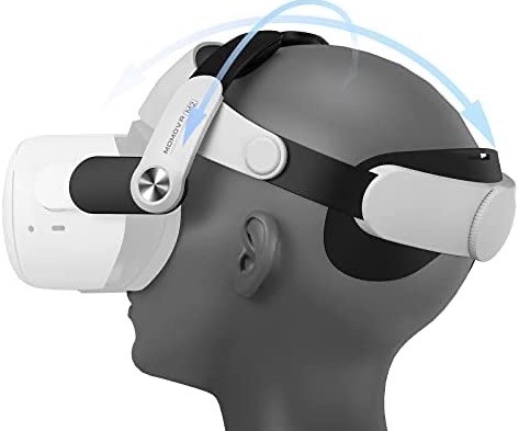
- VR head strap with an adjustable fit wheel
- Android tablet (NEC brand)
- A large monitor to watch what participants see
Adjusting the headset
We strongly recommend using a head strap with a fit wheel. It makes it easier to help the participants put on the headset and avoids excessive physical contact. The product we used is not currently available. However, Meta Official Quest 2 Elite Strap and many third-party products have similar options available.
Turning off the guardian and proximity sensor
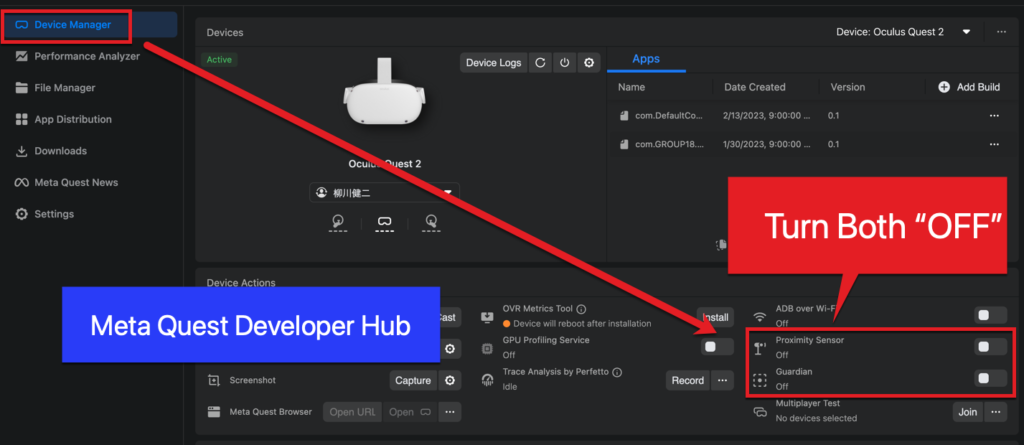
Quest uses a proximity sensor for safety. When someone approaches an obstacle, such as a trash can, the VR stops. It warns the user by turning on the pass-through cameras to show the obstacle in the real world. There’s also a guardian, which is an invisibly marked area in which the user can walk around safely. Once the user leaves the guardian area, the VR stops and switches to the pass-through mode. This prevents the user from colliding with real-world objects and getting hurt or damaging things.
We always check the users’ surroundings and guide them to avoid a collision. Because VR stops when we get close to the user to help them, we turn off the guardian and proximity sensors in Meta Quest Developer Hub. By connecting the headset with a type-C USB cable to a computer, you can change the settings on the application. Rebooting the headset brings both settings back to default.
Designing a survey
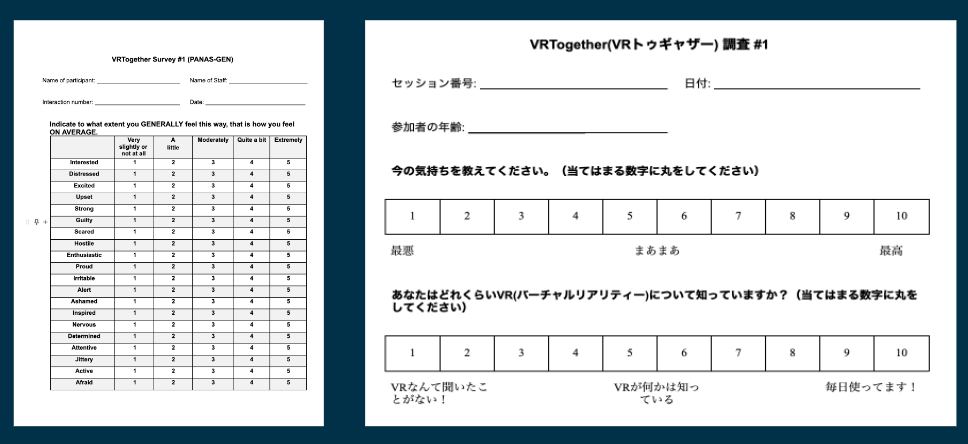
Users complete a questionnaire before and after the VR experience. This allows us to measure changes in feelings.
We plan to do more quantitative and qualitative research in the future once we get funding. Since this is a pilot, we kept it simple. Users answered each question in which they shared how they felt on a scale out of 10, and we marked their answers. We also asked for their overall impressions and gave them the opportunity to add comments.
Environments and Activities
Users don’t walk around in the environments. They can play seated and look around and take action by using one or two buttons. Every interaction with the user followed this script.
- Take the “before” survey.
- Explain the purpose and the duration of the test.
- Give pre-flight instructions, such as how to use the hand controller.
- Complete VR activities.
- Take the “after” survey.
Here are the environments and the actions for each.
Beach
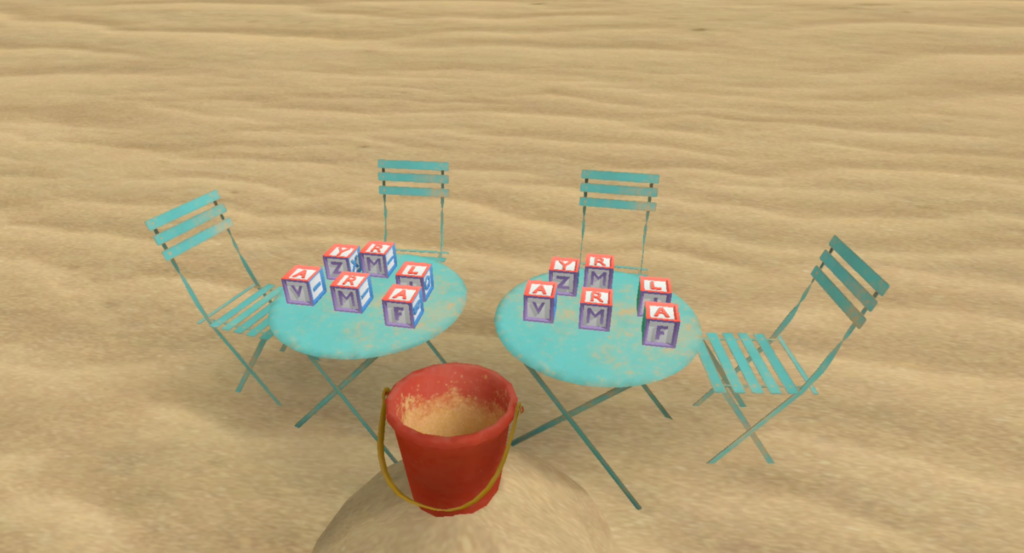
The beach environment is the place where users can come together and manipulate 12 blocks with various letters on each side.
In the beach scene, we ask the users to do the following activities:
- Get familiar with the controls.
- Pick up blocks with the trigger button.
- Look around and find their partner.
- Shake hands with their partner.
Hot air balloon
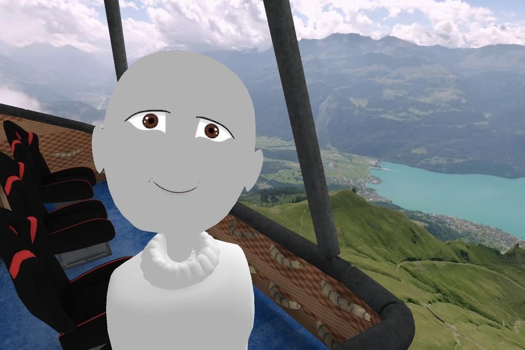
The hot air balloon experience plays a 360-degree video for a few minutes.
While in the hot air balloon, we ask the users to do the following activities
- Look around.
- Find objects like trains.
- Use a virtual camera to take pictures by pressing a button.
Camping site
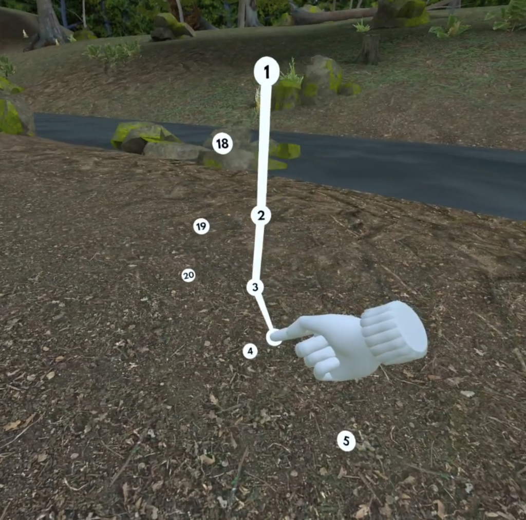
The camping environment is an experience where users connect the dots to generate objects such as a tent.
At a camping site, we ask the users to do the following activities:
- Play a mini-game to connect the dots in numerical order.
- Receive a camping tool award after connecting all the dots.
Findings
Here are the main findings from user observations.
1. VR Controllers are hard to use
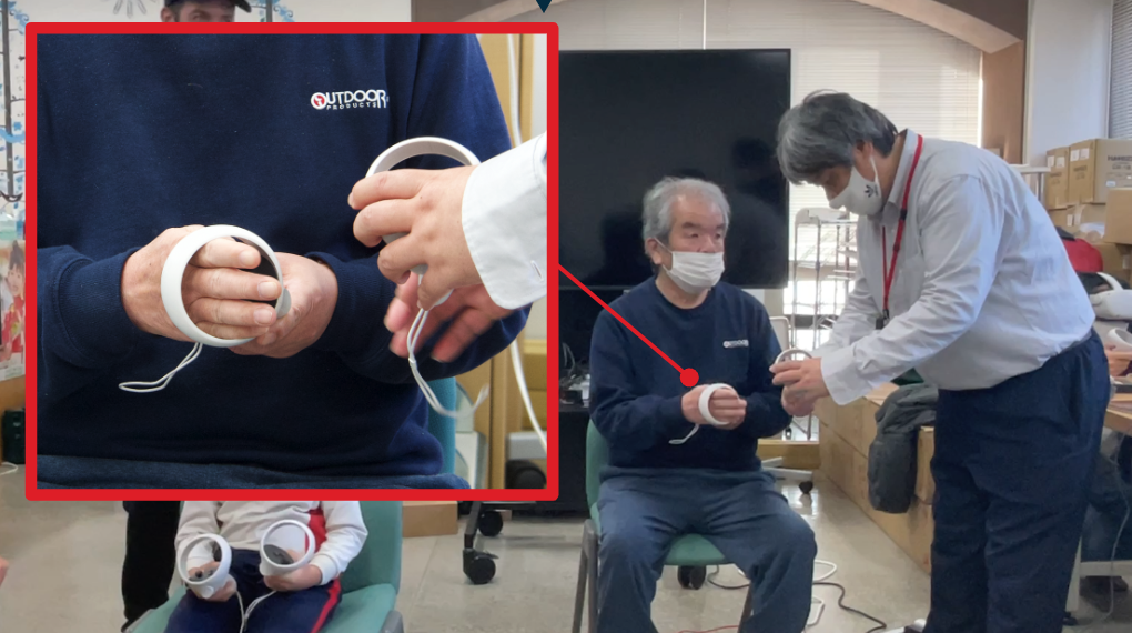
Seniors had a hard time using the hand controllers.
- They thought the round part of the controller was for putting their arms through them.
- Hard to hold the controller correctly based on its shape. (Refer to the raycast issue in our previous blog post, 11 Things We Learned from Blind Users.)
- They had a hard time understanding the concept of a controller. For example, we asked them to virtually shake hands with another player. One participant removed the controller and tried to use their hand.
- They were not familiar with the layout of the buttons.
- With the headset on, they couldn’t see the buttons and button names, such as “X” and “Y.”
- It was hard for them to press, press and hold, or release a button.
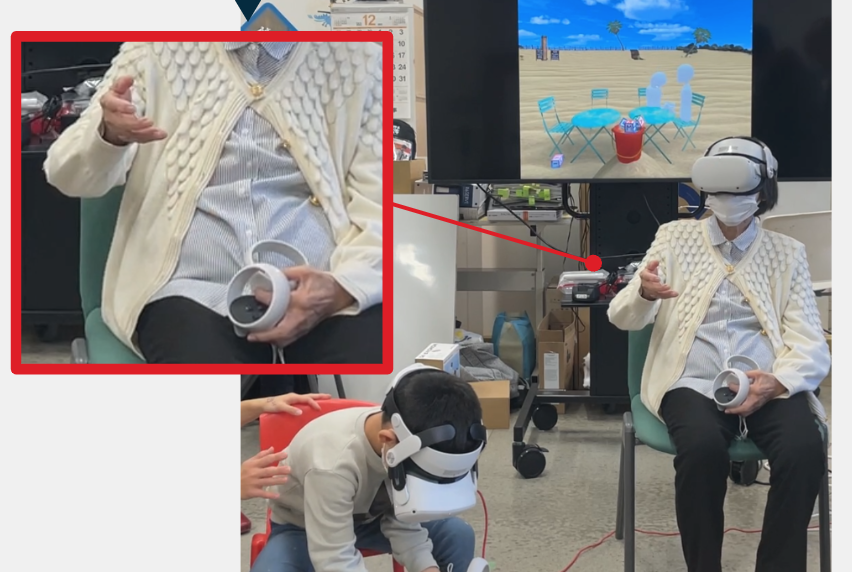
2. Headset is too heavy
Even with the adjustable head strap, it was still heavy and some people looked tired. Hopefully, headsets will get lighter. The headset was also a little too big for the children.
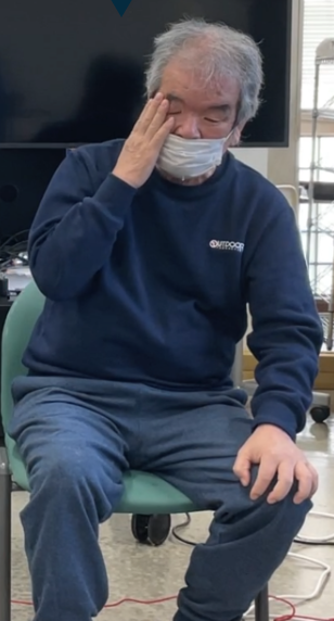
3. The importance of onboarding
Once they get used to holding the controllers, the next step was to use them. It was hard to explain the simplest actions. These included stretching their arms, pressing buttons, and grabbing an object because the virtual reality environment confused the user. They struggled to get a sense of movement, such as looking around or reaching for an object using their hand controller.
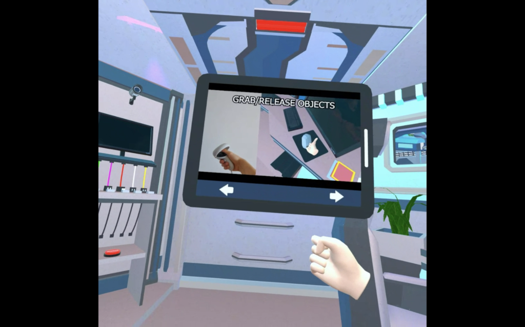
The team agrees that future virtual reality products should have an onboarding process. It would familiarize users with the controllers and how to interact in virtual reality. There are many games that currently do not have an onboarding process. Moreover, there should be a walkthrough or explanation of how to use the controller at the start of a game.
We have tried many VR apps and games. One example is the open-source game RocketMan which had a good tutorial showing videos of how to hold controllers. Some people might not need it, so it would be a good idea to have the option to skip it.
4. Age-based differences in how long it takes to master the controls
Often, the children quickly learned how to use the controls and start playing the game. The seniors, on the other hand, struggled with getting started and needed the team’s help. During the period of mastering the controllers, there was no interaction between the two users. Based on our observation, it is a good idea to create a tutorial in the form of a mini-game where both players work together to complete the game.
Be aware there may be times when children get frustrated by the senior’s learning curve. This is an opportunity in which children can learn how to be kind to people through the experience. In fact, one senior said, “The connecting the dots game was fun because I could see how the child completed it. And I was able to learn from them.”
The key is for developers to create an accessible environment that is effortless to understand.
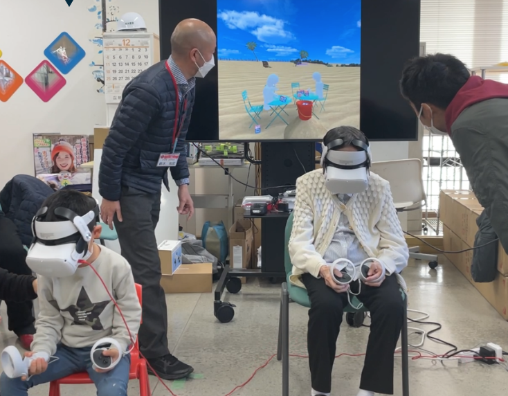
5. Children and seniors started interacting in VR as soon as they saw each other
Every user had a default gray avatar to make it easy to recognize each other. When they saw each other’s avatars for the first time, they became excited. It may have been possible that it was easier for them to interact through their avatars instead of their real-world appearance.
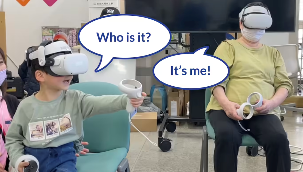
6. Hard to orient movements in VR with the body
Requests to move the body in the real world that are easy to complete such as asking “please extend your arm” or “please look around” were confusing in virtual reality. The tutorial needs to include instructions on how to move the body. For example, “Look to the right,” “Touch the left wall by moving your controller to the left” and so on. Developers often have experience moving around in virtual reality that others may not have and need to take that into consideration.
7. Simple controls are ideal
Because it is hard to see which button does what while playing, having one action button makes the interaction easy. This study used only one or two buttons. This allowed participants to get used to the button controls quickly.
Actions such as picking up blocks and taking pictures with the camera only required one button. Additionally, the game of connecting dots at the campsite did not require using buttons. The players looked like they enjoyed the game as they got used to moving their hands, arms, and bodies.
8. Provide experiences that don’t require reading
Reading instruction, text, and rules were not part of the experience. We were concerned that children would grow bored with a simple experience. It turned out they enjoyed looking at the scenery, grabbing things, and taking pictures without any game elements.
VRTogether suggested that it might be beneficial to try an interaction between people in skilled nursing facilities in the U.S. and in Japan. While the visuals provided clear direction, it’s also important to include audio descriptions for those who need audio-based instructions as an option.
Findings from Setting Up User Testing
1. Using an external monitor helps
By having helpers watch what was going on in virtual reality on the monitors, we could help participants immediately when they had problems. We also recorded it for later reviewing and gaining new insights. The researchers considered entering the same virtual space, but it was more efficient to watch from the outside on a monitor.
2. Limit the number of WiFi-connected devices.
Initially, the study involved connecting many devices to WiFi. This included headsets, tablets, computers for administration, and smartphones. A large number of devices caused connection problems.
We minimized the number of computers on the wifi network by using cell phone connections. It’s important to figure out how many devices need to be connected and the limitations of the WiFi router before starting the study.
Final Thoughts and Future Studies
The most important finding is to have an onboarding process that considers the wide range of human diversity. It’s important to consider everyone and all ages. A representative from Azalee believes virtual reality interaction could potentially be better than real life for children with intellectual developmental disabilities and for seniors with dementia. This is another consideration for future research.
Our Equal Entry team wants everyone to be able to use virtual reality. The participants made comments along the lines of “I’m sorry I’m not good at this.” Thoughtful developers who consider universal design can help avoid these kinds of thoughts. Developers have an obligation to make products that are easy for everyone to use regardless of age, ability, disability, height, mobility, and dexterity.
We continue to do studies on creating accessible virtual reality experiences. Please subscribe to the newsletter for the latest news or contact us about working with us!
Virtual Reality (VR) Accessibility Consulting Services
Our years of experience working with virtual reality and being speakers on the topic have given us a unique perspective when it comes to consulting on VR projects. If you’d like to innovate in the accessibility of VR please, please contact us to discuss how we can help you.