Summary

While in New York City, Thomas Logan and I went to New York University’s Ability Project. It’s an interdisciplinary research space dedicated to the intersection between disability and technology. There, we met with Lauren Race, an accessibility researcher in the lab. She has knowledge and experience in human-centered design of multisensory and accessible educational tools.
We received great background information on tactile design from Chancey Fleet when we visited The New York Public Library’s Andrew Heiskell Braille and Talking Book Library last year. Lauren Race happens to partner with blind and low-vision designers there.
What Makes a Good Tactile Graphic
Lauren’s first lesson was how to decide whether or not you should create a tactile graphic of an object. She shared the following scenarios in which creating a tactile graphic might be useful and provided examples.
- Object unavailable: Stars, extinct animals, and stolen museum artifacts
- Object too small: Insects, cells, and microorganisms
- Object too large: Tree, Golden Gate Bridge, and Mount Rushmore
- Hard to explain: Rainbow, logo, and snowflake
- Cannot be touched: Poisonous, fragile, and art that is roped off or behind glass like the Mona Lisa
- Size relationship needs describing: Comparing the size of a human to a mammoth
Best Practices for Designing Tactile Graphics
Once you decide what you want to turn into a tactile object, you need to keep a few things in mind to optimize it. Not just any tactile item works. Lauren completed a thesis on Designing Tactile Schematics with support from a team of advisors. One of the advisors happened to be Chancey Fleet.
The thesis contains a set of standards and best practices for designing tactile schematics. These focused on nonvisual workflows for building circuits. It includes a library of more than 50 tactile schematics available as a free download.
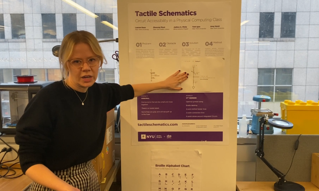
Lauren showed us the following poster of Tactile Schematics. The left side contained the original version of schematics on how to create an accessible circuit for a physical computing class. Next to it, which she points to in the image, was the 11th version. They kept iterating in developing effective tactile schematics.

For example, the original version had components that were too small and too close together. From a tactile perspective, it was hard to discern what they were. It didn’t have braille labels. Some of the lines in the printout were gray. This was too light to ensure the printing puffed up in the fusing machine. The machine needs a dark color to help the design puff up to turn it into a tactile item.
The 11th version had optimal symbol sizes, braille labels, 2-point dotted leader lines, 2-point connection lines, and 8-point strokes around the integrated circuits.
Next, she covered the key things to consider when designing tactile items.
- Hollow is more discernible than solid.
- Use one graphic per page.
- Provide 1/4-inch breathing room between the elements.
- Insert a triple slash in the upper right corner for page orientation OR cut the corner piece.
The Process for Creating a Tactile Graphic
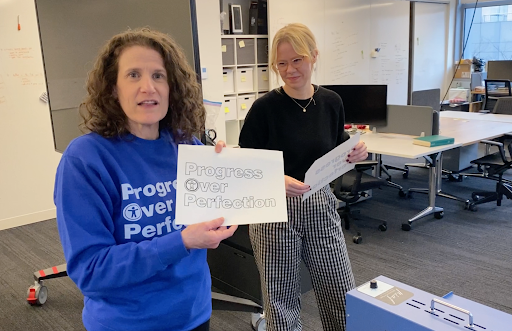
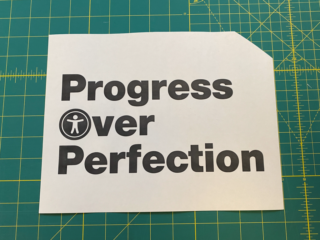
Lauren took us through the process of creating a simple tactile page. We provided a PNG of the “Progress Over Perfection” logo in the shirt Meryl wears. (By the way, you can get your own Progress Over Perfection swag.) Progress Over Perfection appears in three lines and the O in Over has an accessibility icon.
She printed out the logo on swell form paper from a laser printer. We put it through the PIAF Tactile Embosser, a swell form machine. It’s similar to a laminating machine, but instead of putting the paper between laminating sheets, you just put it through the machine. We did that a few times to ensure the logo puffed up enough.
The following image is the result. While it’s not visible to the eye, you can feel the raised text.

Next, Lauren used Illustrator to convert the image to an outline. This makes the logo’s letters and icon hollow. The next video shows the process of converting the image to an outline and running the printout through the fuser.
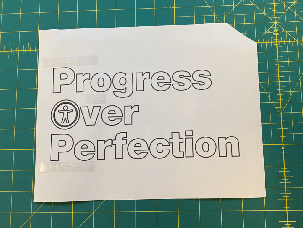
We printed it and fed it through the machine a few times. Ta-da! The next image shows the result. It shows the outline of “Progress Over Perfection.” The accessibility icon in Over’s O is now outlined instead of a solid black circle. In comparing the solid and outlined logo, it’s much easier to identify the logo the with outlined version. The solid version is like a blob.

The image also has Braille labels on top of each associated word. We made this with a Braille labeler that embosses braille on labeling tape. Yes, it’s like those old-style label embossers where you turn the dial to the letter you want. Then, you press the handle to emboss the letter. This is a great way to create Braille.
Unfortunately, like the old-school label makers, the label doesn’t stick on well! Lauren had to use super glue to make it stay put.
Thanks for the amazing lesson, Professor Lauren!
Tactile Graphics Resources
- BANA Guidelines and Standards for Tactile Graphics, 2010.
- BTactile.com, The Place to Find Tactile Graphics
- How It’s Possible to Create an Accessible Tactile Drawing
- New York Public Library. Dimensions: Community Tools for Making Tactile Graphics and Objects
- NYU Ability Project
- Polly Edman. 1992. Tactile Graphics. American Foundation for the Blind.
Does Your Website or Technology Need to Be Audited for Accessibility or Get a VPAT?
Equal Entry has a rigorous process for identifying the most important issues your company needs to address. The process will help you address those quickly. We also help companies create their VPAT so they can sell to the government or provide it to potential clients who require it. If you’d like to learn more about our services for auditing and creating VPAT conformance reports, please contact us.