Summary
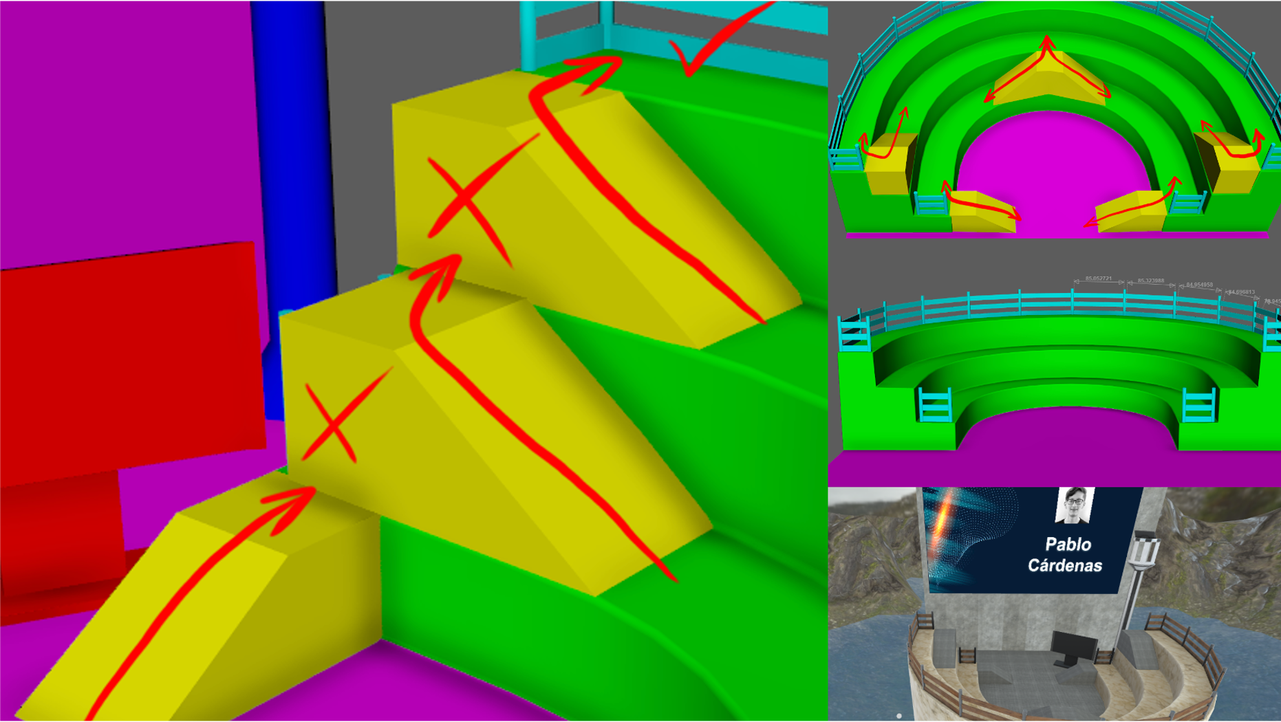
We host a monthly Accessibility Virtual Reality meetup in Mozilla Hubs. The goal of the meetup is to continuously learn and document best practices for virtual reality accessibility. One thing we’ve learned in our first year of meetings is that the meeting design of space can create accessibility barriers.
When the opportunity to work with technical artist and VR/AR developer Pablo Cárdenas to build a new space for our meetup, we jumped at it. He debuted his new environment at the meetup where he gave a presentation on “Why 97.81% of the World Hasn’t Tried VR Yet.”
Creating the space
Thomas: What was the initial process for creating the space?
Pablo: I created “XRPodium,” an accessible scene for A11yVR, by starting with your initial set of requests for the space. These helped me understand the needs of the users based on your experience hosting these presentations in the VR world.
I also received some references from my Spanish friend Pau Guardiola. These references helped me to think of ways to make this space easy to navigate and user-friendly. We still have things to improve and we’ll keep doing it with attendee feedback. I published “How to create Worlds in Mozilla Hubs (Maya – Substance Painter – Spoke“ to explain my process for creating the space.
In short, I used Maya, Substance Painter, and Spoke to create the virtual world. Maya is 3D computer animation, modeling, simulation, and rendering software. Substance Painter provides the tools for adding texture to 3D assets. Spoke is Mozilla Hubs’ tool for creating the 3D space.
Adding Ramps for Navigation
Thomas: The first assessment of the prototyped world had us realizing that the only way to navigate between levels in the space was to rely on Mozilla Hubs’ teleport feature. Adding ramps into the world ensures the arrow key navigation works correctly for moving between areas in the world.
Could you explain how you added the ramps into the world? Was it difficult? Do you have any advice for other developers and designers of virtual worlds for ramps?
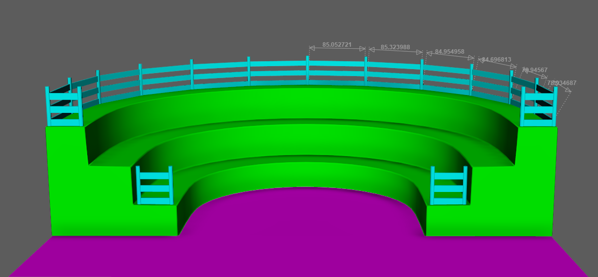
Pablo: It was fairly fast to create the ramps because they are low poly. (This means they have minimal details and don’t require complex geometry.) The process started with a cube in which I tweaked one edge to get a 35-degree angle for the first type of ramps and two edges for the second one.
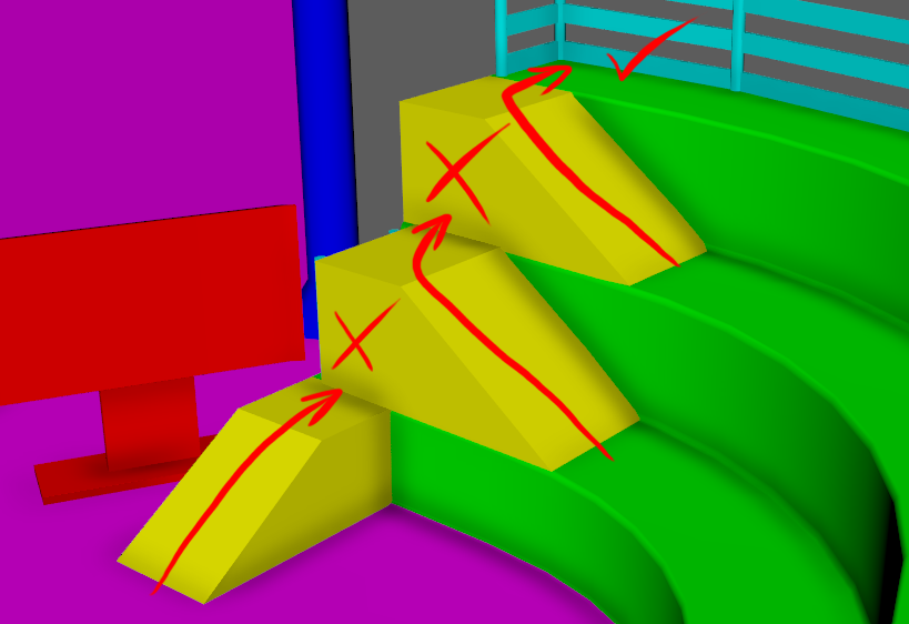
The most challenging thing about these ramps was the design. That’s because the setting couldn’t have only one type of ramp. If I did that, attendees wouldn’t be able to reach all four floor levels.
So, I had to design a second type of ramp placed in the middle with two sides. This allowed the participants to navigate the whole scene without using the teleport feature. It made the scene more accessible for all audiences.
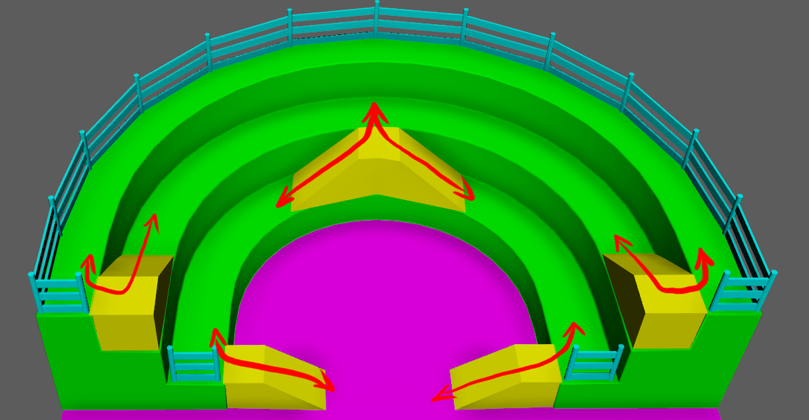
My advice for developers and designers of virtual worlds is to be aware that some people can’t use more advanced features like teleport. Therefore, we need to design locomotion interactions that are effortless to use.
Considerations for the Speaker
Thomas: Pablo, you added a position for the speaker in the world that allows you to present to the audience and see screen slides. How did that work out for you?
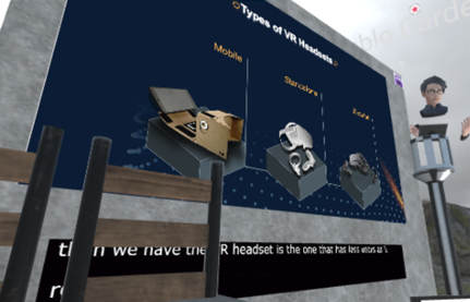
Pablo: This helped me a lot during my live virtual presentation. I felt like I was giving a real-world presentation. It had a virtual podium that worked as a reference of where I was standing.
On this podium, I added another media frame that held my speaker notes. It worked just like my in-person presentations in which I used notes to remember the key points to cover.
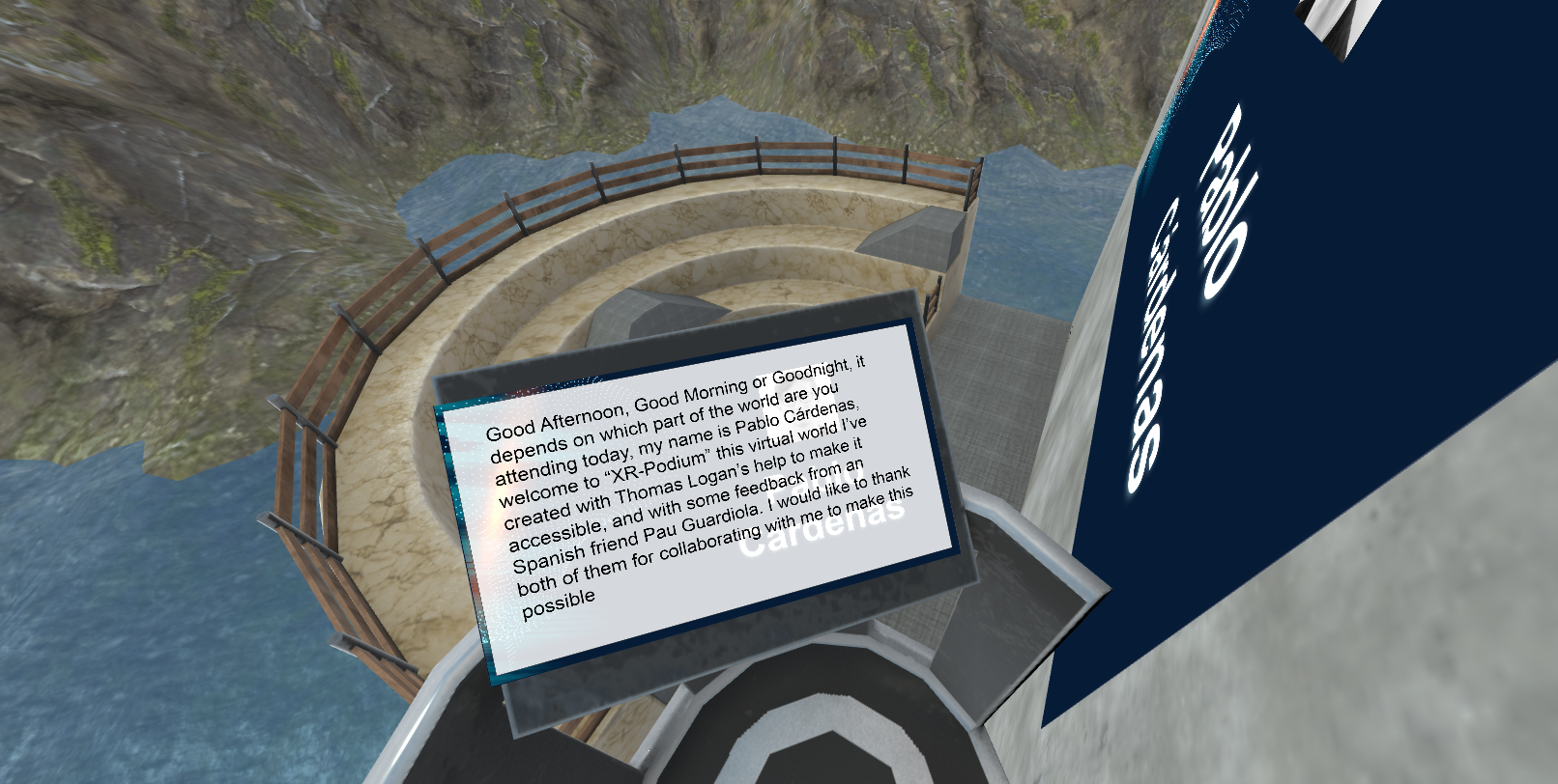
Positioning Live Captions
Thomas: How did you decide where to put the captions in relation to the presentation slides. Do you have any recommendations for dimensions for other people interested in building a similar design in their virtual world?
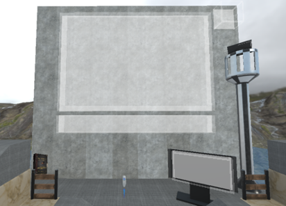
Pablo: I put the placeholders for the slides and captions with the Media Frames tool in Spoke. This locks the media input you assign to them. Only people with admin access can move or change them. I decided that the captions should match the length of the presentation to make it easier to read.
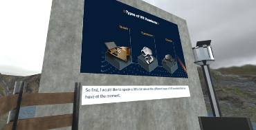
Also, if the caption input is smaller, this media frame automatically adjusts the size to avoid distortion. My recommendation for people building virtual worlds in Mozilla Hubs is to keep the Media Frames slightly separated from each other like in the following image. Otherwise, if they’re too close, the media frames may confuse the media inputs and assign them in the wrong place.
Thomas: When you gave your presentation live at A11yVR, we did some beta testing of the display of captions in the world. We realized that some elements in the environment blocked the captions depending on where the participants’ avatars stood. How did you address this?
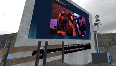
Pablo: In some spots on the third floor, the wood fences blocked people’s view. They weren’t able to read the captions. To solve this problem, I made the presentation slides a little smaller and removed the fences causing the issue.
It’s worth mentioning that we didn’t notice this until an attendee pointed it out. That’s why it’s very important to have people inside these virtual worlds and to keep iterating based on feedback to improve the user experience.
Share Your Thoughts
To review an example of the world in action check out Pablo’s Presentation from A11yVR.
We hope this interview provided you with insights and consideration for creating accessible virtual worlds. Please join us at one of the A11yVR meetups. When you do, please feel free to share your feedback with us on the A11yVR Meetup page.
Great summary Pablo!