Summary
Roland Dubois and I are continuing our explorations of WebXR Accessibility. We’ve made our interface keyboard, screen readable, and voice controllable in “Does WAI-ARIA even work with WebXR?“, now we are focusing on readability in spatial environments by moving on to color contrast. Color contrast is an interesting requirement from the Web Content Accessibility Guidelines (WCAG) that aims to ensure that the colors used to present text on the web are able to be read by the widest number of people.
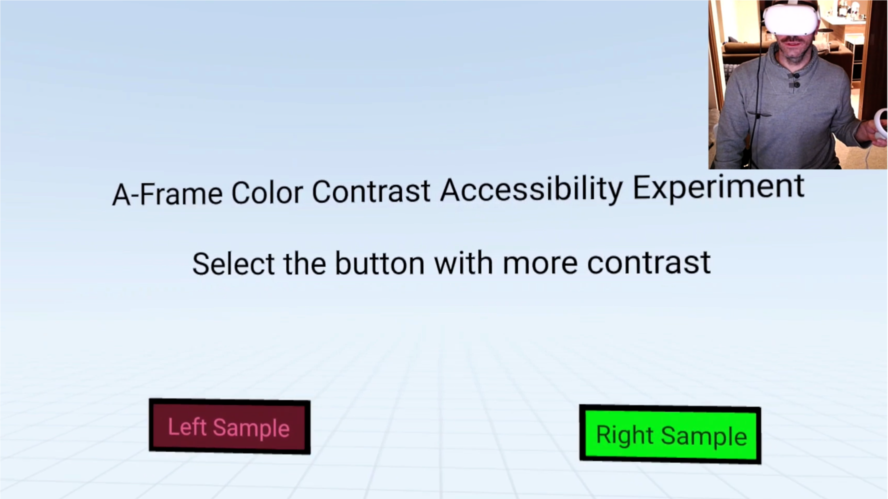
We wanted to design an experiment to test how well people can tell which color combination has the strongest contrast. For a quick introduction, please watch this short video of the experiment demoed on an Oculus Quest 2.
The WCAG Success Criterion 1.4.3 requires a ratio of 4.5:1 for regular text and 3:1 for large text. It is one of the simplest tests for web accessibility compliance because it can be evaluated via an algorithm (Details: Luminosity Contrast Ratio Algorithm). Because text that is larger and has wider character strokes is easier to read at a lower contrast. This allows creators to use a wider range of color choices for large text.
Large scale text is defined as a font size of at least 18 point or 14 point bold. An important and often missed detail in the general understanding of this requirement is that the user’s display and browser play a large part in the calculation. The actual sizing of the text and the contrast perception change due to the proximity of the user’s eye to the screen and the actual lighting in the room. In virtual environments, we can control those factors on top of the standard WCAG readability guidelines that usually end at the screen level of traditional 2D displays.
Experiment Details
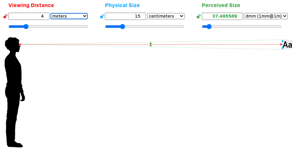
The distance to the navigation is 4 meters, height of the font is 0.15 meters resulting in a perceived size of 37.5 dmm (roughly calculated to 106 points).
This experiment is designed to let individuals test and self-assess their ability to determine strong contrast. Each time the experiment is run, the user will receive 10 questions that are A/B in nature. Our color combinations are 100% randomized with a minimum contrast ratio of 3:1.
The text that the user will choose from reads “Left Sample” and “Right Sample” and is sized (approximately) as regular text so that contrast ratios under 4.5:1 will be considered a failure of WCAG.
The goal for the user is to choose which color combination they perceive to have the strongest contrast of the two options presented. By running this experiment on multiple devices, we are curious to see if any patterns develop on specific platforms for assumptions of color combinations that have stronger contrast than others. We are also introducing the testing of virtual reality headsets in this exploration.
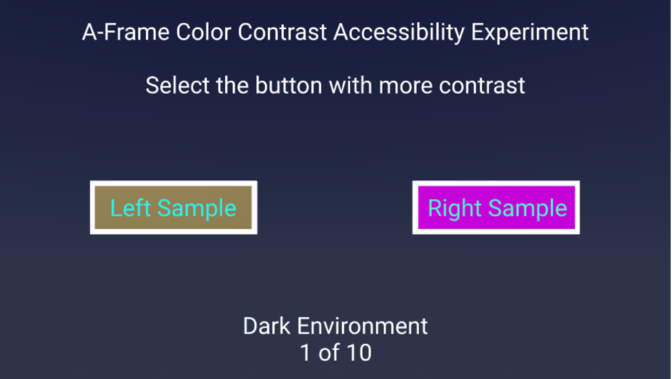
We are simulating this in VR via a daytime / nighttime environment that evokes the style of a light/dark mode in modern software user interfaces on the web. The hypothesis is that the color preference changes depending on Day and Night lighting environments for a scene. The perception of our eyes perceives color contrast differently depending on the environment that we are inside of.
Viewing Your Results
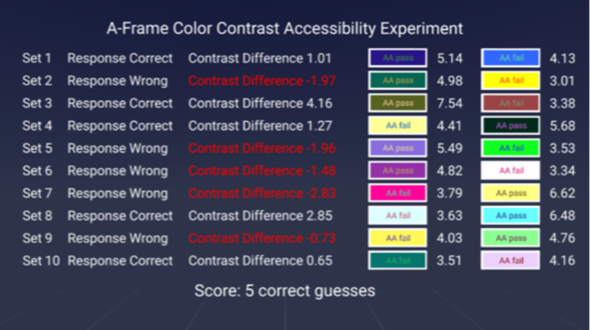
At the end of your assessment, you will have a table of results showing you whether the option you chose has the strongest contrast. You are also given the difference in contrast values between the two color options.
The pass and fail AA flags should only apply to the experience desktop mode. Due to the wider viewing angle of the camera in our scene viewed on a desktop, the font size of the interface closely matches a flat display 18 pt font size. This allows us to assign flags on desktop mode.
In VR mode, however, the scale of the scene changes, and the interface and font size appear larger. Additionally, the screen resolution decreases based on the VR device, so assigning flags for failing or passing AA requirements in VR mode is a little more complicated.
Assumptions of Outcome
We believe this exploration will help designers explore their own understanding of how much weight to put on an exact contrast ratio. Designers should be considering ensuring that the interfaces have more flexibility for color preferences.
We assume that even when the contrast is lower:
- People will prefer light background with dark text option when in a dark environment
- People will prefer dark background with light text when in a light environment
- Individuals will have preferences for certain colors and combinations
Next Steps
Our current exploration is allowing users to choose which color combination in an A/B test works best for their eyes. We have many other ideas that we would like to consider.
Do you have any ideas for what we should do next? Please let us know in the comments.
References
- A-Frame Color Contrast Accessibility Demo
- Color and Readability Study – Equal Entry
- Juicy Studio: Luminosity Contrast Ratio Algorithm
- Understanding Success Criterion 1.4.3: Contrast Minimum
- SizeCalc Tool
Extended Reality (XR) Accessibility Help
Our years of experience working with extended reality including augmented and virtual reality, as well as being writers and speakers on the topic, has given us a unique perspective when it comes to consulting on XR projects. If you’d like to innovate in the accessibility of XR please, please contact us to discuss how we can help.

Something I have to wonder about there is that this test states (in results) that the user “guessed wrong”… as an FYI, users aren’t wrong here, what is actually wrong is that the WCAG 2 contrast math is not perceptually accurate and does not model what the user sees.
There is so much misinformation surrounding contrast on the web, and much of it seems connected to some unusual ideas regarding those with color limited vision. To be clear the WCAG 2 contrast math does nothing special to help, and the fact the math is non-perceptual makes matters worse, most especially those with color limited vision.
Here’s an article on that very subject.
https://gist.github.com/Myndex/c30dba273aa5eca426ad9f5200917c9d#the-lighter-side-of-dark-backgrounds