Summary
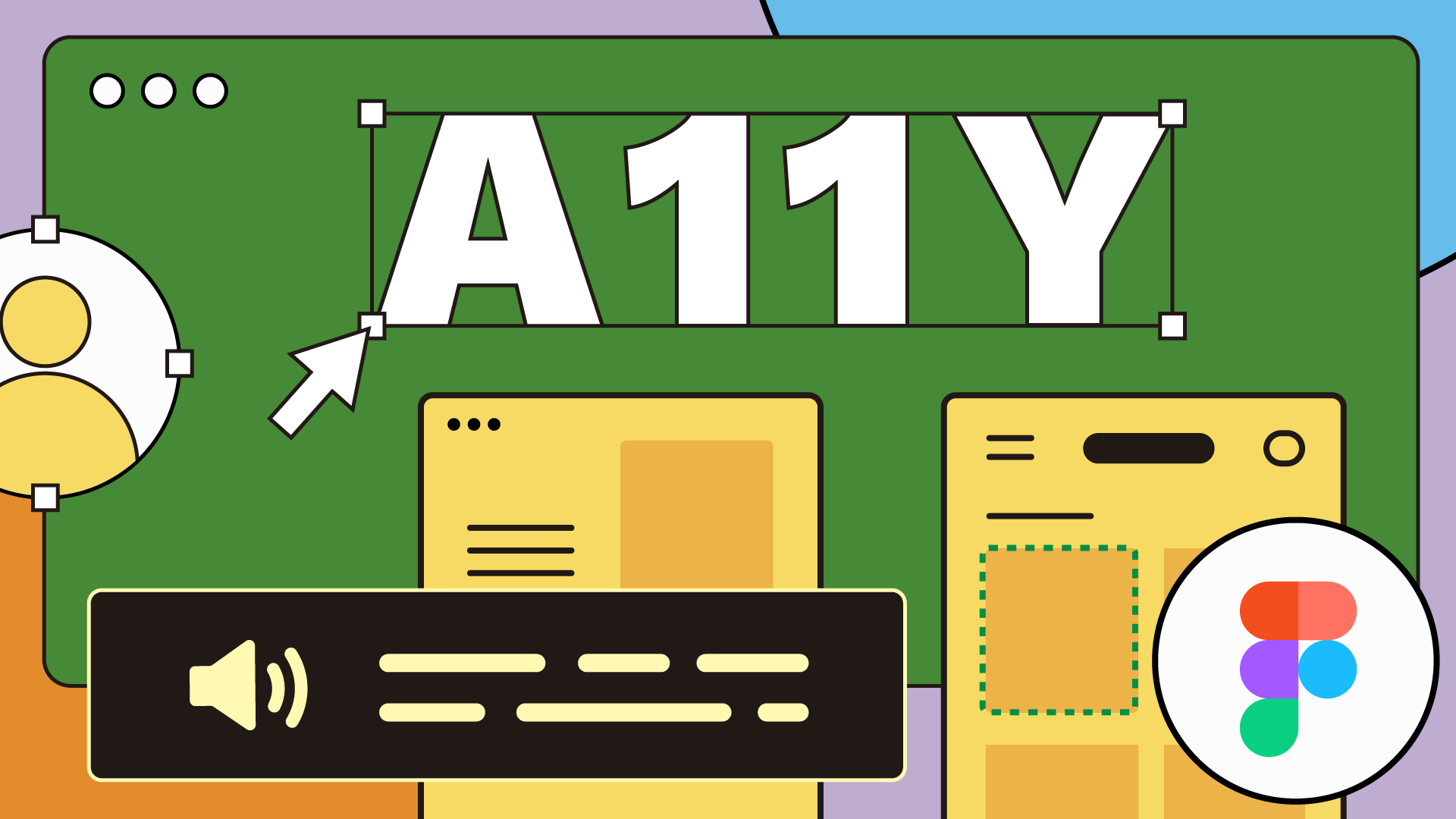
This article is based on a talk David Winslow, software engineer at Figma, gave at A11yNYC.
For those who aren’t familiar with it, Figma is a tool that allows people to share and collaborate on designs for digital products and experiences. Changes are propagated in real time. Think of it as Google Docs for designers.
There are two products. There is Figma, the design platform. And there is FigJam, which is more focused on meetings, brainstorming, and more creative, less structured content creation — a whiteboard-type product.
Dylan Field and Evan Wallace started Figma while they were at Brown together. They landed on the idea for Figma, something that brought design onto the web and made it multiplayer. What’s interesting is that two-thirds of Figma’s users are users who do not identify as designers.
Why Accessibility Matters to David and Others
Why does David work on accessibility? Why does it matter to him? He sees this as important work because he believes in enabling serendipity and building tools that empower users to do things that he didn’t imagine. The more people that can use the tools that he builds, the more opportunities there are for things that wouldn’t have happened otherwise to happen.
He also understands that Figma has a huge influence on the design community. By leading in this space, employees have the potential to influence beyond Figma.
As a software engineer, he believes they can do a better job if they take the time to identify what are the semantics of the user interface, what it means, and what patterns they should implement. It will make the product better for everyone, and not just by implementing accessibility. But also, by thinking about the accessibility or the semantics of the product, in ways that enable accessibility, as well as other experiences.
Accessibility on the Web
What is accessibility on the web built on? What are the tools for doing this? On the web, documents and user interfaces are made using HTML. A designer can make a button by taking the label that they want for the button and wrapping it in angle brackets that say: Button.
This makes an object in the browser’s memory called an HTML button element. That button element is responsible both for making the browser draw a button on the screen as well as for telling assistive technologies like screen readers there’s a button here.
Everything that the web communicates to the screen reader comes from some HTML element. As you dive into the tools, you need to build more interactivity. That’s where things like headings and landmarks help identify the different structures in a web page. There are tools for customizing both the behavior and the appearance of these things. Those are generally developed using JavaScript and CSS.
As designers get into more advanced user interfaces, there will be some required behavior that’s not provided by the browser. So, if you want to make a button in your user interface, the browser handles a lot of the behaviors that are expected of a button. For example, making that button clickable through the keyboard.
But if you want to make a menu, for example, you’re going to have to provide some JavaScript that provides the expected behaviors. Every accessible element comes from an HTML element and may require additional work from developers and designers. There is a lot of HTML that may not need to be communicated to the assistive technologies.
Accessibility in Figma
When David worked on mapping software, his company had a common request from users asking how to make their maps accessible. It’s common to look at a map from the U.S. Census, where you click, and then it tells you information about one place on the map. That’s a challenge to make accessible.
Often, the advice was to provide a table. He learned that sometimes the right way to make something accessible is to provide an alternative. This experience was one of David’s first introductions to thinking about accessibility, thinking about people interacting with computers in ways different from the way he does.
He worked on Google’s preview technology. This is the tool in Google Drive and several other Google products that lets you see content that you uploaded but didn’t author in Google Docs. Things like PDFs and spreadsheets didn’t map perfectly to HTML. Instead of relying on the browser, the team worked with their own rendering technology.
These services were screen reader accessible. This exposed David to a mature product that was in maintenance mode. It helped him understand what a mature accessibility practice can look like. Now, working at Figma, where they have a complicated data model. They have documents inside of documents inside of documents.
Regarding Figma’s specific problems not related to Canvas, one of the technological changes that enabled Figma to exist in the first place was the availability of this technology called WebAssembly. This lets you opt out of some of the things that make web applications slow, by writing them in C++ instead of JavaScript.
So, a lot of Figma uses JavaScript, and the graphics card on a fast desktop computer, to do things about as fast as a browser could be expected to do them. The vision was that Figma would build a cross-platform technology in C++ with a thin layer of web technologies, adapting it to the browser. It would also have a thin layer of MacOS technologies, adapting it to the MacOS platform.
Some of those layers of abstraction are in the product today. They don’t account for the things that you need for accessibility to tell the screen reader that the layer on your Figma Canvas exists. There’s been a lot of care given to the Figma UI.
Even if it doesn’t have all the right roles to make a screen reader understand it, there is a lot of thought given to the way that you can drag in almost any number control on the Figma properties panel to visually — or interactively — change its value.
Another example is every menu in Figma allows you to click on the menu and then move your mouse to the item you want and click on the item as well as hold the mouse down and drag it to where you want it to be. This is a common thing in native toolkits. It’s also a thing that a lot of web toolkits, a lot of things built from scratch, don’t always provide.
Another place where a lot of care is given is performance. As the team added features that use more of the web technologies that Figma was really planned around, they had to make sure that they were not impacting the performance in a way that was going to make Figma less usable. Especially for users who might not understand why the accessibility improvements are improvements.
The other thing is that there are a lot of people working on Figma. Not all of them are trying to build that new accessibility feature. Many of them see accessibility as something that’s not important right now. But accessibility is one of those things, like security, like performance, that’s kind of hard to retrofit into an application. Getting that work to happen sooner is something that David would like to happen as they build their practice.
Figma relies a lot on designers using the product internally for QA testing. They don’t have a ton of dedicated QA resources. It’s mostly designers contacting us on Slack, saying: “Hey, I noticed that this thing is 6 pixels apart instead of 8 pixels apart.” And that has served Figma well for a long time. It’s an area where they’re building and growing their maturity. It’s growth.
Figma Accessibility Philosophy
Figma doesn’t have users internally who are thinking about using a button instead of a link. Or, how a menu isn’t communicating its state properly to the screen reader. The features the Figma team builds must be careful to provide automated testing or some other means to make sure that they don’t get changed inadvertently, as a part of other work. That’s another challenge they face.
Figma has its own user interface. So, when they’re editing designs, the team tries to keep that user interface out of the way. This lets the designers’ experience focus on their own content. Figma doesn’t want its layer browser to prevent anyone from seeing the layers that they’re working on the canvas. The content itself is an important part of the Figma experience. And it needs to be accessible along with the menus around it.
In thinking about user-provided content, Figma knows that they probably won’t always be able to guess what an author means in a particular design. They may be able to do the right thing automatically in a lot of cases. However, for the best accessibility in Figma, it will need to give designers the power to design their documents.
If Figma tries to require things like accessibility roles in designs, then it introduces most users who have workflows that are working for them today and don’t require those things. Hence, Figma needs to make this possible, but optional.
One example is in FigJam whiteboarding. People like to just grab a GIF and put it in. There are lots of different contexts in which people put images into FigJam. One thing the company did while improving accessibility was to add support for alt text. But it’s opt-in.
You can still just drag and drop that image. And if you don’t put alt text, then there won’t be alt text. But if you have someone on your team that you know would benefit from it, then you can make that a practice that your team adopts.
Figma Accessibility Strategy
Figma knows they have a lot of work to do. That said, they look at the smaller pieces that they can deliver to users and celebrate. They’ve been focusing on enabling use cases rather than meeting technical criteria. For example, Figma prefers goals like “Support commenting without a mouse over and ensure that every menu responds to arrow keys appropriately.”
That’s why they’ve shipped things like the ability for screen readers to understand prototypes, as opposed to having incremental updates to the system that makes sure every dialogue in Figma traps focuses the way that it’s supposed to. Figma Files are an important part of the Figma Platform from the accessibility perspective. They want to make progress transparently and ship things that make things better for some users.
The Figma Canvas did not have screen reader transparency before and now it has some. Users have told Figma that it enables, for example, blind accessibility experts on some teams to review designs in some capacity, without needing someone to read them to them. Or without needing them to be exported to PDF with all the complications that that entails.
The launch of the Figma screen reader support for prototypes was one of the top posts on LinkedIn in 2021 when it came out. The company is collecting the stories they get from customers who are part of the beta programs. These folks can back up that Figma’s work is making a difference. This makes it easier to justify more investment in accessibility.
They’re working to identify partners internally who aren’t on David’s team. These partners care about accessibility and they’re helping them to care for and support each other, and enabling them to share what they know, teach each other, and build on the same systems.
Products
The prototype viewer was the accessibility team’s first project. The big challenge they had to solve was accessibility for the Canvas. They had to improve a lot of the incidental UI that’s around the prototype viewer. David’s presentation took place through Figma’s prototype viewer. (View the video to see it in action.) The viewer has its own menu, buttons, and toolbars. As you tab through the UI, it shows you where the focus is currently.
Figma Prototype Viewer
Every Figma prototype has a baseline level of accessibility for screen readers. The team opted to focus on broad support rather than fine control for designers. This ensures every prototype can be accessed with a screen reader.
How does it work? HTML manages all the text and they’re styled with CSS to avoid interfering with the visual presentation. HTML supports screen readers and other assistive technologies. To mitigate the performance impact of having many objects, Figma prefilters the design. Many of the objects don’t make sense for the screen reader and are filtered out.
A user who relies on the screen reader receives a link to a Figma prototype. They go there and there’s nothing there. To help the screen reader, the team added an invisible “skip to content” link. When someone uses that link, it turns on screen reader mode regardless of whether you have an account, are in incognito mode, or anything.
If you don’t “skip to content” and you find yourself at the main UI without having gone through that pattern, then there’s an explanatory text that takes the place of the dynamic canvas that tells the user how to activate it explicitly.
The team has learned designers use Figma in different ways. It’s hard to generalize across all of them. They found some designers that were deep into using components and switching properties around and saying: This is the same object, but it’s changing state. This is helpful feedback for the team.
They’ve also found users who build their Figma designs more like a PowerPoint by navigating to another slide. This is more difficult to support. They’ve also learned that there are many assistive technology users and they’re not all familiar with all the features.
The accessibility team gets a lot of support requests. They meet with the user, do a little investigation, and find that they just turned off speech in their screen reader. The team has no control over this aspect and it’s difficult to design for such challenges that aren’t part of Figma.
FigJam Accessibility
FigJam takes a similar approach. However, throttling was not effective in FigJam. It has little control FigJam can’t create autolayout. Users can copy and paste a design from Figma that has it. But generally, FigJam designs are shallow and simple from a nesting perspective.
The team found they needed to throttle how frequently it updates. FigJam can update multiple times a second, but it doesn’t have real-time text updating the way prototypes do. Generally, the screen reader will also throttle. You can’t send 60 frames per second of text updates to the screen reader. It doesn’t make sense. This was an accessible trade-off.
The team had to define some new UI patterns. They added keyboard-only flows for inserting content into the FigJam canvas. They adopted a pattern that is seen in tools, such as Microsoft Office, where there’s a special keybinding that moves focus to different areas of the UI.
The team added alt text for images. You can click on an image and one of the options that you have for manipulating it is to change its alt text. FigJam allows users to quickly react to a sticky note and other content using a keyboard shortcut. This is accessible and supports collaborative brainstorming and meetings.
Lessons Learned
FigJam is the first project in that the team spent a lot of time looking for exemplars and trying to figure out who is solving the same problems and doing it well. The team talked to users and experts at Fable. They all advised looking at what Microsoft does.
It was challenging to support multiple screen readers. This is the case as FigJam deals with more custom behavior. The team knows enough about the interactions for the sighted user. They needed to make sure that they were not conflicting with screen reader shortcuts and that they behaved acceptably in every supported platform. It was a balancing act of multiple screen reader applications.
The process involves mostly engineering time. The engineers have had to step out of their coding space and think about designing these new interactions. They think about keyboard shortcuts to ensure they don’t conflict with the existing a screen reader user or a keyboard-only user might try. They also consider the impact on the visual experience.
The engineers did have some support from designers in a review capacity. The engineers would make a proposal and the designers will let them know if it works or needs revisiting. The team partners with Fable on testing and consultation about the designing of the interfaces.
When you’re editing your design, even if you want to design for screen readers, there’s nothing in the editor that’s telling you that it will be read to the screen reader. This is a link. This is going to be skipped over. It’s crucial to have some way in design to know what you’re doing for the prototype.
Figma continues to work with Fable. It’s a ripe time for Figma to invest in its foundations by working on some of the legacy codes that are not written with accessibility in mind. They’re also working to consolidate common patterns into a small number of implementations and build out core components. Implementers at Figma need better tools for testing and validating that the accessibility measures they’ve made are protected against future changes.
One cool and surprising side effect of doing this work has been that people who care about accessibility at Figma are starting to reach out to the accessibility team. The accessibility team is becoming that focus, that lightning rod. Many voices are saying that the competency and drive to do this work exist at Figma. The key is to align it and give it the resources that it needs to get off the ground, and there’s a lot of capacity for Figma to do the things that need to be done.
Resources
Video Highlights
- Accessibility learnings
- Accessibility philosophy
- Prototype viewer demo
- FigJam with screen reader demo
- Q&A with David
Watch the Presentation
Bio
David Winslow is a software engineer who enables screen readers to access Figma’s canvas technologies. In prior roles, he’s worked on document viewers for Google Drive and supported open-source map infrastructure for the Web.
