Summary
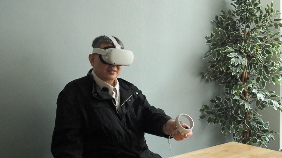
The current platforms and systems used in virtual reality (VR) technologies cannot be used by people who are blind. Equal Entry believes that VR should be accessible to all people with disabilities.
This is why we created a research environment to evaluate how blind people can navigate through a VR environment on the web. We believe many solutions are straightforward and should be implemented and made available today.
Equal Entry worked with the XR Access Accessible Development for XR (adXR) group, a workstream where academics and corporate professionals work together on research projects. For months, we discussed possibilities on how to test and refine some best practices for accessible extended reality (XR) experiences. Building a More Social Virtual Reality World was our first project exploring this topic.
This project focused on 3D content descriptions. These are text alternatives for objects in XR that can receive focus or contain important information. The research looks at how effective these 3D content descriptions are at communicating vital information and considers what needs to be done differently when moving from 2D to 3D environments.
Research Environment
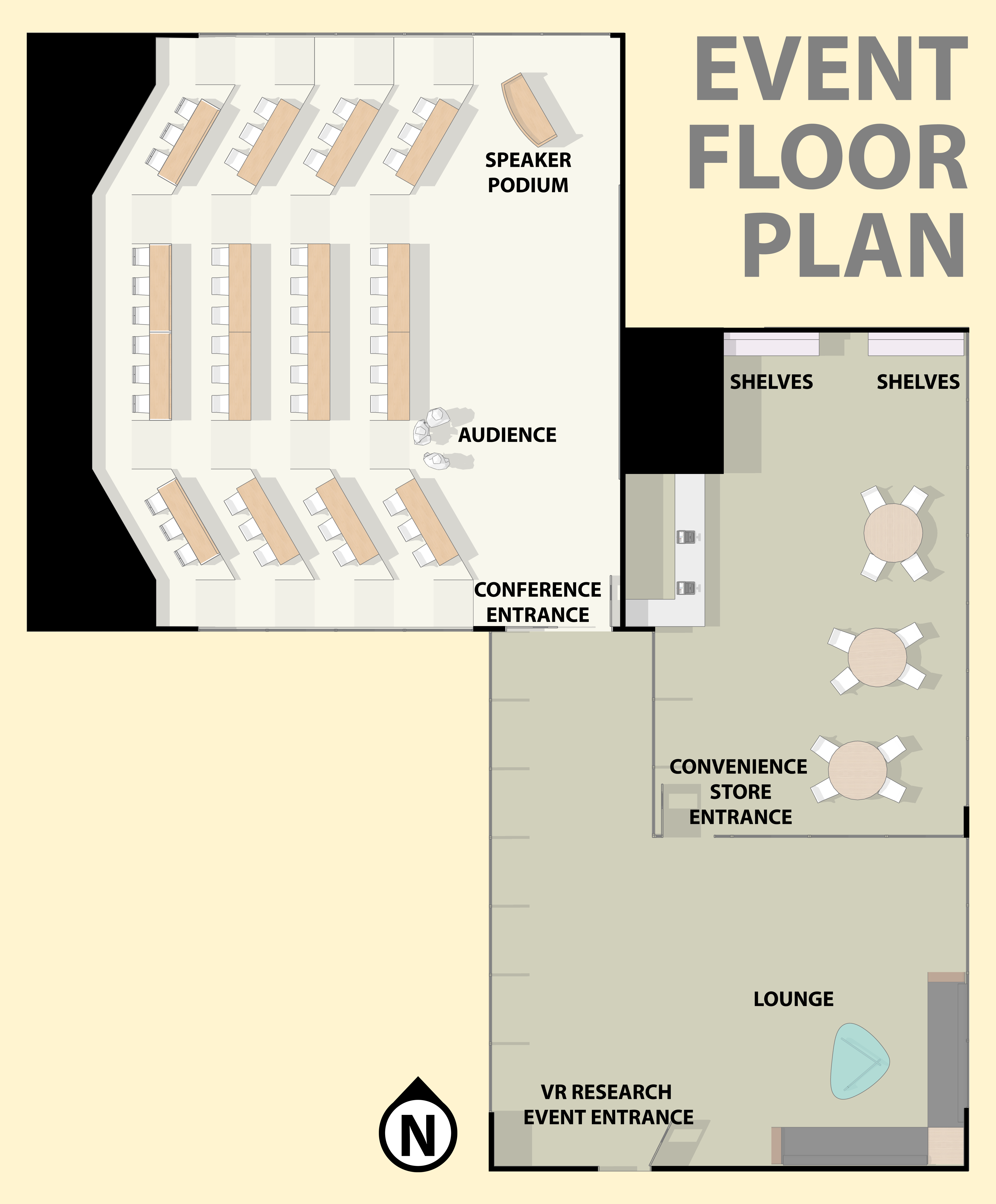
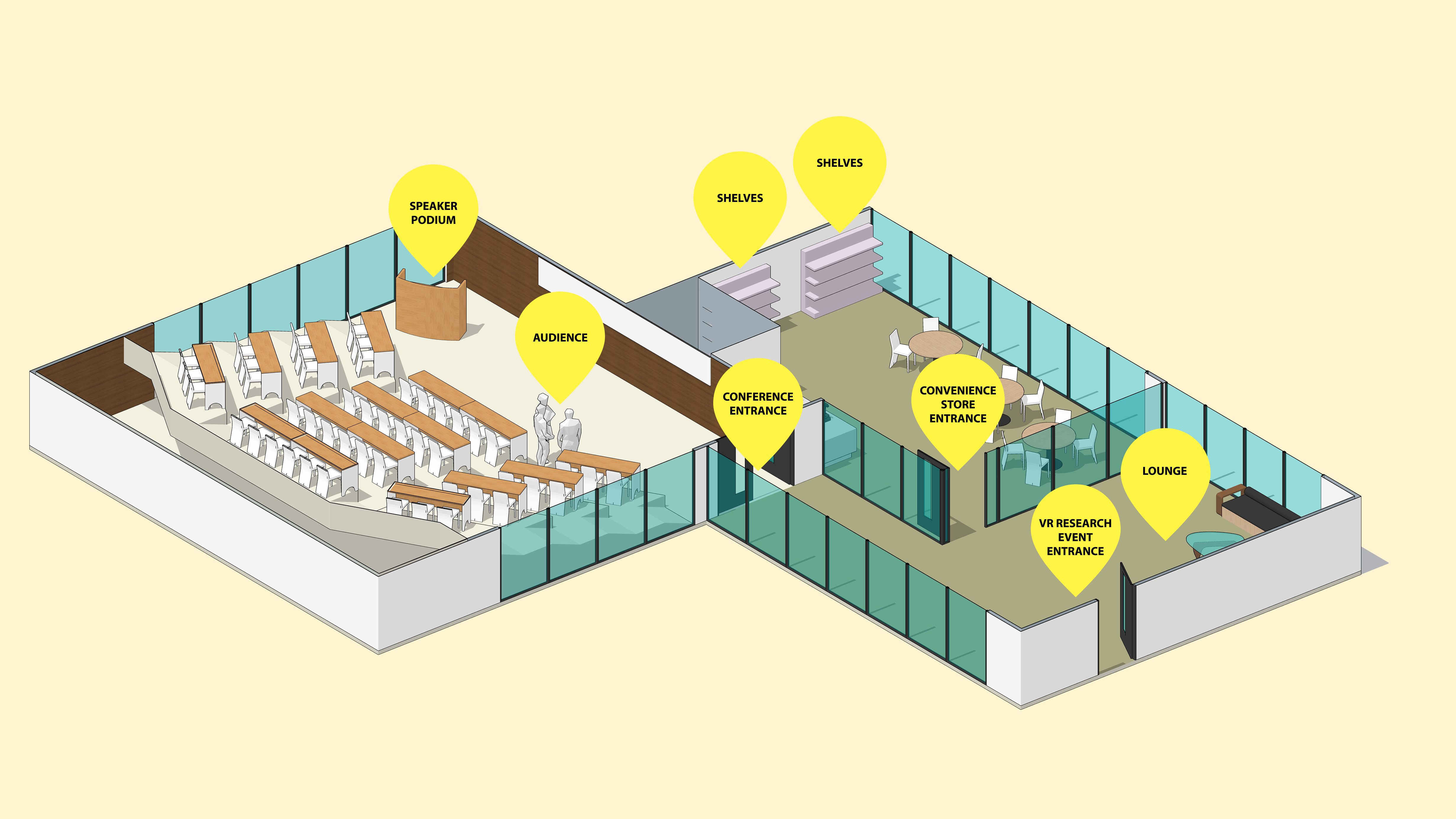
We created a virtual space with a convenience store, lounge, and conference room. Each room contains selectable items with alternative text that we added. Just like 2D images on a website need alternate text, 3D images in VR do too. You can try it out. Wear your Meta Quest 2 or a compatible headset and open our VR Research Environment in your headset’s browser.
There were two main tasks we wanted to explore in our research.
- Can a user navigate from the entrance to a virtual event space and find different rooms and objects?
- Can a user explore and interrogate information about a set of 3D objects that are displayed on three shelves?
XR technology used in research
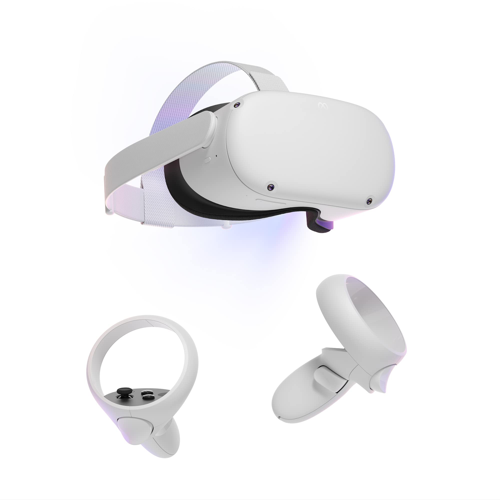
The research used a Meta Quest 2 headset with two hand controllers.
How did we document the controller actions?
It was important to make sure people understood what actions they could perform. As part of Equal Entry’s preparation for this research study, we created a table that described how to perform various actions using the Meta controller and keyboard shortcuts.
| Action name | Action description | Keyboard shortcut | Meta controller shortcut |
|---|---|---|---|
| Orientation | Describe orientation | Space | Press right thumbstick |
| Map | Display map | M | Press “A” button + right trigger |
| Hold object | Grab object | No shortcut available | Grip |
| Hover over object/target | Describe object/target by audio and label | Mouse hover | Point camera at object or Grip |
| Hold object and hover over the back side | Display description | Not applicable | Grab, twist, and point at the object |
| Describe weight | Display/say weight | Z while hovering over object | Point at the object and press “X” button |
| Describe dimensions | Display/say dimensions | C while hovering over object | Point at the object and press left thumbstick |
| Describe price | Display/say price | X while hovering the object | Point at the object and press “Y” button |
| Rotate camera | Rotate camera 45 degrees | Q and E | Move right thumbstick left or right |
| Move Avatar | This will move the avatar position | Arrow keys or WASD | Move left thumbstick left or right |
| Move to target | Select target | Mouse click | Use left and right triggers |
| Cancel speech | Stops speech | Ctrl | Press “A” button |
| Replay location distance | Repeat last selection location label | R | Press “B” button |
Floor plan / Map of the virtual environment
Descriptions of 3D objects
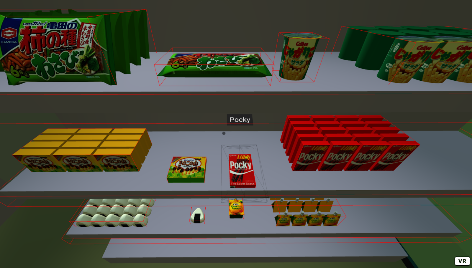
The objects were based on things you might find in a Japanese convenience store. We digitally scanned these objects using a process called photogrammetry. We wanted to explore a variety of metadata that could be made available for each object. In our initial design, we provided a name, description, price, size, and weight for each object.
| Name | Description | Price ($) | Size (cm) | Weight (g) |
|---|---|---|---|---|
Pocky |
Chocolate-coated cookie sticks. It was named after the Japanese onomatopoeic word pokkiri, which is supposed to resemble the sound of the snack being cracked. | 2.19 | 8 x 3 x 15 cm | 40g |
Kinoko no Yama |
It is made in the shape of little mushrooms. Kinoko means “mushroom” and yama means “mountain.” The “stem” of the mushroom is made of a biscuit-type cookie and the top is made of chocolate. | 3.29 | 10 x 13 x 3 cm | 74g |
Tuna Mayo Onigiri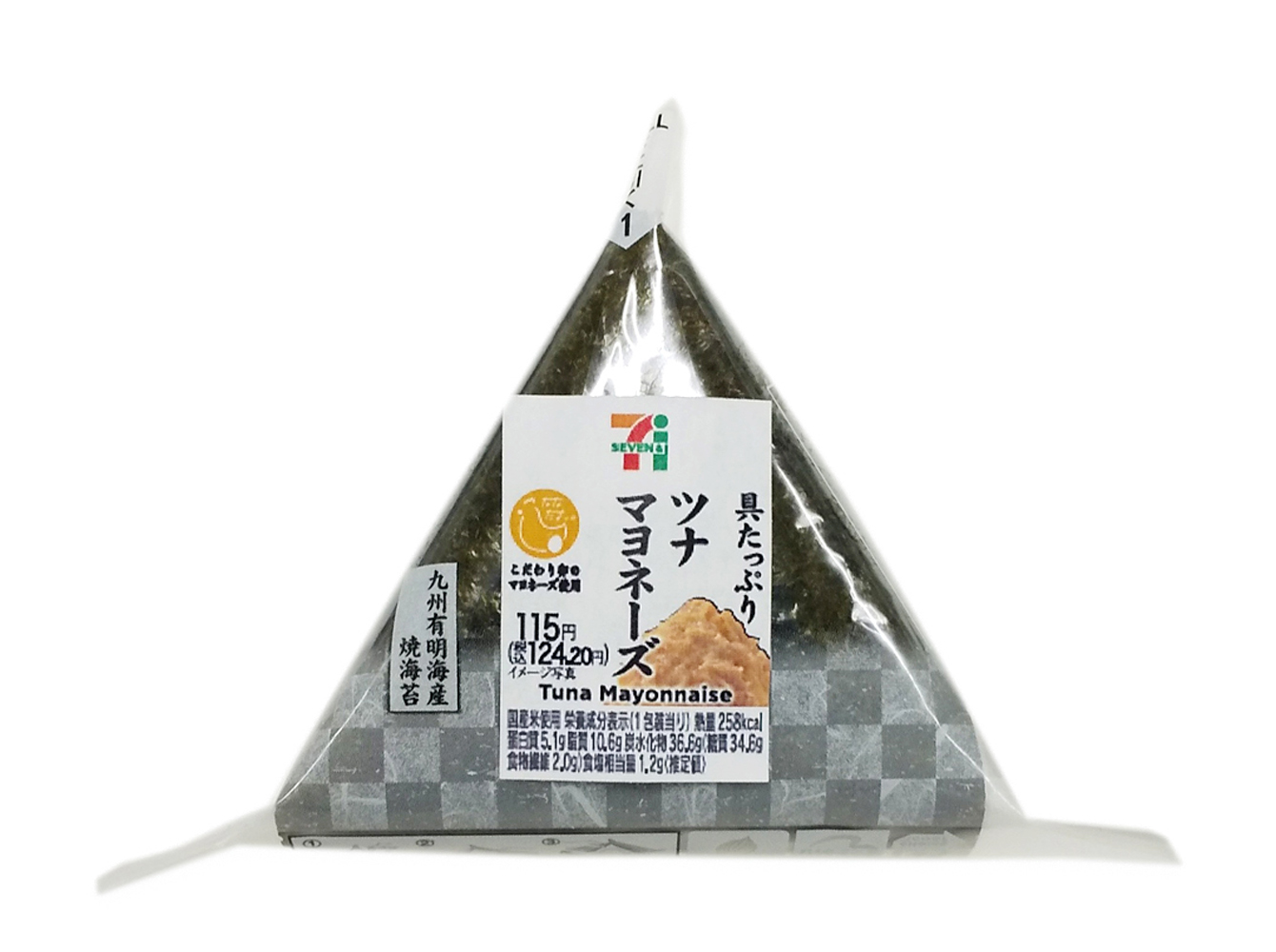 |
A modern take on traditional Japanese rice balls stuffed with canned tuna seasoned with Japanese-style mayonnaise and soy sauce. | 2.50 | 8.5 x 6 x 3 cm | 110g |
Wasabi Kaki no Tane |
Kakinotane is a mix of crescent-shaped rice crackers and peanuts. The spicy wasabi seasoning leaves you with that classic wasabi tingle in your nose, without overpowering the delicious umami of the soy sauce crackers. | 6.50 | 15 x 23 x 3 cm | 130g |
Jagariko |
A family of salty snack products made primarily from processed fried potatoes. | 2.50 | H: 8.5, top Dia: 9, bottom Dia: 6 cm | 55g |
Vitamin Lemon Jelly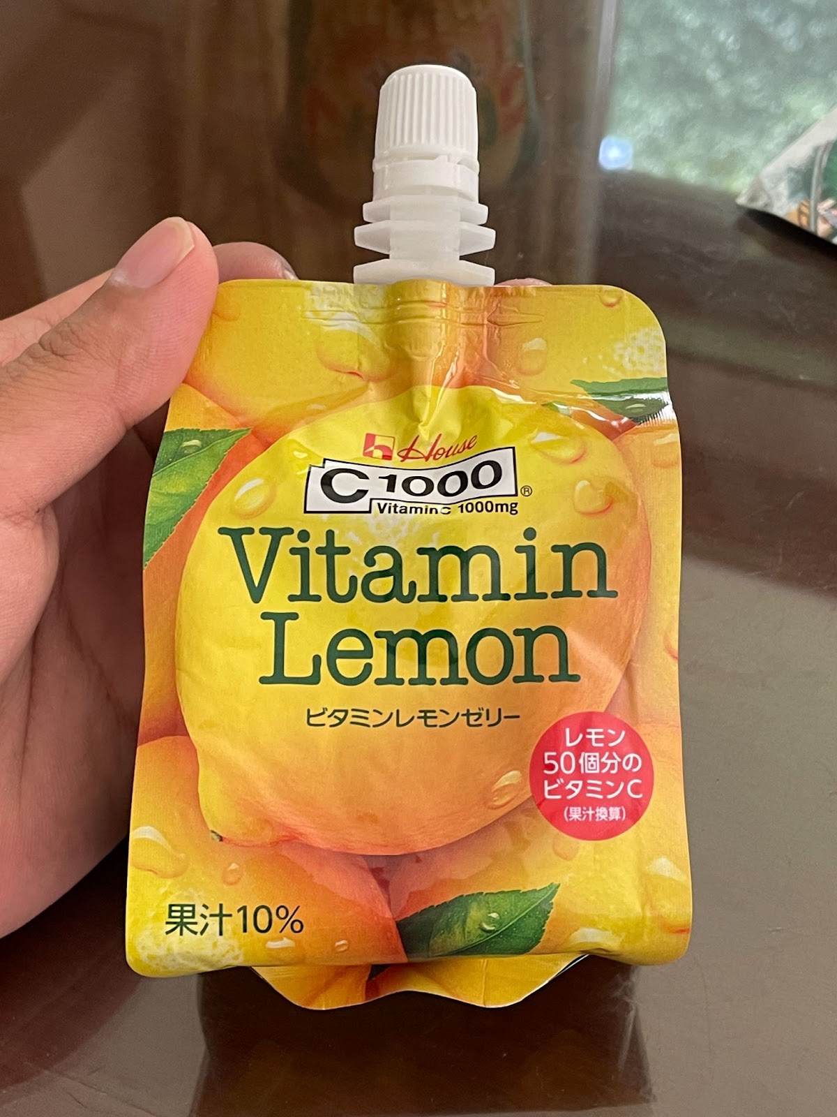 |
Refreshing jelly formulation of vitamin C of lemon 50 pieces (1000mg) and lemon flavor | 5.59 | 7.0cm × 13.5cm × 24.0cm | 180g |
Issues and Recommended Solutions
Issue 1: Using a hand controller to select an object with a small size is difficult
The Meta Quest 2 controller has a unique shape that takes time to get used to. Participants often found it hard to use the controllers to point toward something. Once the pointer landed on an object, the pointer moved away from the object too easily due to the participants’ natural hand-shaking and lack of visual confirmation that the object had focus. Therefore, the participants could not target individual objects very well and could not guide themselves to specific objects.
For example, when Andre pointed toward a door, he believed that he was pointing toward a sign above the door, although the whole doorway was the selection area and the sign did not exist. He was seated, so to point to a door, he had to point upwards, which made him believe that there was a sign above the door.
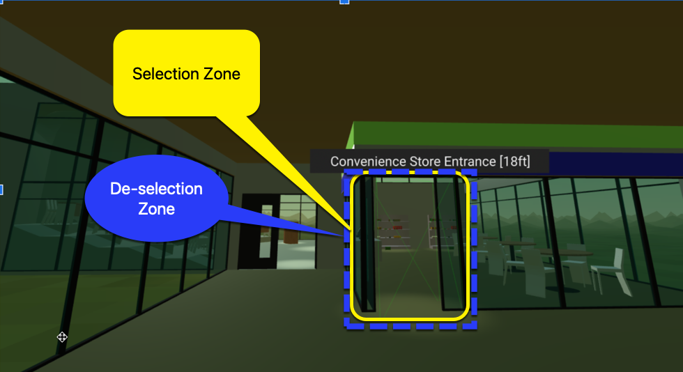
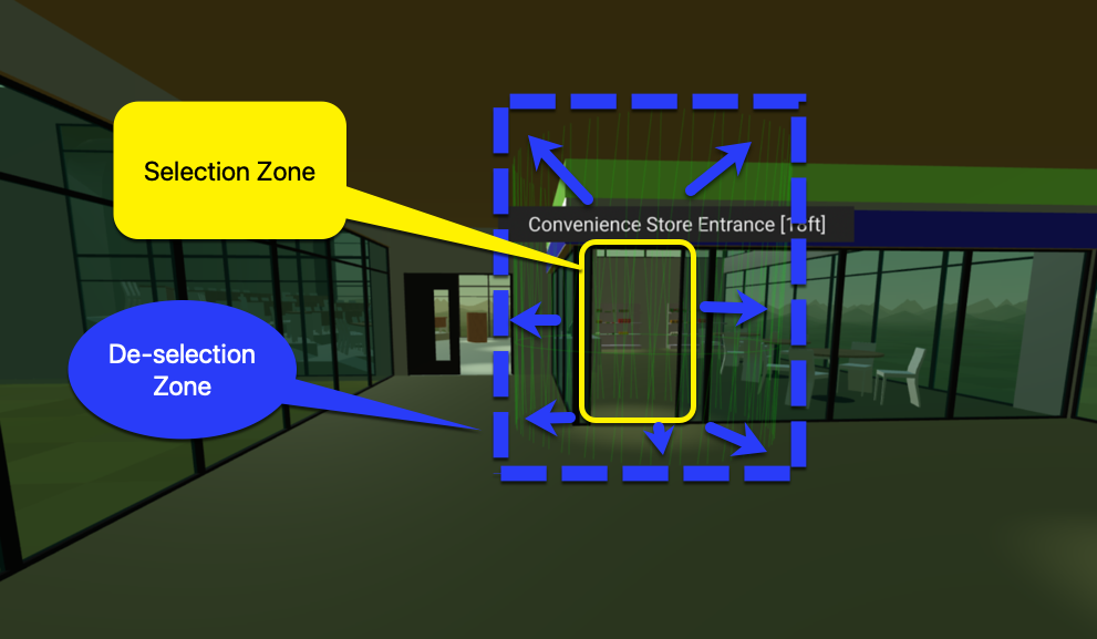
Recommended solution: Increase the size of the selection area.
In conversations with the adXR group, Mark Steelman recommended that the selection area should expand when pointed at so that the pointer cannot escape easily. The experience could be improved with more precise selection zones and less precise de-selection zones. This solution has been implemented in the latest version of the environment and will be tested in a future update.
Issue 2: Using the hand controller raycast to select an item was difficult
When using the left controller, Andre and Michael had trouble maintaining a steady hand to point at a virtual item. They felt their hands were not big enough to hold the controller. They used so much force that their shoulders became tense. In Andre’s case, using both hand controllers increased the precision.
Recommended solution: Consider giving users the option to use two hands to hold a single controller.
Recommended solution: Allow headset-based pointing.
Andre said that using the head for pointing could be more precise. This is a large area for exploration and consideration in the XR community. If we look at technology such as Microsoft Soundscape, we can see how using headphones such as Apple AirPods with the technology allows a person to better navigate in 3D space and point towards an area of interest.
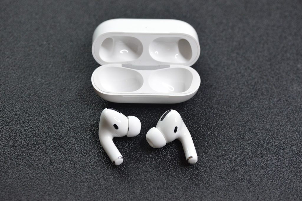
Source: DrNickStafford on Pixabay
Issue 3: The hand controller’s raycast position was difficult to understand
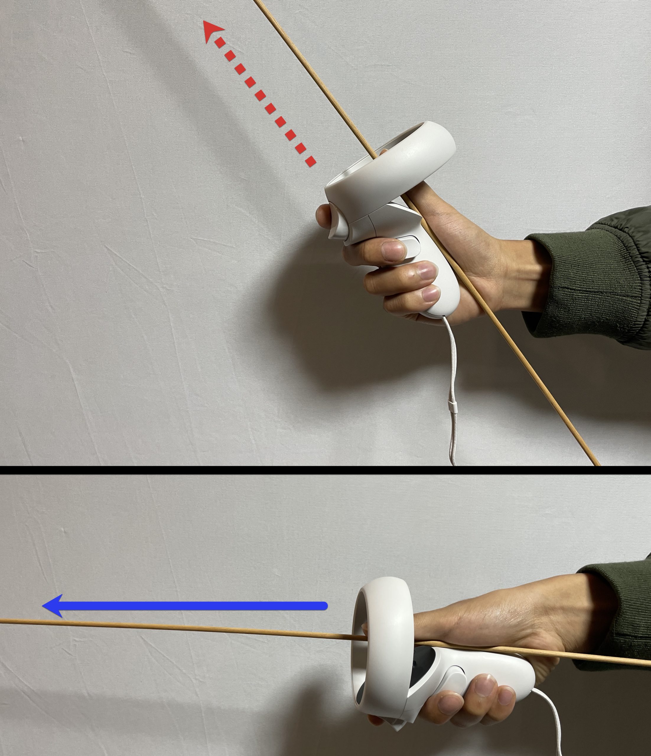
Participants didn’t know how to hold the controller at an angle that points the raycast forward. This may be because some participants are accustomed to using a white cane that points down while the raycast points forward. In the next image, we show where the raycast is protruding, but a person who is blind is not able to see the line drawn on the screen.
Recommended solution: Explain how the raycast works and add a physical feature to the controller that allows someone to feel the direction of the
raycast.
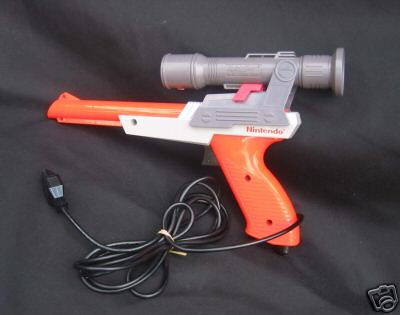
For example, “Imagine the trigger button on the controller points parallel to the horizon. The same applies to the raycast line.” Try placing additional 3D printed lines on the controller, such as making it shaped like a gun. A blind person can visualize the raycast pointer by feeling the physical extension coming from the controller. The original NES Zapper controller shows an example of a design that could be helpful.
Issue 4: No audio notification when grabbing an object
When Katsutoshi grabbed an item at the convenience store, he did not know if the item was in his hands because he did not receive any audio notification.
Recommended solution: Provide an audio notification to indicate the grabbing of an item
The grabbed state should be communicated through sound so that a person can clearly understand when an object has been grabbed and when it has been released. Considering all objects in the real physical world make some type of sound when grabbed or dropped, the best solutions mimic real sounds as closely as possible.
Issue 5: Walking sounds do not vary in pitch and are not reliable as a measurement of distance
In our research environment, each step played the same audio sample. This meant that you could hear the distance while navigating as a looped sound of 10 steps or 20 steps. We asked our participants if hearing the number of steps assisted in understanding how far an object was from another object.
Andre commented that he never counts his steps in real life, and therefore, considering an environment in terms of how many steps to take is not a reliable solution to the issue in an XR environment.
When passing a milestone in the XR environment such as the convenience store or conference room, Andre wanted to hear what he had just passed. But this information was not provided in audio cues.
Recommended solution: Use visuals and audio to communicate environmental details.
Communicating details about the surrounding environment through sound needs more development. The XR technology should not only use visual cues but also 3D audio cues. As Michael said when he arrived at the testing place, “What is the benefit for me to wear the headset?” If audio cues are not provided and headset-based pointing is not an option (reference Issue 2), then it seems like there is no point in wearing the headset if you have a visual disability.
Andre said that he recognizes where he is walking by hearing the pitch of his footsteps. As he walks closer to a wall, the pitch of his footsteps gets higher, echoing against the wall. When he is in the middle of a room, the pitch of his footsteps is lower.
Issue 6: No wall collision sounds
In the research environment, we did not have a sound notification when a participant collided with the wall. The step sound kept playing as the participant walked into the wall, which did not give an accurate representation that the participant’s path had been impeded.
Wall collisions need to make a sound. Michael did not know if he was walking towards the wall and not moving or actually walking and moving forward. In our virtual world, regardless of walls, when someone pushes the joystick forward, the walking footsteps sound keeps on going.
Recommended solution: Stop the footsteps sound upon collision.
This ensures participants know that they have hit an immovable object such as a wall. Equal Entry has made this update in the latest version of our research environment.
Issue 7: No option to stop or skip reading
Users couldn’t stop the convenience store item description announcements, so they had to listen to the whole description before moving on to the next item. Andre wanted to skip through to the next items quickly.
Recommended solution: Provide an option to stop reading or skip ahead.
“I wanted it to be two steps so that I didn’t have to hear it all at once. Like when I decided to check this one out, let me hear the next piece. I also want to be able to fast forward or something,” said Andre.
In our current prototype, we added the CTRL keyboard shortcut and the “A” button on the Quest controller as shortcuts to stop the synthesized speech. We suggest that the industry work to design a common pattern on hand controllers for stopping synthesized speech such as pressing the “A” button.
Issue 8: The screen reader rate of speech could not be adjusted
People did not want to have to waste time reading all the descriptions of convenience store foods. But they had to listen at a set speed and could not go faster.
Recommended solution: Let participants adjust the speed of announcements.
Katsutoshi wanted to be able to use the joystick to control the speed of announcements. For some parts, he wanted to hear the speech at a faster rate. For important information, he wanted to hear the information at a slower rate.
Issue 9: Background audio cannot be disabled
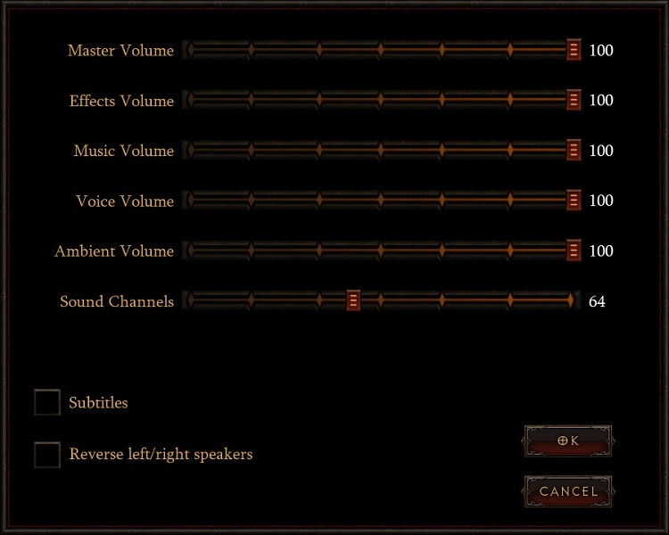
Some participants found it hard to hear audio cues if the background audio was playing at the same time as a screen reader announcement.
Recommended solution: Allow users to turn on/off background music.
The ability to turn background music on or off will make it easier for users with hearing disabilities to understand screen reader announcements.
Source: Game Accessibility Guidelines
Issue 10: Too much information is announced for convenience store products
Recommended solution: Create two steps to get information. Press the button to get a detailed description.
We designed two shelves. One shelf worked with all of the descriptions included in a very long description. The other shelf used buttons to trigger information such as size, weight, and description of the object. It’s recommended to provide two steps to obtain information to allow users to decide if they want to know the product in detail.
Issue 11: Researchers need to touch the participant’s hand to guide them to a certain place
Participants found it hard to orient the controllers correctly, select a certain object, or move to a certain place. Sometimes, it was hard to get to the place to begin the test, such as going in front of the shelves. With permission, researchers had to touch users’ hands to orient the controllers correctly, which can be awkward, especially during a pandemic.
Recommended solution: Use software to control the participants’ controller with an external controller.
There is software that allows you to control the participant’s position by using an external Xbox controller.
Recommended solution: Provide a link to start at a certain position.
In our case, there was a test to explore the objects on the shelves in the convenience store. It was better to create another link that puts the person in front of the shelves. That saves us time in guiding them to the shelves.
Acknowledgments
We want to thank the people who helped make this project a success. Thanks to our study participants Katsutoshi, Michael, and Andre for their help.
- Bill Curtis-Davidson: Co-Director at Partnership on Employment and Accessible Technology (PEAT)
- Celso Yamashita: Developer at Equal Entry
- Chancey Fleet: Andrew Heiskell Braille and Talking Book Library
- Dylan Fox: UX Design and Accessibility Consultant for Virtual and Augmented Reality
- Jesse Anderson: Illegally Sighted
- Kenji Yanagawa: Accessibility Consultant and Business Manager at Equal Entry Japan
- Mark Steelman: TransfrVR
- Mike Shebanek: Meta
- Regine Gilbert: NYU Ability Lab
- Ren Tyler
- Roland Dubois
Virtual Reality (VR) Accessibility Consulting Services
Our years of experience working with virtual reality and being speakers on the topic have given us a unique perspective when it comes to consulting on VR projects. If you’d like to innovate in the accessibility of VR please, please contact us to discuss how we can help you.