Summary

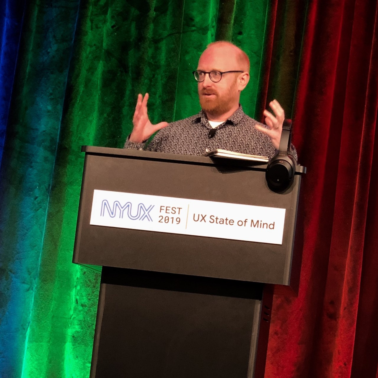
Matt May is Adobe’s head of inclusive design. His work includes integrating inclusive design practices across every aspect of the Adobe user experience, training and mentoring the Adobe Design team, and advocating principles of accessibility and inclusive design to the public at large.
How did you get your start in accessibility?
I was working as an engineer at an online grocery site called HomeGrocer back in 1999 when we got a request from our support line from a user who was blind. When I talked with her, she detailed for me what she had to go through to get groceries for herself from the local store.
What we were selling was effectively a convenience: giving someone back 20 minutes of their week on a task they didn’t like very much. But for this customer, it was a minimum of a couple of hours, and if the local Paratransit service didn’t have slots, or they were late, as was often the case, it could take days. Whether this customer could get a half-day or so of their life back using our site depended on how I was building it. So we did the best that we could, with the tools we had in that day and age.
I think a lot of people would read this story and think: see? If you build an accessible product, you’ll reach a larger market! But I never really thought of it that way. This was my first real experience being confronted with inequity in the work I was doing.
Access work is a political act. It requires you to make decisions about your work that aren’t solely about what’s the most immediately profitable next step. If that’s what it’s all about, then all the calculus teachers would be machine learning engineers or options traders. But that was what led me to think about accessibility full-time.
I turned down an Amazon offer to work on accessibility standards at W3C/WAI in 2002 and eventually landed at Adobe as an accessibility engineer in 2007. Since then, I’ve been a lead, a program manager, and a product manager in design, so I’ve had a whole lot of different perspectives on disability and accessibility in the software lifecycle over my career.
In 2008, you co-authored the book Universal Design for Web Applications with Wendy Chisholm, Principal Accessibility Architect at Microsoft. How have the lessons and best practices you outlined changed since that time, particularly for technology users in the over-50 age group?
To set the scene, the second-generation iPhone came out just as we were going to press. At the time, mobile devices consisted of iPhone, BlackBerry, and other keyboard-centric phones, and a bunch of flip and candybar-style feature phones. The first Android device, the G1, came out as the book was being printed (as did the final Web Content Accessibility Guidelines 2.0 Recommendation).
Where I think things have changed with respect to users who are 50+ (I’m getting there!) is that in 2008, smartphones just weren’t designed for them (Steve Jobs being a notable exception). It was expensive ($699 for a phone? Come on). 3.5-inch phone with passable Internet connectivity and a hard-to-type soft keyboard. And what were you going to do except text and wait for a website to load? The iPhone was an early-adopter device, and the ones who snapped it up early were rich and/or young and/or terribly afflicted with FOMO.
Compare that to now: screens up to 6 inches (and tablets above that); great cameras back and front (that didn’t come until iPhone 4); and apps that connect all kinds of users to the people and services they want: family chats on FaceTime, financial services, medicine, fitness. And that spawned even more categories of connected devices.
Who do you think cares about a watch that’ll give you an electrocardiogram or check to see if you’ve fallen? Not most of the 18-34 segment. The fastest-growing segment of smartphone users in the mid-2010s were older customers. It’s not an accident that on a modern smartphone OS, you can now resize the text on your messages app until it’s visible from space.
I think it’s natural for a lot of new products to target younger users. But younger users get older (we hope!), and older users have different needs and wants from a platform. (See also: Facebook.) If you think your users are only ever going to be young and cool, not only will you limit your product’s full potential, you could end up designing something that no longer even makes room for you.

As the Head of Inclusive Design at Adobe, you have played an integral role in developing and implementing some of the most innovative accessible platforms in the tech industry. What can you tell us about current projects in development that excite you the most?
One of the greatest things about running the Adobe Inclusive Design Workshop with everyone in our Design organization is that they start to come up with projects on their own. One thing that’s partially out there in the world is the updated captioning panel in Adobe Premiere Pro. Premiere has this great text engine and a timeline that’s familiar to pretty much anyone who edits video.
Now, captions appear in the timeline as their own tracks: you can move them around just like you would an audio or video clip. You can also style them using the Essential Graphics panel, which opens up an amazing amount of potential for innovation beyond the capabilities of broadcast captioning standards: fonts, colors, motion, effects, you name it.
We’re now testing automated captioning in the Premiere Pro beta. While human captioners are still the gold standard, they add a step to the production process that can be time-consuming. And if you have to go in and edit your video before the captions get imported, you can have a mess on your hands. Soon, you can have Premiere send off the audio for machine transcription, and get an editable caption track back in short order.
Sometimes B happens after A as a coincidence. But in this case, Christopher Azar, the designer who led this project, told me it was one of “dozens if not hundreds of little inclusive features” he’s been able to work through, by putting an inclusion lens on what he and his team are doing.
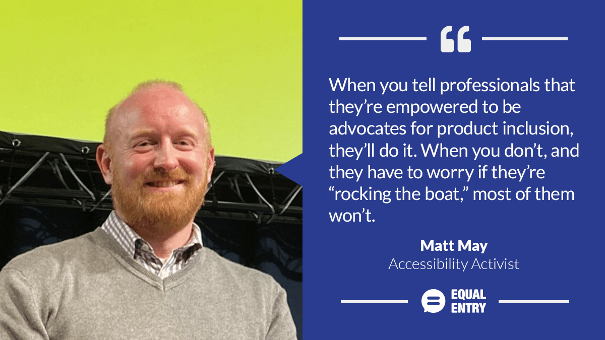
It’s not magic. When you tell professionals that they’re empowered to be advocates for product inclusion, they’ll do it. When you don’t, and they have to worry if they’re “rocking the boat,” most of them won’t.
What is an accessibility barrier you would like to see solved?
I guess I don’t think about accessibility that way. I can’t think of an accessibility problem that’s been “solved” in my career. I think our awareness of some issues gets better. I think our tooling gets better. I think our processes get better. And all that lets us think about higher-order problems. But I can’t think of a single thing that was once an issue, and just 100% isn’t one, anymore.
That’s at least partly why I stopped talking about “Universal Design” and moved toward “inclusive design” as an umbrella term. The problem with universality is that it’s a really big universe out there, and nothing that’s made by us, of any complexity, is going to work for everyone.
I think a lot of us would love to design ourselves out of a job, but I don’t know anyone who has. If anything, the scope of what we’re doing keeps increasing. Part of thinking about this by another name is recognizing that there’s no solved, no finishing line. Every day, you have to get up, look around, see where you can help, and go do it. Someday I’d like to retire. But I don’t expect to be done.