Summary
Fifty Shades of Grey
Technology has made it possible for legally blind people like myself to do many things independently. However, shopping for clothes is arguably not one of them. Unfortunately, websites make the task more difficult by providing vague descriptions and using color names in ways that are not entirely accurate.
Shopping is a struggle. When I want to buy clothes, I often have a broad picture in my head of the kind of clothes I want to buy, but I don’t have the benefit of browsing online or in the store until I find something close to what I want. As a blind person, I still care about how I look and about the colors I wear. Not only is dressing well important in professional settings, but colors can tell others a lot about your personal style.
Color is a way for people to express themselves and their personality, and this is no less true for blind people. I can see enough to appreciate the color of what I am wearing, but not enough to pick out colors in store racks or relatively small online pictures.
Unfortunately, many online websites do not make the shopping experience easy. They do not provide detailed descriptions of clothes because they rely on the customer simply looking at the picture. Additionally, many websites describe colors broadly. They leave out a lot of information and assume that customers will just see the product.
For example, shopping sites describe an item as “pink” but don’t tell customers what tone of pink the item is. Coral, salmon, hot pink, and bubblegum are all “pink,” but they represent very different styles.
Someone could love bubblegum and dislike coral, but the description of “pink” does not cover any of these nuances and relies on the customer to decide by looking at the picture of the item is the tone of pink they actually like.
Is There a Silver Bullet For Retailers?
One potential solution to this problem is to look for specific color names. I could search for a “coral pink sweater” and buy from the brand that actually describes their sweater as coral to be safe. This is not ideal because it limits my brand options.
However, the bigger problem is that even if I do find a brand with specific color descriptions, brands often get creative with color names. They use a name that is widely associated with a specific color tone to describe an item that is not quite that color. Therefore, the same color name can mean something completely different depending on the brand.
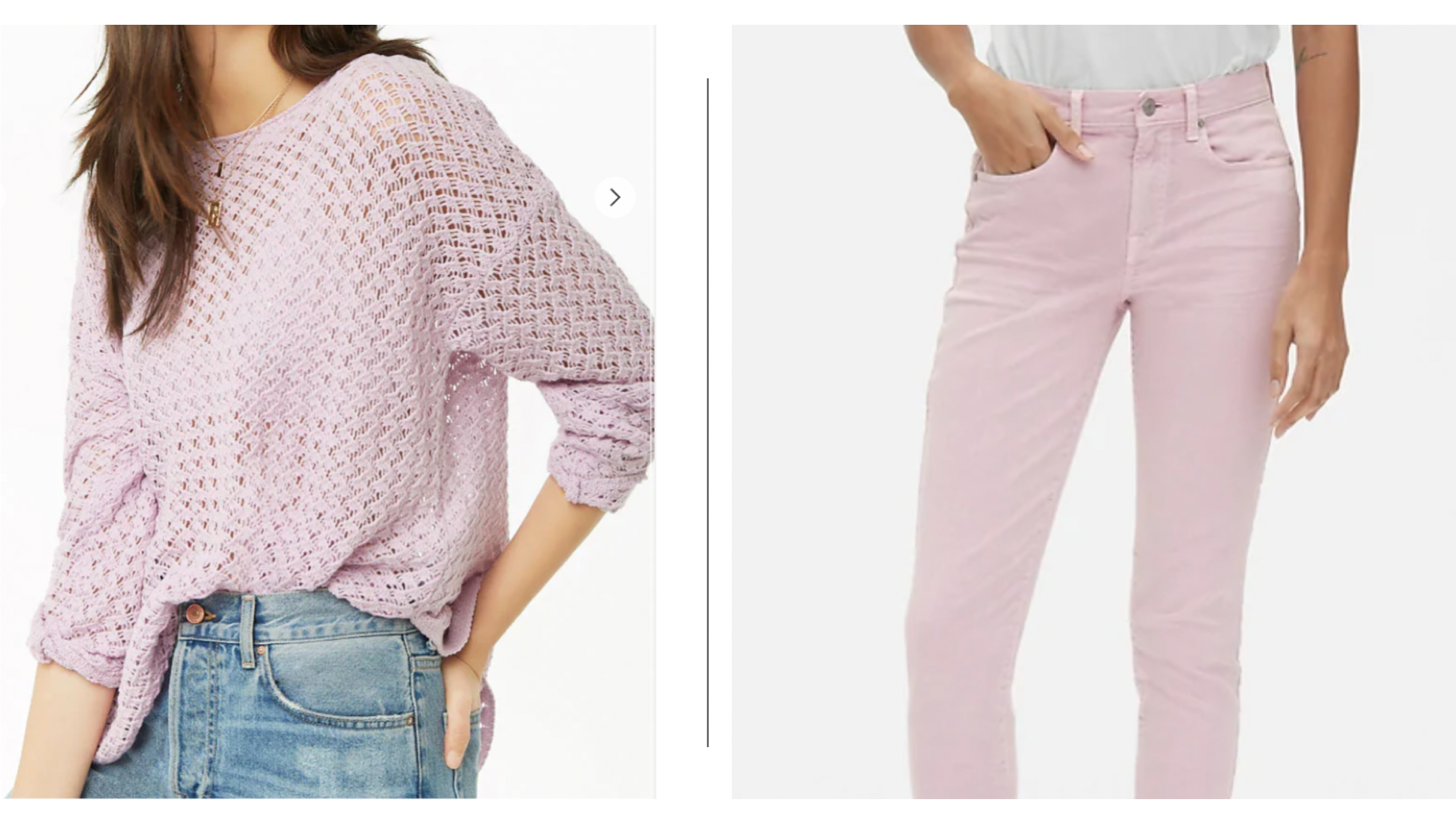
For example, recently, I was trying to find a lilac sweater. When I think of lilac, I think of a solid light purple. I searched three of my favorite brands: Ann Taylor, Forever 21, and Gap for “lilac” items.
In order to determine if the shopping sites’ color descriptions were giving me the same information that sighted users were getting through an image of the product, I found a lilac sweater on each site and asked my sighted sister to tell me what color she thought each of them was.
I didn’t give her the website’s original color name because most sighted people pick a product based on the image, not the color name the website provides, and I wanted to know if the websites’ color description matched people’s conception of that color.
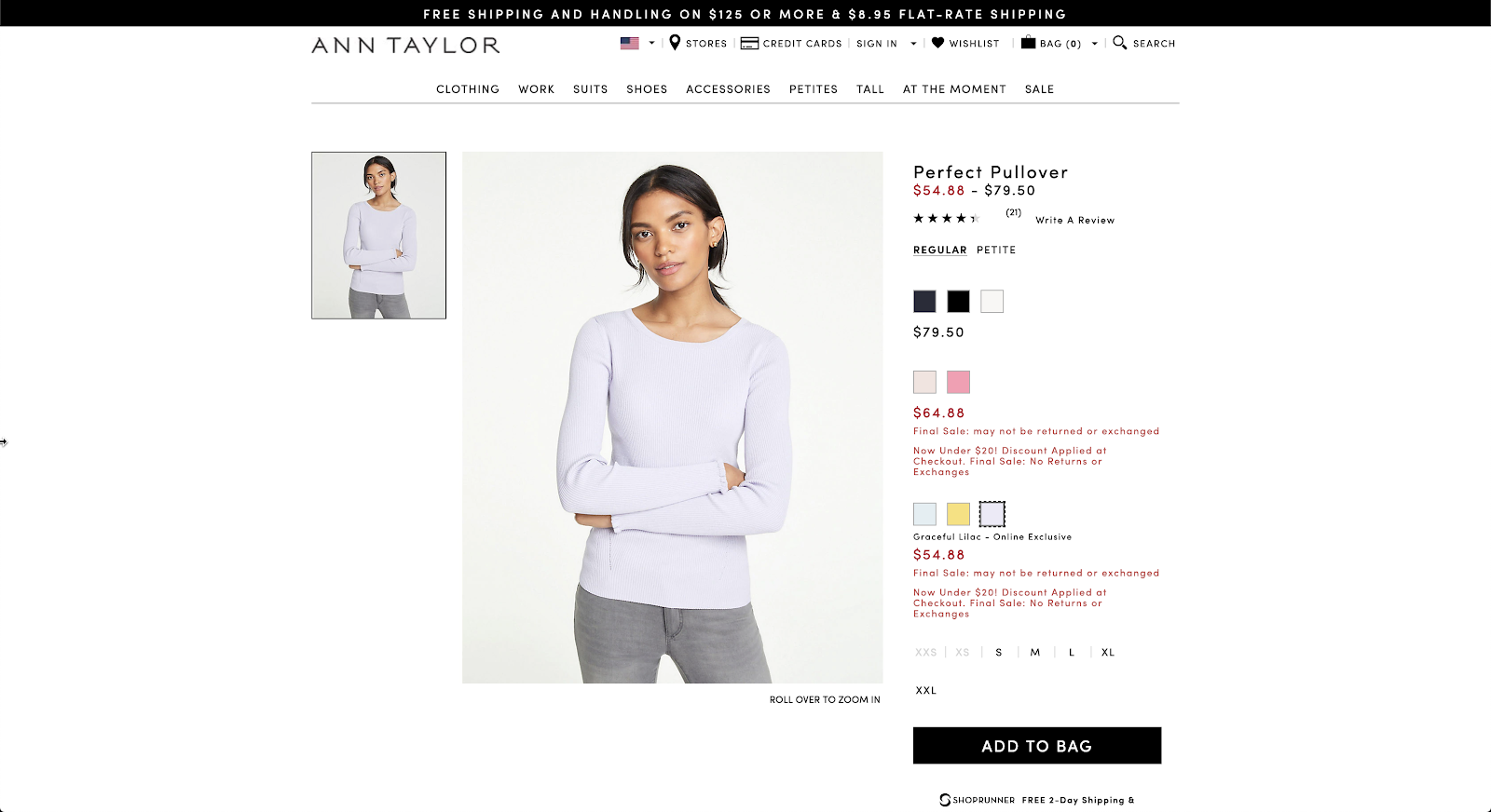
She described this Ann Taylor “Graceful Lilac” sweater as a white-ish purple, even lighter than lilac.
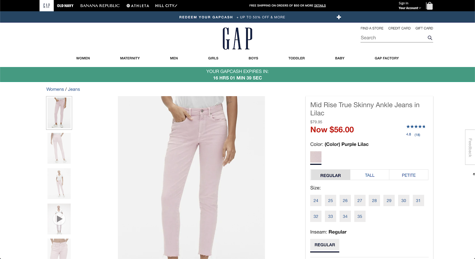
Gap called this “soft lilac”, but my sister said it was a light pink / lilac, but closer to light pink.
Forever21’s “lilac” was similar to Gap’s color above, but a little more “lilac” and opaque in comparison.
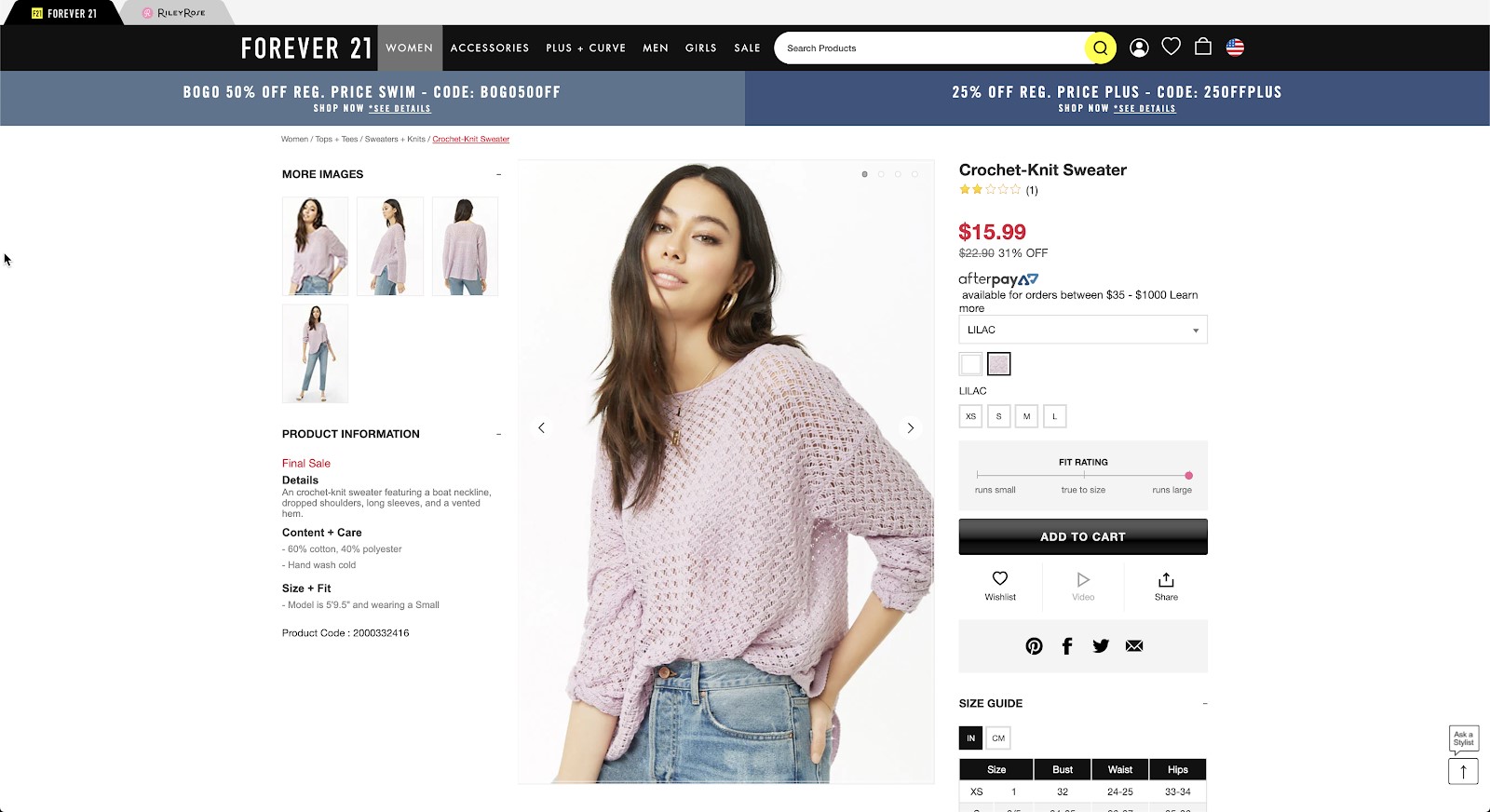
In all of these brands, the color was adjacent to lilac. My sister mentioned this even when I didn’t tell her how the websites described the color. The items could pass as lilac, but the descriptions were not quite accurate. When using a specific color name, these differences matter because sighted people are looking at the color picture, not the color name. However, if a website calls something “lilac,” I have to take them at their word.
The Grass CAN Be Greener
When it comes to fashion and colors, most people assume that since I can’t see the color, I don’t care about it. Others, however, simply do not design their websites with blind people in mind. Therefore, color names on the Internet tend to be too vague or too creative, which makes it difficult for me to choose what style of clothes I want independently. It doesn’t have to be that way.
Adding more complete descriptions or accurate color names will not change the shopping experience for sighted users at all, but it could help those of us who can’t see be more independent. This tends to be true of accessibility in general. Designing accessible products in most cases does not change functionality at all, but it allows people with disabilities to fully and independently participate in social activities, tasks at work, and popular trends.
In the case of fashion, brands could add more specific color descriptions using alt-text if they still want to use unique color names that only apply to their brand. By being intentional about accessibility from the beginning, fashion brands, software developers, and content creators can improve the lives of people with disabilities, while avoiding the problem of having to rebuild the product in order to make it accessible years down the road.
And who knows, these accurate descriptions may even get rid of angry 3-star reviews from buyers who bought a sweater based on a color in the picture, only to discover the actual fabric color is not quite what they were expecting.

mouler en fange étude