Summary
In this day and age when technology is at its peak, communication and information dissemination are vital in our highly digital world. One of the strongest and most effective platforms we have for communication is electronic mail.
As a blind person who solely relies on screen reading software to read, write and send email, I highly value the experience I get from the email system that I am currently using. Accessibility for me is important, but it is only part of the equation. Apart from accessibility, I’m looking for a pleasant and intuitive user experience.
This leads me to what I have experienced with my Gmail account. Among the many competing email services, I opted to create my account in Gmail because it is reportedly the most accessible. I appreciate that the interface provides two different views: the standard view and the basic html view. The latter is my default view as it is more compatible with screen readers.
I rarely encounter challenges when writing and sending messages, but reading email is a slightly different story. This is where my concern with accessibility and user experience comes into play.
The Gmail interface is unquestionably accessible. The most essential navigation and command keys of JAWS, the screen reader I’m using, work as expected. In the compose form, all the form fields are labeled and easy to understand.
What is the Issue?
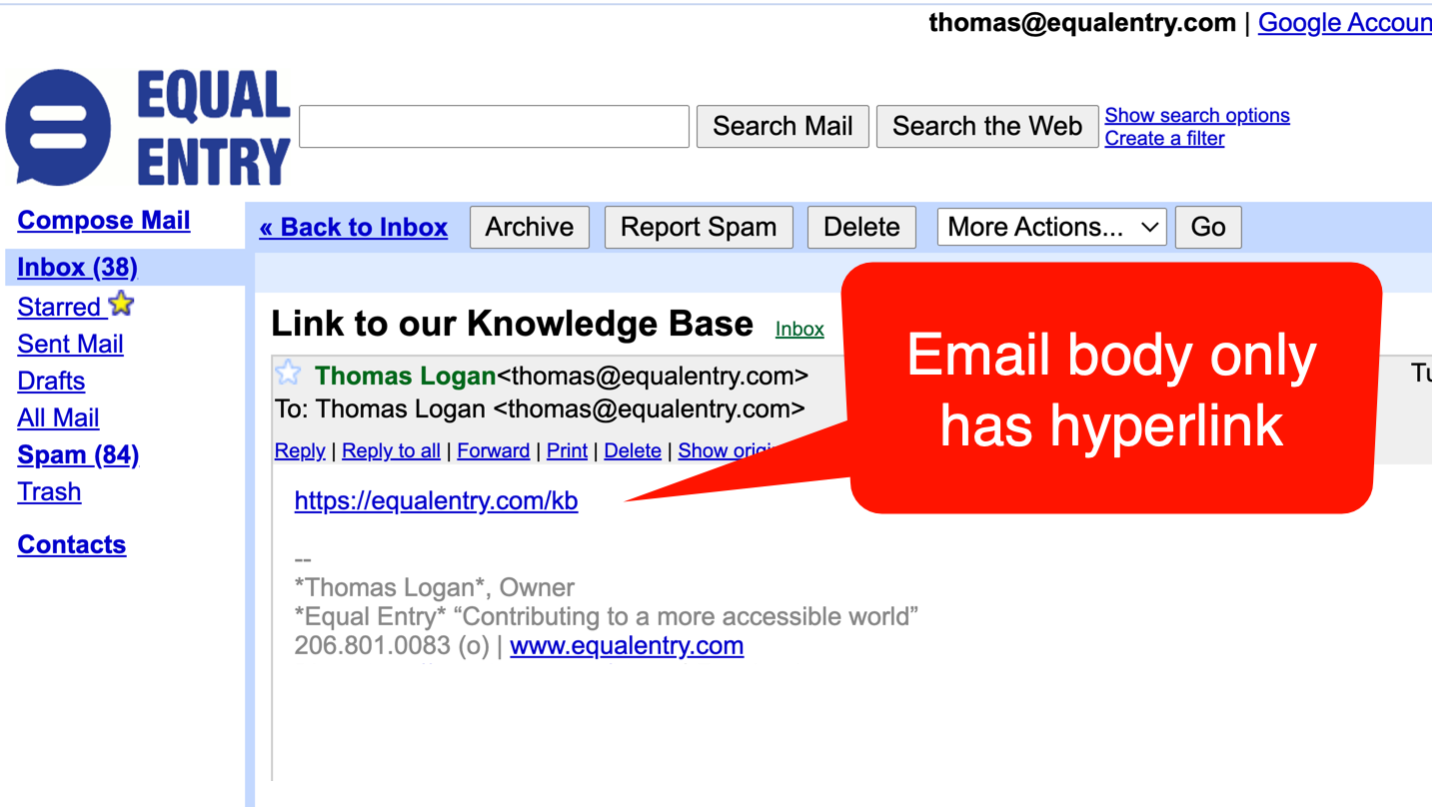
So, what then is the issue? Send me a URL, just the URL alone without any descriptive text, and we have a problem.
Picture this. Once I open an email, I need to use the letter “H” to move along the headings. I navigate through the subject of the message followed by the sender heading. To go to the actual content of the mail, I can either use the down arrow key and be forced to listen to a lengthy list of fields like my email address, the email address of the sender, the action links such as reply, reply to all, forward and many more, or I can simply press the letter “N” which should in theory bring me straight to the beginning of the content.
Simply pressing “N” seems to be the easiest thing to do, however, it is conditional. It only works when the sender sends something other than plain URLs. If an email consists of a single URL, pressing “N” will entirely skip the URL and will redirect to the signature block or to the elements after the signature block such as the quick reply section.
The problem is if I am not aware that the content of the email is just a URL, it is highly possible for me to miss it. I might get the wrong impression that the email is empty. The only workaround is to use both the up and down arrow keys to check the content. This is doable, but incredibly tedious and can be time consuming and detracts from the pleasant user experience I am looking for.
I know it is highly unlikely that people will randomly send email containing URLs alone. You could probably argue that the subject line would surely hint at what the email content is, but that’s beside the point.
One example: I have been experiencing technical issues with a tool being used in one of the webinars I attended a few months ago. I couldn’t get in the virtual room through the server credentials provided by the organizers. I raised this concern and the solution was to email me a URL that would instantly direct me to the meeting room. Because the webinar was starting a few minutes later, they simply sent the URL without any other email content.
In that particular scenario, instead of me just pressing the “N” key, I had to use the up and down arrow keys several times just to locate the URL. Inconvenience at its finest.
This exemplifies the difference of having an accessible experience versus a pleasant and accessible user experience.
Locating the URL is accessible. I was able to do it via the arrow keys, but it is not very intuitive or convenient. I could have saved lots of time and effort if simply pressing “N” moved the focus to the URL. Instead, I was left a bit frustrated.
Details Matter
This detail may seem tiny and trivial if we look at the entire accessibility picture of the Gmail interface. Nonetheless, nothing is trivial or insignificant when it comes to what users experience, particularly when said users have certain levels of difficulties because of their disabilities.
