Summary
My passion for accessible technology was ignited sixteen years ago at the University of North Carolina when I was a Computer Science undergraduate. I worked on a small team software project with a graduate student, Jason Morris, who was blind and needed access to maps of the ancient world for his research in the Classics Department. The project showed me that a map can be converted from a visual representation to a different form, one that can be experienced through sound and touch. This project directly exposed me to the role technology can play in improving access to information for people with disabilities.
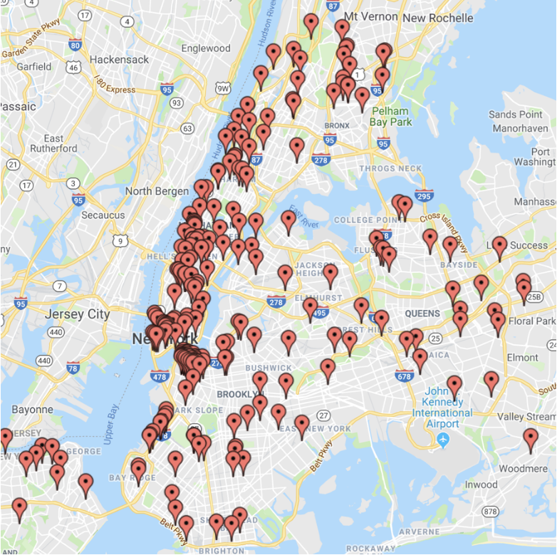
Recently, I encountered accessibility challenges with maps as part of my work on Open APS, my submission with Chuck Groom. We submitted a proposal to the New York City Department of Transportation Call for Innovation – Enhancing Mobility for Blind and Low Vision Pedestrians challenge. Because the city can only add about 75 accessible pedestrian signals per year, I decided to visualize where the existing accessible pedestrian signals exist in the city. I believe it is important to allow NYC constituents to find out the locations of these signals.
In this article I will show the work that was required to be done on an individual page hosting a Google Map to make it accessible. I would like to give special thanks to Kostiantyn Plakhotia for his development work on building an accessible proof of concept.
Accessing the Data Set
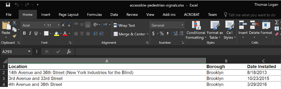
The data set for the locations of the Accessible Pedestrian Signals in New York City is provided as an Excel file that I download to my local computer. The three data attributes in the file are the Location, the Borough, and the date the signal was installed. In an Excel format, it is not possible to easily understand when and where the pedestrian signals were deployed in NYC. I recommend that New York City publish this data set into the data.gov portal with more specific attributes supplied.
Visualizing Data with Google Maps API
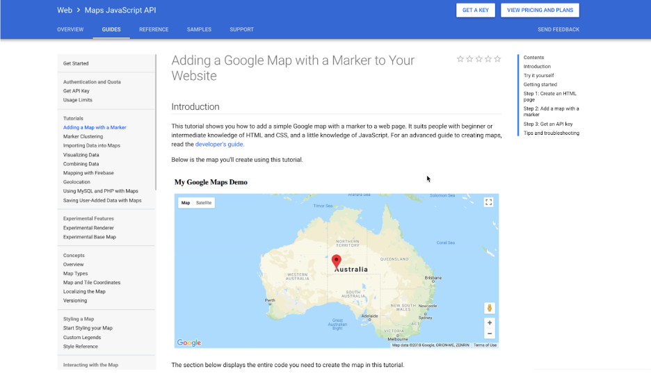
There are many map visualization libraries that exist for the web. I chose to use the Google Maps API and I went to the Software Developer Kit for Google Maps for instructions on how to use it. I quickly found the tutorial Adding a Google Map with a Marker to Your Website. The code sample shows how to add markers to a map that can include tooltips to display more information.
Note that I did not find any information in the SDK specifically on how to make a Google Map visualization accessible. Because the code sample itself in the SDK does not point out any requirements, it is reasonable to assume that most developers building a visualization from this code sample will not know that additional work is required to make the information available to people who are blind or who rely on the keyboard. I have found many examples of this type of Google Map visualization being used around the web and nearly all are inaccessible. To make this visualization accessible, it currently requires the developer of the page to do extra work to support this functionality.
My initial implementation of the visualization using the information from the Google Maps SDK is located at Background | Open APS.
Issue: No Keyboard Access to the Markers
In the animation I show that I have attached the name of the intersection and the date the APS was installed to the tooltip of the marker. The issue is that accessing the information requires someone to use their mouse pointer to hover over the pin and get the additional information from a tooltip. There is no way to get keyboard focus to the marker point for a person who cannot use a mouse.
This issue is an example of WCAG Failure F54: Failure of Success Criterion 2.1.1 due to using only pointing-device-specific event handlers (including gesture) for a function. Note that the Google Map does support some keyboard accessibility. A user can use of the arrow keys, and the + or – minus keys to control the visual positioning of the map and what zoom level is currently being displayed.
We can support accessibility on this element by following Success Technique SCR29: Adding keyboard-accessible actions to static HTML elements.
We make the marker element keyboard focusable by setting tabindex=”0″ on the containing element.
<div class="ee_cluster_icon" tabindex="0">We also want to ensure that the element displays visual focus rectangles when it receives keyboard focus. By following C15: Using CSS to change the presentation of a user interface component when it receives focus.
.ee_cluster_icon:focus {
   outline: -webkit-focus-ring-color auto 5px;
}
Issue: Excessive Tab Stops
Having too many tab stops on a web page can make it very difficult for people to navigate that are unable to use the mouse. By default our map visualization would have over two hundred tab stops due to the number of locations in NYC.
We can make the navigation of the map more efficient by clustering groups of map pins together. This allows the user to more quickly keyboard navigate between sections of the map. When the user gets to a specific area of NYC that they are interested in, they can activate the cluster and have the map zoom in closer to the location they are interested in.
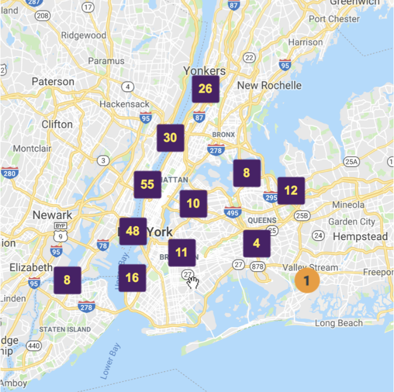
Our current recommendation is to have no more than twenty tabbable points on a map at a time. From reviewing various map implementations across the web it looks like developers and designers often seek to have no more than ten to twenty tab stops on a map.
Issue: No Programmatic Access to the Markers
Now that marker elements can receive keyboard focus we need to ensure that they provide all of their important information to screen readers. We can make the marker element programmatically accessible by adding a role and name for the control. The clickable points we labeled using aria-label and we set the role attribute equal to button.
By using the aria-label attribute and the role attribute we can enable the screen reader to read out the associated information when the element receives focus.
<div class="ee_cluster_icon" tabindex="0" role="button" aria-label="10
results available near Queens Boulevard and 58th Street, Woodside">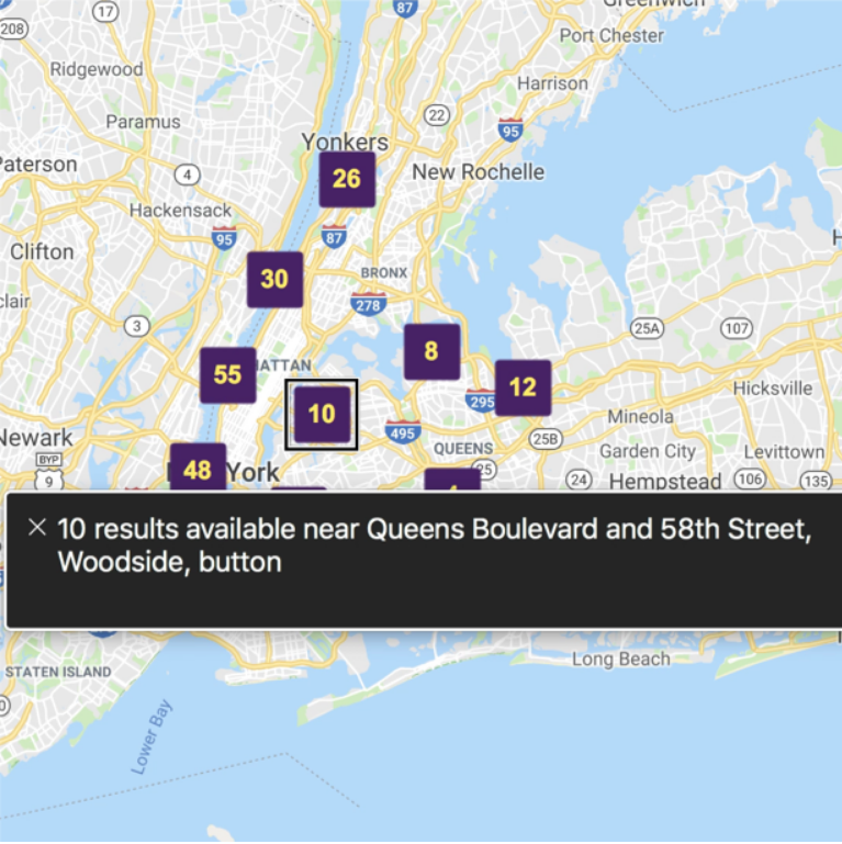
After the user has zoomed in close enough to an intersection in NYC the marker pins will convert to individual buttons representing the location of an accessible pedestrian signal.
Issue: Visualization has no text alternative
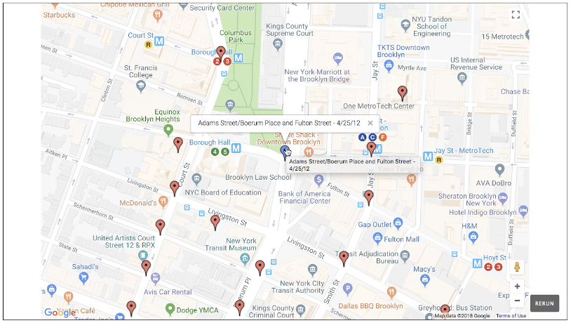
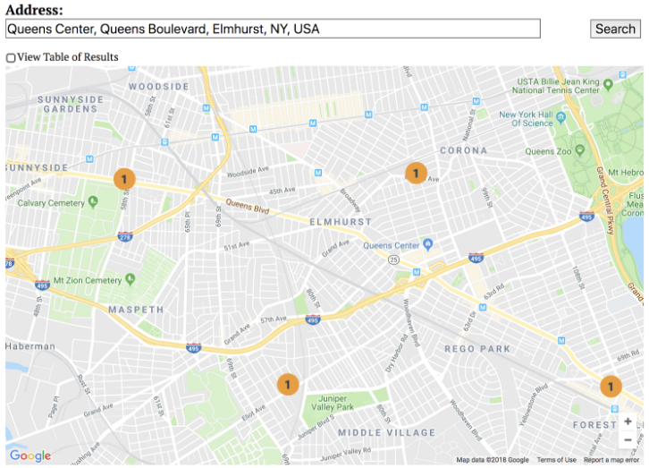
Once I visualize the data I can better understand the deployment of APS in NYC. Most of the APS signals are spread out across the city but there is an area in Downtown Brooklyn that has an APS signal on a sequence of intersections. Being able to find this unique area could assist an Orientation and Mobility specialist with finding a good location to train a person in how to properly use a variety of APS to cross the street.
Because map visualizations contain such dense sets of information, it is best to provide a data table alternative for accessing the map information. The data table alternative dynamically updates to stay in sync with the searches performed on the map. Our data table solution is an example of G92: Providing long description for non-text content that serves the same purpose and presents the same information.
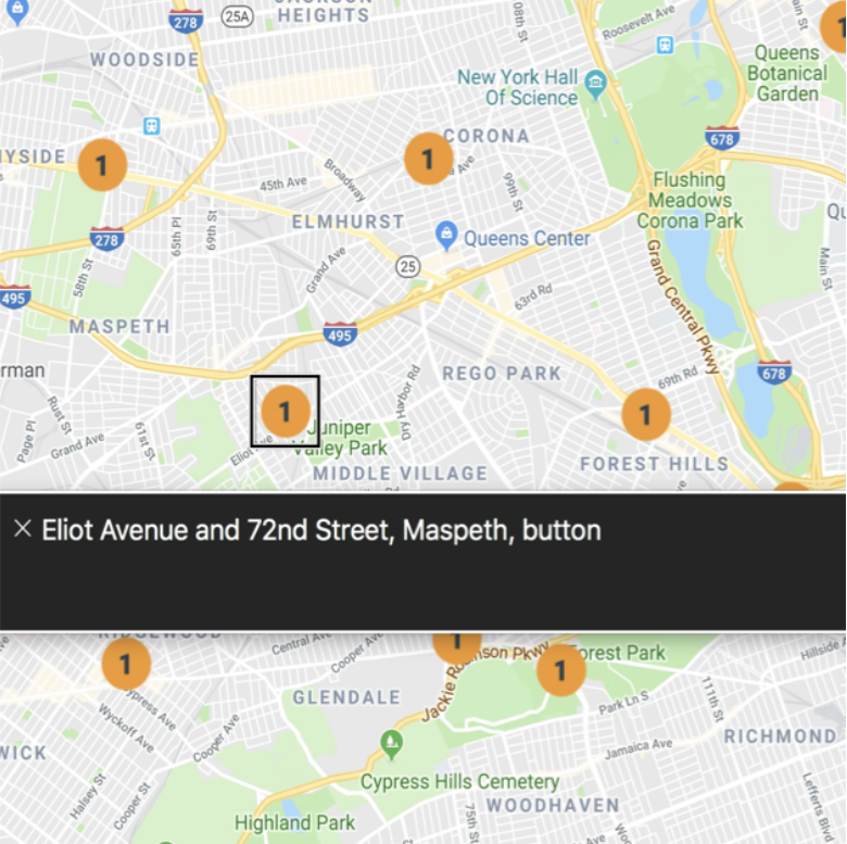
If a user searches the map for a particular location in New York City they can get access to a specific set of information for that geographical location. In this example the user has typed “Queens Center, Queens Boulevard, Elmhust, NY, USA” into the search field. After the search is submitted the map is zoomed and displays only four points visually.
Users that wish to access this information in a data table format can check the View Table of Results checkbox. When this option is enabled the map is replaced with a data table containing three columns of information: Intersection, Distance, miles, and Date created.
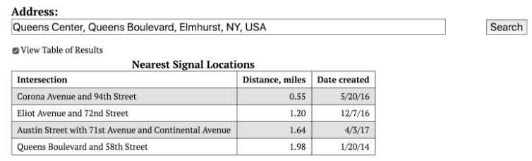
Users can continue searching the map and displaying the search results using only the data table alternative. This is an example of a dynamically updating long description of visual information.
Conclusion
With my single map example I was able to demonstrate what any map visualization author would face in 2018. If you want your map visualization to be accessible you will have to build the accessible alternatives yourself. Over the years there have been numerous demonstrations of accessible map interfaces for people with disabilities. However, these demonstrations usually only support a small number of specific map visualizations. If the authoring tools that people use to build map visualizations do not automatically provide an equivalent accessible alternative it is unlikely that the map author will do it themself. If these requirements are given to the map API vendors such as Google, arcGIS, and CARTO then we would be able to foster the ideal situation where just using the API as specified in the developer documentation would have the accessible alternative automatically created.
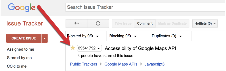
If you would like to follow-up on this request with Google you can indicate that you are affected by this issue by activating the button to star Feature Request – Accessibility of Google Maps. I would recommend you leave additional details in the comments to help Google understand how a built-in accessible solution for map visualizations would support your work.
As I have continued my career working in accessibility, I have seen many inaccessible maps over the years. In 2018 I think it is finally time to see widespread support for alternative representations of map information.

Nice work with the maps. Did the google maps api (which I’m admittedly not familiar with) allow you to specify the role and aria attributes or did you have to do it via a “hack”? If the api allows you to do it, I’m trying to figure out what further you want from the api. Should the api make the points tab focusable by default? As you said, you probably don’t want all of them focusable because that would be too many tab stops. The grouping was a good idea.
And as a side note on your use of the aria-label, I’m guessing it was a typo that you put the word “button” in the aria-label? You’re not really doing that, are you? You set role=”button” so the screen reader will already announce “button” in addition to your label.
Also, in your map search results, the paragraph text says it found “three points” but the figcaption says “four points”.
Hi glen,
Thank you for your feedback, I have corrected the aria-label and the paragraph text.
The point with the API is that if I use the API to create a Google Map visualization (like thousands of developers do) I would like the points to automatically have the correct ARIA semantics provided for me and for there to be a documented method of supplying keyboard access. The biggest piece is the generation of the data table alternative for the current rendering of the interactive map. This could be done automatically at the API layer with the correct semantics of associating the currently displayed map viewport and the metadata that I have sent to be associated with each data marker.
At minimum I think the SDK sample for Google Maps API as it stands today should explain that additional work is needed from the developer to make the visualization accessible to people with disabilities.
Hi,
Esri has a prototype web app to test keyboard/screen reader interaction on a map [1], which uses the pattern on Google Maps [2].
[1]. https://github.com/kellyhutchins/a11y-map
[2]. https://support.google.com/maps/answer/6396990?co=GENIE.Platform%3DDesktop&hl=en
Feel free to take a look at the prototype app to see if it will work for you and let us know if you have any questions.
Hi Tao, thank you for this information. I will take a look at these later this week and connect with you all!
A couple examples of accessible maps from New York City.
* HRA Center Locations – https://www1.nyc.gov/site/hra/locations/locations.page
* Sidewalk Sheds – https://www1.nyc.gov/site/buildings/about/sidewalk-shed-map.page
Hello Thomas, this is a very good article and shows the exact problem we are facing in maps. I have been looking at existing interfaces to audio maps that have been extensively tested by blind users:
http://icad2018.icad.org/wp-content/uploads/2018/06/ICAD2018_paper_51.pdf
Here is the existing prototype:
https://frastlin.github.io/Nonvisual-Modeling-and-Mapping/globegrid1
Apparently there has been worry about interfering with brows mode of the screen reader. I will put this in my next paper, but brows mode is only for semantic interfaces and a map is not a semantic interface at all. If you look at the map itself, it is probably using canvas or some picture. There is a very good reason why buttons, links, tabs, accordions, and checkboxes aren’t being used: It’s extremely difficult to show that information using those widgets.
So in this one circumstance, just as sighted users don’t use semantic interfaces for maps, screen reader users should not use semantic interfaces for a map.
The grid interface in the above links allows users to view geographical relationships, quickly find countries, view what is around them, and follow boarders, all of which is not easily achieved when using a semantic interface.
Hi Thomas, it’s really a great article. But I want to add a point here, Does it make sense for a Screenreader user, if we have a Hide/Show Map link just above the Map. So that if the user doesn’t want to enter in to map can directly hide it and jump to the Alternative content provided for Map.
Thank you for your comment. The current version of the site Finding Accessible Pedestrian Signals in NYC has the ability to toggle the display so that the data table view of information always stays visible. This toggle comes before the map. Are you suggesting maybe a better name is “Show/Hide map” instead of “View Data”?