Summary
Equal Entry conducts many audits. In doing the work, we make suggestions on how to make something accessible and improve the user experience. We want to share what we’ve discovered in our work to help people understand accessibility guidelines better. We’ll share them here.
This one is about context-sensitive text alternatives. Many people think that once you set a text alternative for an image, it will be the same across the site. This article will show you that you need to look at how the same image is being used on the page to determine what the text alternative should be. Context matters.
Background
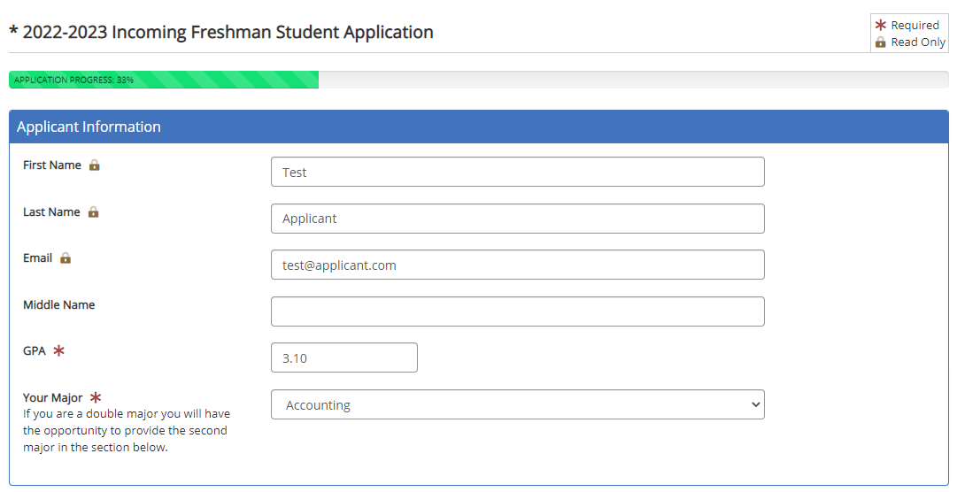
Many online forms use images to convey information about form fields. For example, a lock symbol may denote a read-only item. Bolded text or asterisk may indicate a required field. However, this scenario is unique because the gold lock also appears in a legend. When this happens, the gold lock will need a text alternative. The legend part makes this example interesting.
Now that we’ve set the stage, let’s look at the WCAG 1.1.1 Success Criteria.
1.1.1: Provide text alternatives for any non-text content so that it can be changed into other forms people need, such as large print, braille, speech, symbols, or a simpler language.
This means that whenever there is an image, it needs to have a text-based alternative. This ensures someone using a screen reader or refreshable braille display knows what it is. The screen reader will say the text alternative out loud. A refreshable braille display will produce braille based on the text alternative.
The legend contains two images that are shown in the following screenshot.
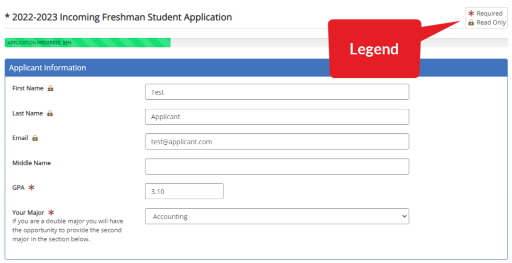
The two items in the legend are:
- Asterisk representing a required field.
-
Lock representing a read-only document.
The gold lock has two text alternatives as the following table explains.
| Image | Text Alternative | Context |
|---|---|---|
| Gold lock representing a read-only item | Appears in the legend to let the user know what it means when the gold lock appears on the page. | |
| Read-only | Appears on the page and uses “read-only” as alt text instead of “gold lock” because its meaning is the context for this instance. |
One of the key points about WCAG 1.1.1 is that text alternatives are context-sensitive. One image doesn’t always have the same text alternative. Originally, the client started by using these images. However, the client had to add a legend to explain what these were to everyone.
What is the problem?
For a person who does not see the screen and wants to understand the design of the website, they need a way to know what image represents an item in the legend.
The elements in a legend are not decorative. So, elements need to be described in how they are visually being represented, such as “gold lock.” And within the form, they are being used to explain what the legend identifies them as, such as “read-only.”
In reading the legend, when the screen reader encountered the gold lock, it said: “graphic read only read only.”
Having a screen reader announce the same information twice affects the user experience and negates the reason for a legend. Legends are designed to define an image that replaces text. When they’re not properly identified, they will confuse the screen reader or other technology as the person won’t know what the image represents.
What is the solution?
People with disabilities have provided feedback that it’s helpful to have a visual description of the image in the legend. For this example, it will be:
Legend
- Image Red asterisk required
- Image Gold lock read only
The client’s legend is coded as follows:
<div>
   <i class="fas fa-fw fa-asterisk text-danger" aria-label="red asterisk" role="img"></i> Required
<br>
   <i class="fad fa-fw fa-lock-alt text-warning" aria-label="gold lock" role="img"></i> Read Only
</div>
This is an example of how text alternatives can be context-sensitive. In this case, they’re elements in a legend. Hence, they’re not decorative. The solution explains how they are visually represented as in “red asterisk.” and “gold lock” Then, within the form they are being used to explain what the legend identifies them as “required” and “read-only” respectively.
Does Your Website or Technology Need to Be Audited for Accessibility?
Equal Entry has a rigorous process for identifying the most important issues your company needs to address. The process will help you address those quickly. If you’d like to learn more about our services, please contact us.

When icons like a gold lock are used in both form fields and a legend, they must be accompanied by a meaningful text alternative to ensure accessibility.Regard S2 Akuntansi