Summary
Equal Entry audits hundreds of web pages, from retail shopping sites to news aggregators to custom web apps that solve custom problems. We manually navigate your sites with a keyboard and screen readers, we interact with every one of your controls, and we use automated tools where useful.
Our accessibility consultants logged over 7,500 instances when a webpage didn’t meet WCAG 2.0 AA success criteria. Then, we ran some numbers. (We do love our pivot tables!)
Top 10 Accessibility Issues
Here are the top 10 accessibility issues we found in 2021:
- Does not meet the contrast minimum of 4.5:1 for regular text
- Control has no programmatic name / label
- Inaccurate role, state, or value information supplied
- Programmatic reading order doesn’t match the visual layout
- Screen reader doesn’t announce information updated visually on screen
- Action is not available from the keyboard
- Control’s programmatic name/label is inaccurate
- Logical focus order isn’t provided
- Control does not receive keyboard focus
- Control does not provide role, state, and value information
Breaking Down WCAG Success Criteria
If you’re familiar with the WCAG success criteria list, you’ll notice that our top issues don’t appear to match. That’s because many of the WCAG success criteria comprise multiple types of errors.
At Equal Entry, we break down those success criteria into the common types of errors we see during our audits. For example, 4.1.2 Name, Role, Value includes these issues, all of which are in our top 10:
- Control does not provide role, state, or value information
- Control provides inaccurate role, state, or value information
- Information updated visually on screen is not announced by the screen reader
We break success criteria down to make it easier for web developers to understand what they need to fix on their site, to make it easier for web developers to find help on their website problems, and to make it easier to explain what problems users are likely to encounter.
Why study the top ten issues?
These top ten issues are the most common issues we see that suggest you might have one or more of these issues on your site. This is especially true if your development team is new to accessibility or is creating a lot of custom controls. We’ll describe each issue and note the ways we test for it, using both automated tools and manual testing.
Issue #1: Does not meet the contrast minimum of 4.5:1 for regular text
Color adds interest and flair, and sometimes meaning, to your website. Color helps define your company brand and can help project emotion on the viewer.
What is the issue with color contrast?
Many people with visual disabilities may be unable to read your content if there isn’t enough contrast between the foreground text color and the background color. This issue affects people with colorblindness as well as people with low vision and other vision disabilities.
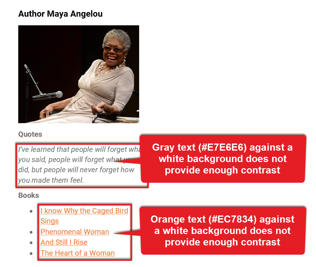
In this example, a web page features author Maya Angelou. The example uses a gray and orange color scheme that does not provide enough contrast. A quote uses gray (#E7E6E6) against a white background. Those colors provide a contrast ratio of only 1.2:1, instead of the required 4.5:1.
A list of links to some of Angelou’s books appears in orange text. The orange (#EC7834) provides a contrast ratio of only 2.9:1. Some users will not be able to distinguish one link from another because there isn’t enough contrast. If your site is part of an affiliate program, you may be losing money if users cannot see the links to click and buy those books.
Interestingly, fixing color contrast issues can be more difficult than technical issues because the process often involves working with a graphics design team, who may not know about accessibility issues. They may not know about company color schemes that may look great on print materials but that don’t translate well to the screen.
How do we find color contrast issues on your site?
We often start by running an automated accessibility checker, like Microsoft Accessibility Insights or Deque Systems axe DevTools, and looking for color contrast violations.
Automated tools can’t always find all instances of color-contrast issues, especially when text is layered over an image. Our experience guides us when to do manual checks to compare the RGB or hex values of the foreground and background colors to ensure there is enough contrast.
Issue #2: Control has no programmatic name/label
Some people with visual and other disabilities use a screen reader app to read aloud everything on a digital page. Every word, every image, every hyperlink, every control. Screen readers read both visible labels (if any) and the programmatic name of the actual control.
People who use speech input programs usually speak a command followed by a reference to some visible label, like “Click Search,” but the programs use the programmatic name of the controls to identify and interact with them.
What is the issue with controls not having a programmatic name?
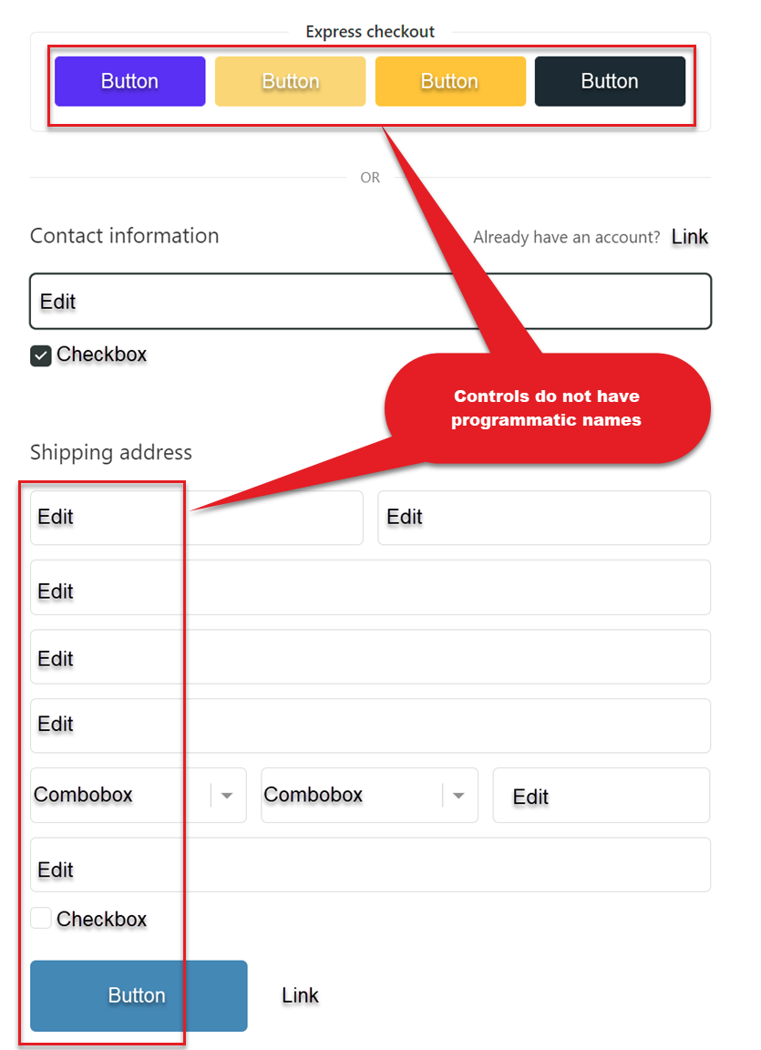
If a control doesn’t have a programmatic name or label, then assistive technology customers can’t use the controls. Imagine trying to buy shoes online and working through the checkout process, but all the buttons are labeled “button” and all the edit controls are labeled “edit.” How would you be able to pay for your shoes and ensure they were shipped to you correctly?
How do we find controls that do not have a programmatic name on your site?
Automated tools are useful for finding missing information so we often start by running an automated accessibility checker. We always follow up by navigating through your entire page using the keyboard and a screen reader. Some of us use speech input programs so we navigate your site with those tools also.
Issue #3: Inaccurate role, state, or value information supplied
For a screen-reader user to interact with a control, the control must pass along a lot of information:
- What type of control it is (the role): a button, drop-down list, checkbox, edit box?
- What state the control is in: is a checkbox checked or unchecked? Is a menu expanded or collapsed?
- What the value of the control is: does an edit control contain text already?
What is the issue with an inaccurate role, state, or value information?
Screen-reader users will interact with a set of radio buttons differently than a single button, but if the radio button does not express its role correctly, the screen reader user will be unable to interact with the control correctly.
Similarly, if a control can expand or collapse, but it doesn’t indicate when it is expanded correctly, screen-reader users will be unable to find the expanded content.
Some of the common errors we find include:
- A combo box that indicates it is only an edit box.
- A checkbox that indicates it is checked when it is not.
- An item that indicates it is “clickable” by the screen reader but in fact is not actionable.
This issue is closely related to Issue No. 10: Control does not provide role, state, and value information, but Issue 10 deals with whether any information is passed along to the screen reader. Issue No. 3 deals with whether the information that is passed along is actually accurate.
How do we find role, state, or value inaccuracies on your site?
Automated tools can typically determine whether the information is missing, but they can’t determine whether the information is accurate. We navigate to and interact with every control on your site with a keyboard and a screen reader, such as NVDA (free with donation recommended), JAWS (short free trial), Narrator (included with Microsoft Windows), or VoiceOver (included with macOS). We listen to the screen reader announcements and ensure the screen reader provides the same information that is visually displayed.
Issue #4: Programmatic reading order doesn’t match the visual layout
Web pages are typically designed with headings, white space, colored backgrounds, lists, graphics, and more to create a visually appealing and informationally dense environment. Sighted users can use the visual layout of a page to add an additional layer of meaning to the content. They can skip around quickly to make connections and relationships. They can scan the headings to quickly discern whether the web page even contains the information they want.
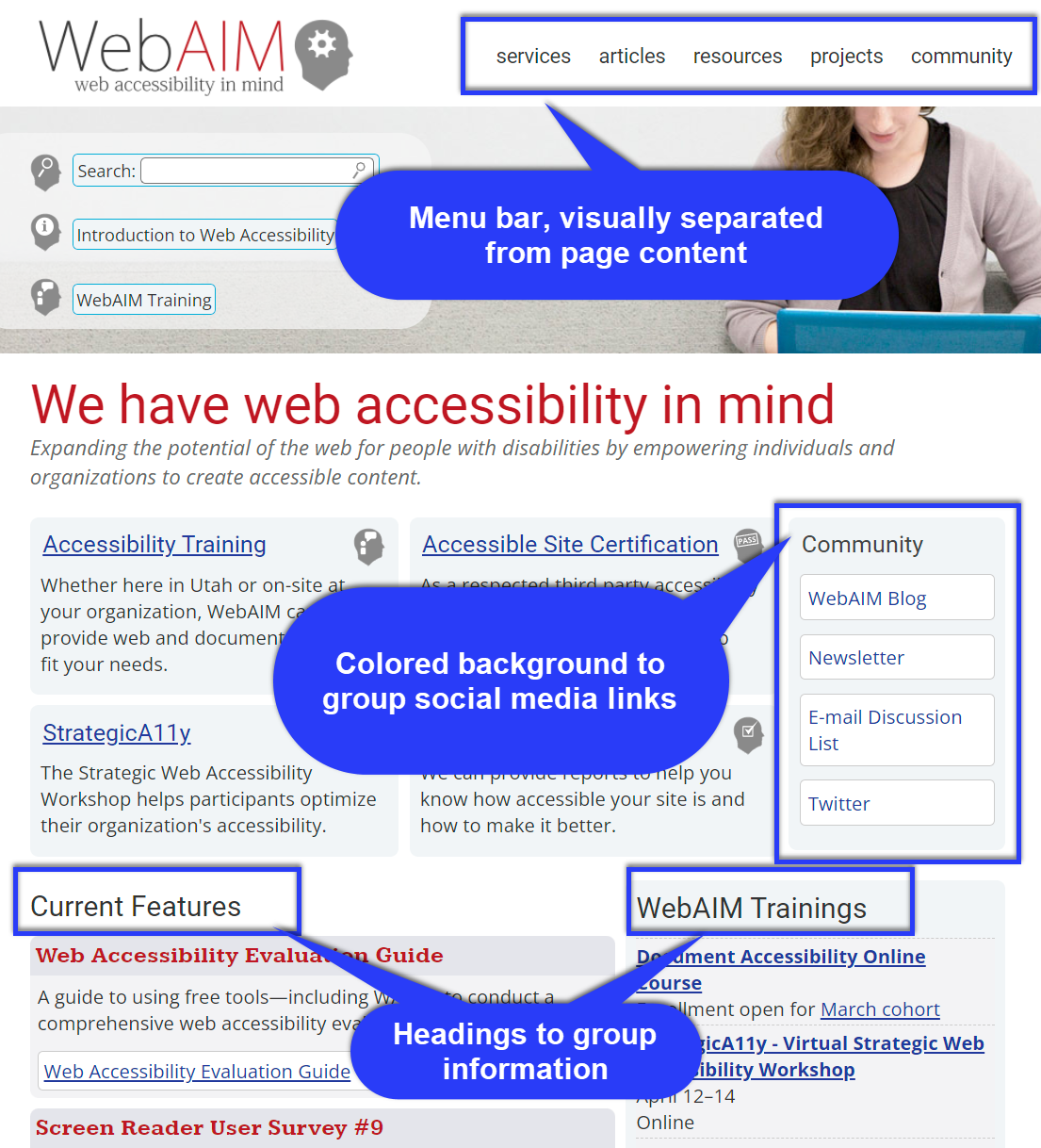
For example, the WebAIM home page sets its navigation apart from the main content of the page in a menu bar in the upper right of the page. They use larger gray text as headings to group and communicate different types of information. They use a colored background to group their social media links together (under the Community heading).
What is the issue with programmatic reading order?
A screen reader reads a web page in a linear fashion in whatever order the developer programmed (or didn’t). If a page isn’t programmed correctly or is missing structural information, screen-reader users not only miss out on the information that a sighted user is privy to, but they also can easily become lost on a page, unable to find the information or perform the task they require.
(Structural information can include using landmarks and headings. Landmarks define significant page areas or regions, such as navigation, the main content, and typical footer information such as footnotes, copyrights, and links to privacy statements. Headings are numbered (h1, h2, etc.) to indicate the hierarchy of information. Screen readers provide ways to skip from one heading or landmark to the next, giving users an experience similar to skimming the page.)
This issue also covers instances where aspects of the visual interface aren’t included in the reading order at all.
How do we find reading-order issues on your site?
We use automated tools to quickly tell us if structural information, like landmarks and headings, is missing. However, we primarily rely on manual testing. We use a screen reader to read everything on a web page, noting where headings are missing or incorrect, where the reading order skips around and doesn’t proceed in a logical order based on the visual presentation of the page, or where an item on the page is skipped entirely by the screen reader.
Issue #5: Screen reader doesn’t announce information updated visually on screen
This is the second 4.2.1 Name Role Value issue on our Top Ten list. The first is Issue No. 3: Inaccurate role, state, or value information supplied. Issue No. 3 deals with whether a user can interact correctly with the site. This issue deals with whether a user even knows what is happening on the site.
As a user interacts with certain controls, the user interface may change. Examples can include an advanced search button that displays additional search options like a date range; a menu button that drops down a list of options; a dynamic search that updates the results as a user types; and filter and sort options on a table.
What is the issue with the screen reader not announcing visual updates?
If the screen-reader user isn’t notified of these changes, they may not find the new controls or other changes their actions caused.
A simple example is when a user checks a checkbox. A sighted user sees the checkmark or X appear in the box. Unless a screen reader is notified of the change, the screen-reader user will not receive a verbal notification that their action was successful.
How do we find missing screen-reader announcements on your site?
This is another instance where automated testing tools haven’t caught up to the benefits of manual testing. To find these issues, we use a keyboard and screen reader and navigate to and interact with every single control on the web page, checking and unchecking checkboxes, expanding and collapsing panes and panels, sorting columns in tables. We watch the page for visual changes and we listen to the screen reader for announcements of those changes.
Issue #6: Action is not available from the keyboard
Many users use only the keyboard to navigate your app or website. They may be completely unable to use a mouse or find using a mouse extremely difficult. Users may include people who use assistive technologies, such as people who are blind (screen readers), have hand tremors, or use a mouth stick. Sometimes people with temporary impairments, such as a broken arm, will also use only the keyboard because their broken arm cannot use a mouse.
What is the issue with an action not being available from the keyboard?
Not only must a person be able to navigate to all actionable controls on your site by using the keyboard (see Issue No. 9: Control does not receive keyboard focus) but also they must be able to interact with those controls using only the keyboard. A simple example: If a person uses the Tab key to get to a button, can they use the Enter or Space keys to activate the button?
Typically, we encounter this error when a site offers a task that was specifically designed to be used with a mouse, such as dragging and dropping an item to reorder a list. To be accessible, the page must also provide a method that allows keyboard users to reorder items.
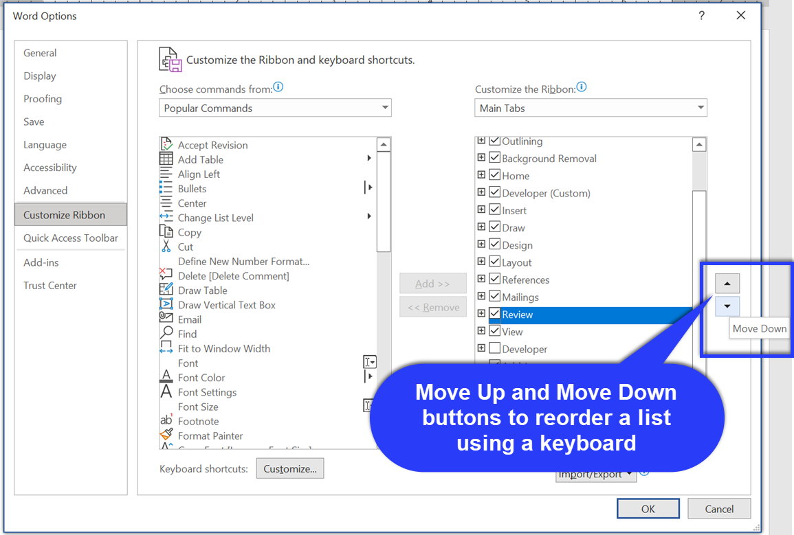
Microsoft Office’s Customize the Ribbon dialog boxes allow users to use a mouse to drag and drop menu items to reorder the ribbon. Move Up and Move Down buttons are also included to allow users to use a keyboard to reorder their menus instead.
How do we find controls that cannot be activated on your site?
These types of issues are hard to find with automated tools, so we manually interact with your pages using only a keyboard to ensure all tasks can be completed. Once again, we interact with every control on the page.
We especially look for keyboard alternatives for actions that include drag and drop, selecting items, resizing regions, bringing up context menus, and interacting with floating menus that may appear as a user scrolls “below the fold.”
Issue #7: Control’s programmatic name/label is inaccurate
Controls on a website can have two or more labels: a visible label, a tooltip, and a programmatic label. The programmatic label is typically used by assistive technologies, like screen readers and speech input programs, to identify and interact with a control.
What is the issue with a control’s programmatic name being inaccurate?
When the visible labels do not match the programmatic labels, voice dictation users may be unable to interact with the control at all. Screen reader users may find that instructions or trainers refer to controls they cannot find and interact with because of the name mismatch.
This issue is closely related to Issue No. 2: Control has no programmatic name/label and essentially causes the same basic problem: users of assistive technology will not be able to interact with the site and will go find another site that is accessible.
How do we find controls with inaccurate names?
Automated accessibility testing tools are pretty good at finding missing labels, which is why we start there, but those tools are not great at finding mismatches and inaccuracies between a visible label, a tooltip, and the programmatic label. So, we bust out our keyboards and screen readers once again and navigate to every control on your page and compare labels.
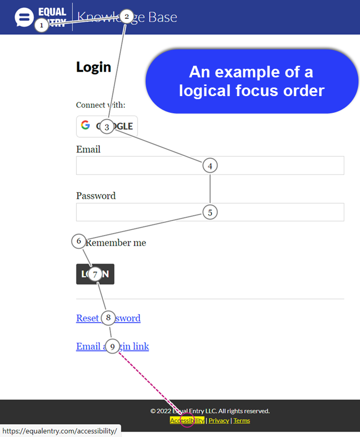
Issue #8: Logical focus order isn’t provided
Keyboard focus indicates which control is currently selected to receive input. If you’ve used Tab to navigate to a Submit button, the Submit button has a keyboard focus. If you press Enter, you will activate that button.
What is the issue with logical focus order?
Once you’ve ensured a person can reach all the controls on your site by using a keyboard (see Issue No. 9: Control does not receive keyboard focus), you also need to ensure a person can anticipate what control will receive focus next, to ensure they can easily find their way around your site.
Typically, English-language readers read from top to bottom, left to right. This is a logical and expected order for interacting with an English-language website. It isn’t necessary to slavishly adhere to this order when determining the proper order for interacting with your controls, but it is necessary to ensure the order is logical. It makes logical sense to tab from a username control to a password control to a sign-in button. It makes less sense to tab from a username control to a sign-in button and then to a password control.
How do we find focus order issues on your site?
We manually navigate to each actionable element on your page using a keyboard. We also use automated accessibility checkers while we’re navigating because they can draw on your page, providing a visual map of the focus order. The automated checkers cannot alert us to an illogical order, but they can help us visualize the order to make that determination.
Issue #9: Control does not receive keyboard focus
As previously stated, keyboard focus states which control is selected and ready to receive input. For example, you use Tab to navigate to the Login button. You know the Login button has a keyboard focus because it’s highlighted in some way. At this point, you can press Enter to activate that button and log in.
What is the issue with a control receiving keyboard focus?
If a control on your site does not receive keyboard focus — a person cannot use the Tab or arrow key to move to the control — then they cannot use the control. Depending on the control that does not receive keyboard focus, some people may not be able to complete fundamental tasks like signing in to your site or completing a purchase.
This issue is related to the previous Issue No. 8: Logical focus order isn’t provided. It can occasionally be difficult to determine whether a control doesn’t receive focus at all or is just in such an odd location in the focus order that it cannot be found easily.
How do we find controls that do not receive keyboard focus on your site?
In this case, automated accessibility checkers can help. Automated accessibility checkers can determine when a control is actionable but doesn’t receive keyboard focus. These tests aren’t foolproof, however, so we also manually review your site by pressing Tab (or arrow, depending on the control type) on the keyboard and ensuring we land on every active control on your page. (Note: This requirement does not apply to disabled controls.)
Issue #10: Control does not provide role, state, and value information
When the value, state, or role of a control is identified, then someone using a screen reader will know how to interact with it.
What is the issue with a missing role, state, or value information?
When someone uses a screen reader to interact with a web page, some controls do not specify their value, state (e.g., checked or unchecked), or role (e.g., what type of control it is). When a user lacks this information, they do not know how to interact with the control or what information the control isn’t providing. For example, a user needs to know if a checkbox that determines whether you are purchasing a one- or three-year subscription is checked or unchecked.
This issue is closely related to Issue No. 3: Inaccurate role, state, or value information supplied. Issue 10 deals with whether any information is passed along to the screen reader. Issue 3 deals with whether the information that is passed along is actually accurate.
Common issues that we see include:
- A checkbox control that doesn’t indicate whether it is checked or unchecked.
- A dropdown control that does not indicate its current value until the user opens the control.
- A tab control that doesn’t indicate which tab is currently selected.
How do we find a missing role, state, or value information on your site?
Automated testing doesn’t usually catch role, state, and value errors. We manually review your site using a keyboard and screen reader, navigating to every control and interacting with it, and then navigating away from and back to the control to check for updates. We observe the screen reader response and ensure it is providing enough information for a user to interact with the control appropriately.
Note: No web pages were harmed in the writing of this article. All examples of errors were created rather than sourced from existing pages. And hearty congratulations to you for reading all the way to the end!
Want Your Site Audited for Accessibility?
Contact us to chat about auditing your digital product or website for accessibility. We also do accessibility training, accessibility testing, and expert witness for lawsuits.
