Below is the help documentation for the Tableau Embedded Dashboards on Tableau Accessibility Demo & Test. It is provided to support these dashboards and as a best practice example for Tableau authors. This document was created by leveraging Using a Tableau Dashboard, removing sections that did not apply, and adding supporting information.
Overview
Created as a demo to test the accessibility of Tableau dashboards, all data is fiction. Controls were chosen for test ability first and logical usability second. For example, several filter control buttons are included because authors have the choice of including these, but, as a best practice, they should be removed before a final publication of a Tableau dashboard.
SAT Performance of Admitted Students
The first dashboard shows Hypothetical University’s SAT Performance of Admitted Students using two graphs.
The first graph is a line graph that shows Percentage of Students by SAT Decile. SAT Decile is on the x-axis, and Percentage of Students is on the y-axis. Each line shows the data for a different academic division.
The second graph is a histogram that shows Number of Students by SAT Score. SAT Score is on the x-axis, and Number of Students is on the y-axis. The male and female students are represented by gender symbols. The reference line displays the average SAT Score.
Manipulation of the Select Academic Year, Select Gender, and Select Academic Division controls filter the data in both graphs.
Use the Legend for Percentage of Students by SAT Decile or Number of Students by SAT Score to highlight data within their respective graphs.
High level stats
2016 saw a slightly wider variation in Academic Divisions of percentage of students in the higher SAT decile. Dentistry was the one Academic Division that didn’t have year-over-year consistency, with almost 50% of their students in the 30-40 decile in 2018, where all other divisions were at or near 5%.
The histogram shows slightly more male students with higher SAT scores and more females in the mid to lower SAT scores.
Accessibility Test Dashboard
The second embedded dashboard is a traditional test dashboard, hosting specific features that have been improved to support keyboard accessibility. The parameter and set controls have no impact on the data that is displayed. The scatter plot is only updated by selections in the Highlight Sub-Category in Sales vs. Profit Chart data highlighter.
Keyboard Shortcuts for Equal Entry’s Tableau Accessibility Demo & Test
All Components
| What to Do | Keyboard Shortcut |
|---|---|
| Move focus to next major component | Tab |
| Move focus to previous component, including supporting elements of major components | Shift + Tab |
| Button activation | Space or Enter |
Sheet Tabs
Applies only to SAT Performance of Admitted Students
| What to Do | Keyboard Shortcut |
|---|---|
| Move focus to next tab | ↓ or → |
| Move focus to previous tab | ↑ or ← |
| Navigate to the focused tab | Enter |
Legends
Applies only to SAT Performance of Admitted Students
Tip: To view legend item text with more contrast, select individual legend items, and then toggle highlighting on and off.
The action of selecting items within the legend and toggling the highlighting on and off is the keyboard equivalent of the Highlight Selected Items feature available to mouse users.
| What to Do | Keyboard Shortcut |
|---|---|
| Move focus to next item | ↓ |
| Move focus to previous item | ↑ |
| Move focus to next column or item | → |
| Move focus to previous column or item | ← |
| Move focus to the first item | Home |
| Move focus to the last item | End |
| Toggle item selection | Space |
| Toggle highlighting | Enter |
| Clear all item selections | Esc |
Data Highlighter | Highlight Sub-Category in Sales vs Profit Chart
Applies only to Accessibility Test Dashboard
Similar to Legends, data highlighters are designed to bring a visual focus to a set of data that is displayed.
Highlight Sub-Category in Sales vs Profit Chart is a combination of 3 elements: search edit box, Search/Clear button, and list.
Tableau search edit displays a text box where you can type a few characters. All values that match those characters are listed within the remaining results. Pattern match is not case sensitive.
| What to Do | Keyboard Shortcut |
|---|---|
| Open drop-down | Space, or activate Search |
| With focus on the list, move focus to next item | ↓ |
| With focus on the list, move focus to previous item | ↑ |
Margin Navigation
Another way to bring a visual focus to a set of data that is displayed, is by using the keyboard navigation of margins.
Percentage of Students by SAT Decile only has a lower margin. Number of Students by SAT Score and Sales vs. Profit both have labeled X and Y axis but no margins. Sales by Category and Sub-Category was created to demonstrate Margin Navigation. With keyboard focus on the Sales by Category and Sub-Category visualization, press Enter to navigation within the visualization. Focus will now be on the inner visualization.
| What to Do | Keyboard Shortcut |
|---|---|
| Open the View Data Windows | Enter |
| Move focus to a margin | ↑ or ↓ or ← or → |
| Move focus within a margin | Enter |
| Move focus to a specific data set | ↑ or ↓ or → or ← |
| Toggle item selection | Space |
For example with keyboard focus on the Sales by Category and Sub-Category visualization, pressing Enter, ←, Enter, ↓, →, ↓,↓,↓, Enter – will highlight the Envelopes Office Supplies.
Filters and Sets
Select Academic Year, Select Gender, and Single Value List
| What to Do | Keyboard Shortcut |
|---|---|
| Move focus to next item | ↓ or → |
| Move focus to previous item | ↑ or ← |
| Move focus to the first item | Home |
| Move focus to the last item | End |
| Toggle item selection | Space |
| Revert changes to default settings | Esc |
Select Academic Division, Single Value Dropdown, and Multiple Value Dropdown
With focus on an unopened drop-down, Esc will restore the default state of the control.
Select Academic Division is a combination of 4 elements: search edit box, list, Cancel button, and Apply button.
Single Value Dropdown is a combination of 2 elements: search edit box and list.
Multiple Value Dropdown is a combination of 4 elements: search edit box, list, Cancel button, and Apply button.
After opening, focus will move to the search edit box. Tab or ↓ will move to the list element. When searching, press Esc once to clear input. Press Esc again to close the drop-down filter.
Tableau search edit displays a text box where you can type a few characters. All values that match those characters are listing within the remaining results. Pattern match is not case sensitive.
| What to Do | Keyboard Shortcut |
|---|---|
| Open drop-down | Space or Enter |
| Move focus to next control within the filter | Tab or Shift + Tab |
| Close drop-down filter | Esc |
| With focus on the list, move focus to next item | ↓ or → |
| With focus on the list, move focus to previous item | ↑ or ← |
| With focus on the list, move focus to the first item | Home |
| With focus on the list, move focus to the last item | End |
| With focus on the list, toggle list item selection, or for the Single Value Dropdown this will make the selection | Space |
| With focus on the Cancel or Apply buttons, activate selection | Space or Enter |
| To clear search results | Esc |
Note: The drop-down must be open to change its selection. Also, the list will wrap around to the top if you request the next item and are at the bottom of the list.
Multiple Value List
Multiple Value List is a combination of 3 elements: list, Cancel button, and Apply button. Until a change is made, Cancel and Apply are disabled. When enabled, they are in the Tab order for the dashboard and will not cycle within the elements that make up the Multiple Value List.
| What to Do | Keyboard Shortcut |
|---|---|
| With focus on the list, Move focus to next item | ↓ or → |
| With focus on the list, Move focus to previous item | ↑ or ← |
| With focus on the list, Move focus to the first item | Home |
| With focus on the list, Move focus to the last item | End |
| With focus on the list, Toggle item selection | Space |
| With focus on the list, Revert changes to default settings | Esc |
| With focus on the list, Apply current selection(s) | Enter |
| With focus on the Cancel or Apply buttons, activate selection | Space or Enter |
Filter Control Buttons
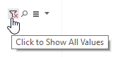
Click to Show all Values, Click to Include All Set Values, Search, All values in Database/Only relevant values, Show Quick Filter Context Menu are all filter control buttons. Tableau authors define which are available but they always appear in the same order. With focus on a filter or a set control, Shift + Tab can be used to move keyboard focus to these supporting elements, allowing a faster forward tab experience between Tableau controls.
With focus on a filter control button, Space or Enter can be used for activation. When activated, Search toggles an edit box, which is added to the tab cycle.
Show Quick Filter Context Menu and All values in Database/Only relevant values filter control buttons are drop-down menu buttons. They support ↓ or ↑, and Space or Enter to make menu selections.
Parameters
Applies only to Accessibility Test Dashboard
Compact List
| What to Do | Keyboard Shortcut |
|---|---|
| Open drop-down filter | Space |
| Change current selection | ↓ or ↑ |
Note: The drop-down does not need to be opened to change selection.
Slider
| What to Do | Keyboard Shortcut |
|---|---|
| Decrease value | ↓ or ← |
| Increase value | ↑ or → |
Type-In (Float – All Values, String, Date and Time, Integer – All Values and with a Range of Values)
With focus within the input, anything can be typed, but the value will only be accepted if it meets the input’s requirements. If the input is not acceptable, the entered information will be discarded and the previous value will be displayed.
Type-In Parameter controls with a Date Range will round accepted inputs. Values below the minimum will be rounded to the minimum value, while values above the maximum will be rounded to the maximum value.
View Data Window
When a Tableau visualization graph has keyboard focus, press Enter twice. First to enter the visualization and the second time, with focus on the inner visualization, to to open the View Data window to view the underlying data for the graph in a table. View Data launches as a new browser window, which can be closed or navigated away from like any other window. However if you filter the data after opening the View Data window, you must close and reopen the View Data window to view the updated filtered data.
Tab or Shift + Tab are used to move focus to actionable elements on the View Data page, Download all rows as a text file links, Summary/Full data tab control, and Show all columns checkbox.
Tableau Toolbar

The first element on the Tableau toolbar is always the Tableau button. Other buttons will vary based on how the Tableau visualization was authored and by the current state of the visualization. Inactive, grayed-out buttons, are not keyboard focusable.
| What to Do | Keyboard Shortcut |
|---|---|
| Move between active buttons on the toolbar | ← or → |
| Activate the selected toolbar button | Space or Enter |
| Returns focus to the Tableau button within the toolbar | Shift + Tab |
| Returns focus to the first actionable element within the Tableau visualization | Tab |
Non Visual Desktop Access (NVDA) Instructions
Because Tableau embeds are HTML applications, we have found that some additional navigation instructions are helpful.
Reading text within a Tableau dashboard
With focus on the Tableau Tab control (in this case “SAT Performance of admitted Students”, “Percentage of Students by SAT Decile” and “Number of Students by SAT Score”), ensure that you are in Browse Mode and then arrow down to read any text included in the dashboard.
Using the Elements List dialog
NVDA’s Elements List dialog is context sensitive. When focus is outside of the Tableau embed, it will expose information about the web page itself. While focus is within the Tableau embedded web application, it will show information pertaining only to the Tableau application.
Glossary of terms
Academic Division – Hypothetical University has 10 academic divisions granting degrees. They are Arts and Sciences, Business, Communication, Dentistry, Education, Engineering, Graduate School, Music, Public Affairs, and Visual Arts & Design.
FAQ
Q: Where can I find out more about Tableau’s work on Accessibility?
A: Tableau Community Forum FAQ: Accessibility.
Contact information
Equal Entry “Contributing to a more accessible world”
206.801.0083
Tableau
206.633.3400