Summary
In an increasingly data-driven world, persons with special needs, particularly the blind, may find themselves left in the dark when it comes to visual representations of information and statistics.
Unlike sighted people, the blind are disproportionately deprived of the ability to consume accessible information, especially when it is presented in graphs, charts and other visual formats.
It’s a reality today in the midst of a global pandemic that if we turn on our televisions or browse the internet for the latest news that we will frequently see COVID-19-related data presented via graphs. This works out fine for blind viewers and readers when the content is provided alongside text descriptions, not so well when color alone is used to illustrate the data. Because of this, advocates in the digital accessibility world have raised this concern and are making efforts to remediate the issue.
Personally, as a blind person, this issue is something that I have struggled with since well before the pandemic began, dating all the way back to my college days. Any data represented through solely visual means creates major problems for me. Right now, given that I’m also immunocompromised, it agitates me whenever I fail to access information related to COVID-19 because it is not accessible. So, when I was invited to participate in a webinar about accessible data representations, I jumped at the chance, even if it was 2am on my side of the world. The webinar was conducted by Ed Summers, Director of Accessibility at the SAS Institute and Chancey Fleet, an Accessibility Advocate with DataSociety.Net.
A Multi-modal Approach
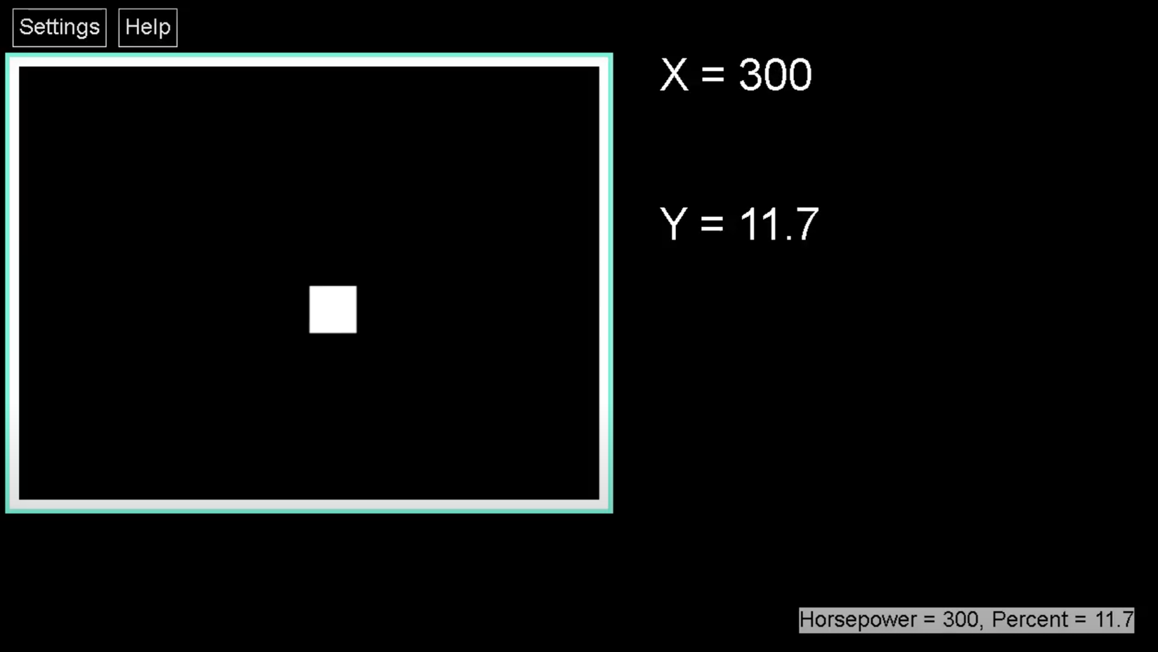
In this webinar, Ed guided us through a multi-modal exploration of vital COVID-19 data using sonification and high-contrast visuals. From what I understand, Summers used the SAS graphics accelerator Chrome extension. When installed in the browser, this tool enables users with visual impairments or blindness to create, explore and share data visualizations. I personally liked the fact that the graphical data was read through a screen reader with ease. Summers only used the arrow keys, indicated by a piano sound effect to maneuver through the data. In my observation, Summers was able to navigate the data by using shortcut keys alone. It also appeared to me that the presentation of the information was easy to read and understand, therefore making it not just accessible but also usable at the same time.
As a blind attendee of the webinar, I was able to follow along with relative ease. However, there were a few minor issues that caused a little confusion for me, specifically the Zoom notifications. Given that I was using a screen reader, it would have been better if the Zoom notifications for the entry and exit of webinar participants was silenced. Same goes for the questions in the chat window. By default, JAWS or any screen reader for that matter will speak simultaneously to the presenter if prompted to do so. In these instances, I sometimes failed to understand what the speakers were saying. Unfortunately, given that this was a live event, there was no way for me to instantly rewind the video unless I interrupted the speaker, which would have likely frustrated and annoyed my fellow sighted attendees.
I appreciated the fact that for this webinar, the speakers took the initiative to silence their screen readers, so I silenced mine as well. Also, I appreciated that the questions were collated. When the questions started to pile up, Chancey repeated each one while Ed gave an answer. This made it easier for me to follow because it was clear what question was being answered. Usually when I attend webinars that are not inclusive, the speaker has a tendency to randomly answer questions shown in the chat box. As a result, I sometimes find it hard to follow the lecture. Very glad that was not the case with this webinar!
Final Thoughts
For this particular webinar, Ed and Chancey focused on providing a demonstration of how to navigate accessible data. They mentioned that in upcoming webinars, they will show how to create graphs as well, which is something that I look forward to.
In the midst of the ongoing chaos and confusion surrounding the virus, I am relieved to know that there are efforts being made to support inclusion. Hats off to those designers, developers and advocates like Ed Summers and Chancey Fleet who consider the right to accessible information for people with disabilities in these trying times.

Rhea,
You are an extraordinary writer and your thoughts and observations are so valuable and helpful for everybody who presents and consumes information.
Thank you!
Julie Neumann, Bergen County (Covid19 Hot spot of New Jersey)
thank you for the appreciation! 🙂