Summary
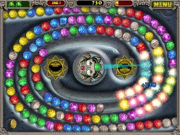
Zuma, a tile-matching puzzle video game created by PopCap Games, continues to be one of the most popular free games on the internet. During play, colored balls roll around the screen on a set path, and players attempt to eliminate these balls by firing like-colored balls at them from a stone frog’s mouth, in an attempt to prevent the balls from falling into a hole.

Image courtesy of PopCap Games, Inc.
Unfortunately, the need to differentiate between ball colors makes Zuma very difficult for color blind players. In the paid version of the sequel game, Zuma’s Revenge!, players have a “Color Blind Assist” option. When this option is selected, the balls that are normally colored green become gray.
Image courtesy of sphotos.xx.fbcdn.net.
Many websites take the same approach as the original Zuma game, and use colors to signify categories of information. This is unwise, because 1 in 12 men and 1 in 250 women experience some form of color blindness, and are thus unable to distinguish one category of information from another.
If you want your web content to be fully accessible to color blind visitors, here are a few recommendations:
- Make sure that the colors you use do not convey important information.
- Exaggerate the difference between foreground and background colors.
- Don’t use colors with a similar lightness, no matter how much they differ in saturation.
- Lighten the lighter colors and darken the darker ones.
Following these recommendations will make your web content accessible to a much larger number of visitors. For more information, please visit the following pages on the Web Accessibility Initiative home page: