Summary

Automated testing tools for accessibility are software applications that evaluate websites, applications, and documents for compliance with the Web Content Accessibility Guidelines (WCAG). They identify and report on accessibility issues that could make digital content unusable for people with disabilities.
Automated testing tools can bring efficiency to the testing process. While it’s true that manual testing is better at finding single instances of things, and at examining user flows, it is more labor intensive. Automated testing, on the other hand (and in theory, at least), can quickly provide a quick view of problems in a digital environment that shows a remediation team where to focus.
But are all automated tools created equal? Do the differences between the tools matter? How reliable are these automated tools? This past September, we had a chance to find out for ourselves.
What We Did
Evinced hired Equal Entry to make just such an assessment. To start, we built a reference website containing accessibility defects commonly found through manual testing — that is to say, the website was meant to fail various accessibility tests. After building this flawed site, we would evaluate it for accessibility using a variety of popular automated testing tools, and compare the results to better understand the state of the market. By mutual agreement, we did not include Evinced tools in our analysis.
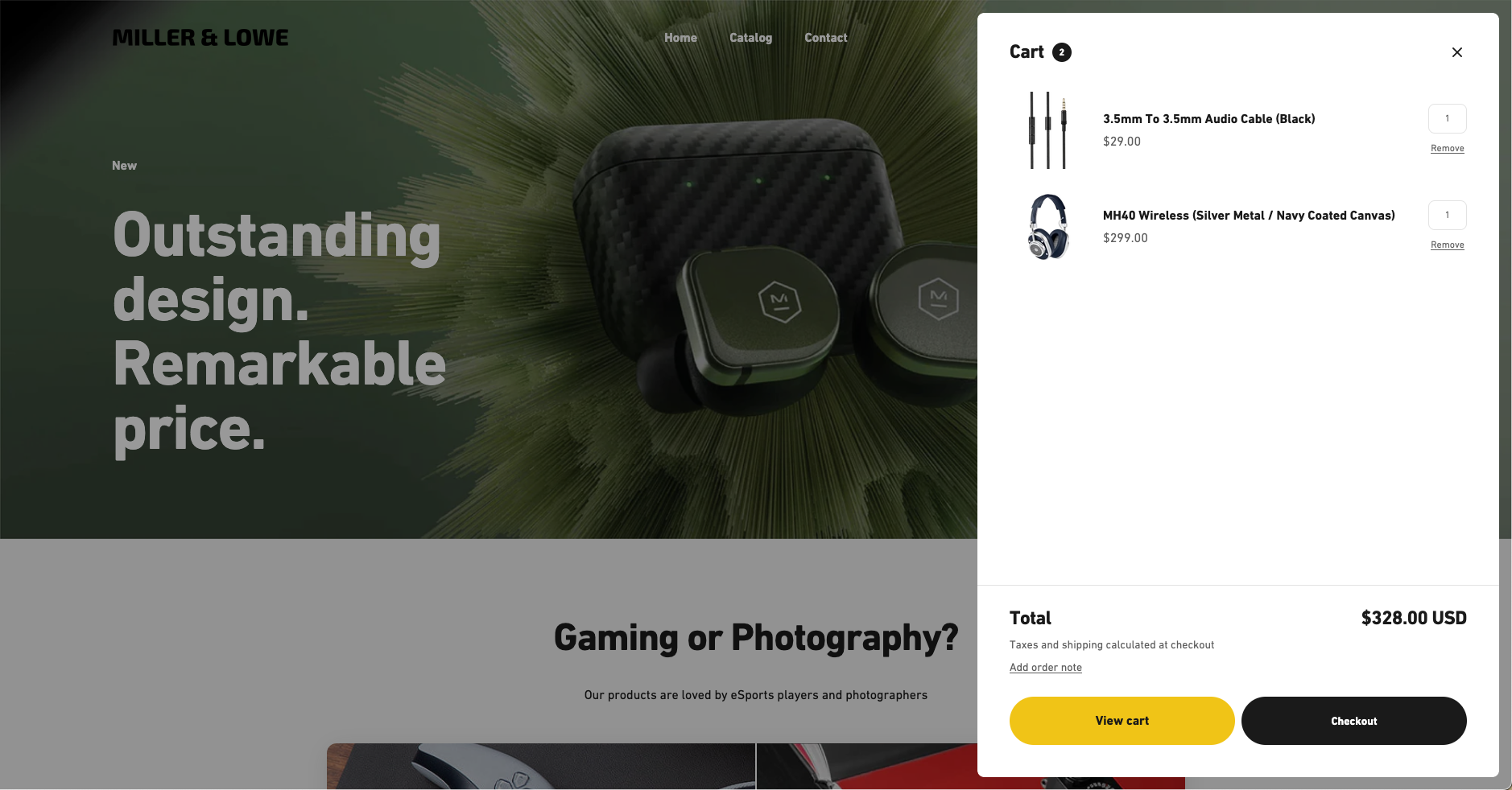
To build the site, we used a standard, professional Shopify theme because Shopify is the dominant platform on which e-commerce websites are built. The first step in the project was to clean the Shopify theme of accessibility defects. Then, using our past experiences with accessibility audits for various retail company websites, we deliberately added a set number of typical accessibility defects to our reference site.

Why We Did It
While Equal Entry is a manual accessibility testing company, we do use a simple scanner to efficiently and accurately catch simple syntax errors. We were interested in finding the best tools and the characteristics of each tool.
We thought this study would be useful for two additional reasons:
First, there are no significant benchmarking tools available from the W3C. If someone wants to evaluate how many success criteria can be automated by today’s tools, they will first need to conduct a time-consuming independent study.
Second, the public demonstration sites that others have developed in the past were typically static. As such, these sites do not represent the dynamic nature of many websites and web applications that we test at Equal Entry.
Our goal was to create a site that could have a flow or process to be tested, rather than a static page. For example, when a user searches for a product, registers to purchase the product, inputs their credit card, and validates that their purchase was completed successfully, that’s a typical purchase flow that is nevertheless rarely found in past accessibility demonstration sites.
How We Added Issues
WCAG 2.1 has 50 success criteria for AA compliance. In the fall of 2023, we set out to embed at least one representative failure for each success criterion into our reference website. (This study was conducted before WCAG 2.2 was released.)
However, there were three success criteria that were not relevant to an e-commerce website:
- 1.2.4 – Live Captions
- 2.5.1 – Pointer Gestures
- 2.5.4 – Motion Actuation
Removing them left 47 success criteria. After creating at least one issue for each, we added several more issues to make the test more robust and create greater degrees of freedom for evaluation. In the end, we had a total of 104 issues to be found during our evaluation of each automated tool.
The website we built contained 31 total pages. To simplify the comparison of results, we ensured that any given defect on the entire site would be found once, and once only. This is very different from the real world, where issues are often duplicated across hundreds or even thousands of pages due to the use of templates or component development practices.

What Did We Discover?
Once we were finished with the reference site, it contained precisely 104 errors. Then we turned to many of the most well-known scanning tools to include in our study:
- aXe
- SiteImprove
- AudioEye
- Stark
- Level Access
- TPGi
For legal reasons, the results of our test are necessarily anonymized. While this does reduce the helpfulness of our study somewhat, most of these tools have terms-of-use that contain anti-benchmarking clauses, sometimes called DeWitt Clauses.
At their worst, we believe these clauses are anti-competitive and prohibit much-needed information from informing potential buyers. At their best, these clauses protect a competitor from being publicly defamed in a benchmark test over which they had no control and which might well have been conducted in a biased manner. So the balance we struck was to do the benchmarking, in an unbiased way, but to report results on an anonymous basis.
As we dug into the project and were given the opportunity to understand how automated tools work in 2023, we learned that, at least on our reference site, the scanning tools in our test set vary substantially on two dimensions:
- Overall levels of defect discovery
- False positive generation
| Scanner A | Scanner B | Scanner C | Scanner D | Scanner E | Scanner F | |
|---|---|---|---|---|---|---|
| Issues found | 5 | 9 | 7 | 11 | 9 | 4 |
| % 104 issues in total | 4.8% | 8.7% | 6.7% | 10.6% | 8.7% | 3.8% |
| False Positives | 63 | 12 | 46 | 2 | 3 | 474 |
Defect discovery
On our reference site, the tools tested tended to find a relatively small percentage of the defects we had embedded in the site. Moreover, they ranged in their defect discovery rate from X% to Y%. All of these rates are lower than we expected, given the vendor claims we have seen in the last two years. But, please bear in mind that:
- We did not test all the automated scanning tools in the market, just most of them.
- Scanning results will always be highly sensitive to the unique mix of defects on your own site, which would almost certainly be different from those of our reference site.
- We did not include semi-automated tests, such as Accessibility Insights. If those had been included, then the discovery rates for vendors that have semi-automated tests could well have been higher. However, such tools were out of scope for this project.
User experience
Each scanning tool had a different way of showing its findings — for example, there were some scanners that flagged issues as either “alert/recommendation/advisory” or “error/critical/violation.” We ignored the “alert” issues and only looked through “WCAG violation” issues.
It’s true that some issues are more significant than others. Therefore, simply comparing the number of issues may not be the definite measurement of how good the tools are. Still, we can see that some tools detected more issues than others.
We recommend testing on your own site and determining the best-suited engine for your type of website.
Did the User Interface (UI) of Each Tool Make a Difference?
In short, yes. There are three main reasons why:
- How a tool displays the issue details.
- How it visualizes each issue.
- Whether or not it uses an overlay.
Issue summary display?
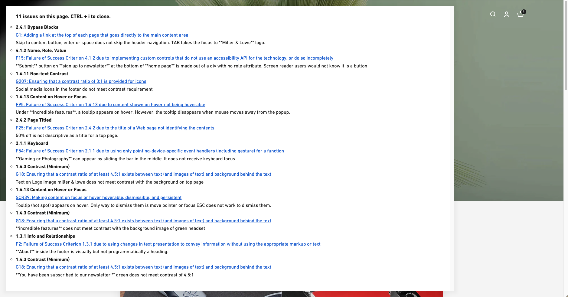
In general, the best user interfaces (UI) for automated tools allow you to see a list of issues on a specific page. But not all do. For example, one tested scanning tool only showed a high-level list of all the issue “types” on one page; to see the actual issue, the user had to click on the issue type, go to the page, and see which element needed to be fixed. The tool also required you to navigate to a page and wait for a popup with issue details to load.
Issue visualization?
Some tools show a color rectangle around an element on a page to visually indicate the issue is there. Some don’t. Some put the rectangle in the wrong position — there was a tool in which the visual rectangle did not work on any of the popups that our site has. In the real world, this would greatly affect efficiency and how swiftly developers could fix the issue.
Use of overlay window?
Some tools require you to have an overlay so that the crawler can scan the page. This can lead to some difficulties. If you are running another crawler at the same time, then the testing tool might detect some minor issues in the crawler’s overlay itself.
Also, the overlay could give a false impression to some people. They might think, “This company thinks adding an overlay solves all the accessibility problems, and I know that’s not true,” even though it is only a small part of the company’s overall accessibility project. Therefore, some companies will say they want to turn off an overlay, but doing so might not be allowed with certain tools.
Lessons learned
False positives matter
Simply comparing the number of issues an automated scanning tool catches is not enough to determine the quality of that tool. As we mentioned earlier, some tools will flag the same issue multiple times because the site is based on a template.
Another reason is that some tools will flag “issues” that are not truly a violation of WCAG upon close examination. So, someone might say, “Scanner F caught 478 issues and Scanner D caught only 13 issues,” and without doing a detailed comparison, someone may draw the conclusion that Scanner F is the better tool, even if it is not. (It’s worth noting that half the players in this study produced more false positives than true defects.)
Bottom line: Every issue costs your organization time and money to investigate. A great deal of time and money can be wasted in examining “issues” that are not issues. We believe companies should, during their internal review of potential automated tools, select the one that has the least number of false positives.
Issue counts across many pages are complicated
Because it is common to have accessibility issues coded into site templates or components, it’s possible for a site with 100,000 pages to have 100,000 issues of the same issue type, when there’s really only a single issue to be repaired.
The best scanning tools would accommodate this reality. Seeing that a site has 400,000 accessibility issues to address is not helpful to an organization that is trying to make progress on accessibility. Some automation testing tools do a better job of summarizing frequently occurring issues across pages than others. If you are evaluating an automated testing tool, make sure you look at the net difference between the number of issues detected and the number of false positives.
Comparing issues by their title is complicated
Different automated tools might refer to the same issue using different words, but the results mean the same thing. Because different accessibility testing tools use different nomenclatures even when they are describing the exact same issues, comparisons between tools require a lot of judgment. For example, it is difficult to ensure that an issue titled “element must have a lang attribute” in Product A is the same as an ostensibly different issue titled “lang is not defined programmatically” in Product B.
Equal Entry has always advocated for linking issues to techniques in the WCAG Guidelines because it gives you a way to standardize and compare evaluation tools. If a product links to a WCAG technique that is a published standard, then it is easier to ensure that the issues reported are consistent between products. For example, in the issue referenced above, both of these issues can refer to the same WCAG technique: H57: Using the language attribute on the HTML element.
Another concern is that some tools show best practices that are not related to WCAG. For example, a tool might recommend that text alternatives contain fewer than 140 characters, even though this is not a requirement. Such tips might be helpful to organizations that have already reached a certain level of accessibility. But they could slow down organizations that are working to at least meet WCAG AA standards, and place them at risk of mis-prioritizing their accessibility work.
Conclusion
Automated testing tools are imperfect, just like manual testing. However, they can help your organization to efficiently improve the accessibility of digital content by extending the productivity of your existing team.
The things to care about when choosing the right tool for your company are:
- Defect discovery (the sheer number of accessibility issues detected)
- False positives
- Quality of the UI
- Quality of the issue descriptions
- Ability to remove an overlay
Reference
- Comparing Manual and Free Automated WCAG Reviews by Adrian Roselli
“For legal reasons, the results of our test are necessarily anonymized. While this does reduce the helpfulness of our study somewhat”
This is understandable.
But not providing the test site is unhelpful…
Hi Steve, we appreciate the sentiment. We will continue discussions to see if this can be made available in the future.
In the section “Use of overlay window” it is not clear to me if you are talking about an ‘accessibility overlay’ (as AudioEye and Level Access offer), or if you are talking about something injected by the testing tool (what you refer to as “the crawler’s overlay”). I assume “window” does not genuinely mean a separate browser window or tab.
Like Steve, I am also very interested in seeing the test site. For context, I can create a 1.1.1 Non-text Content issue that gets caught by all tools or I can create one that gets missed by all tools. I can even create a 1.1.1 issue that I know will be caught in some and missed in others.
On top of that, I would be curious to see results of manual testing (from someone unfamiliar with this) as a control.
I appreciate how much work this must have all been. As you know, I ran my own comparison of automated tools in early 2023 (and from which I have linked this article). Thank you for your efforts!
My previous comments was four paragraphs: Para 2 starts with “Like Steve”, para 3 with “On top of”, para 4 with “I appreciate”.
Hi Adrian, we appreciate the comment. We will find out what we can do in this area. We have linked back to you at https://adrianroselli.com/2023/01/comparing-manual-and-free-automated-wcag-reviews.html. Thank you for pointing out the paragraph problems in the comments. We’re working on it.
This is a very useful piece of work despite the results being anonymised. It would be good if you can include SortSite if you do anything like this again.
Just to put it out there. W3C has the Accessibility Conformance Testing task force working on similar problems. They have hundreds of test cases that various tools vendors use and publish the results of. You can find the results of it here:
https://www.w3.org/WAI/standards-guidelines/act/implementations/
Thank you, Wilco!
Hi Wilco, can you let us know how we should think about this for this issue? How would we submit this test case to your implementation list?
Very interesting study. The legal reasons why you couldn’t publish the name of the companies really jumped out to myself. In fact having the clause, raises more red flags to myself than if the company was revealed with the scores.
It would be great for a website where companies who don’t have expertise internally and want to use automation tools could run tests against with these tools. If you know what the defects are up front and then run a bunch of defects across them, this will give you an idea of the tool for the organisation. The output and reliability of the tool is only one thing to consider.
Yes, it is unfortunate that it works this way. I would completely support the idea of a public website that is dynamic for automation tools to train and improve from.