Summary

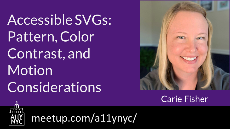
Accessibility New York City hosted a Meetup entitled “Accessible SVGs: Pattern, Color Contrast, and Motion Considerations.”
Scalable Vector Graphics (SVGs) became a W3C open standard in 1999 — back when the new tech hotness was the Blackberry phone, Napster first invaded college dorms, and the Y2K bug sparked fear in us all. Fast forward to our modern digital world and you’ll notice that while the other tech trends have waned, SVGs are still around and thriving.
This is partly due to SVGs having a small footprint for such high visual fidelity, in a world where bandwidth and performance matter more than ever — especially on mobile devices and situations/locations where data is at a premium. But also because SVGs are so flexible with their integrated styles, interactivity, and animation options. What we can do with SVGs today goes way beyond the basic shapes of yesteryear.
If we focus on the accessibility aspect of SVGs, we have come a long way as well. Today, we have many robust patterns and techniques to help us optimize inclusiveness. This is true regardless of whether you are creating icons, simple images, or more complex infographics.
View Carie’s presentation to learn about:
- Inclusive SVG patterns for web and mobile
- SVG color and contrast guidelines, tools, and @prefers-color-scheme
- SVG animation guidelines, tools, and @prefers-reduced-motion
Carie Fisher is an author, speaker, and developer with over 15 years of tech experience who is passionate about the intersection of front-end code and UX, digital accessibility, and diversity in technology. Carie works as a Senior Accessibility Consultant and Trainer at Deque Systems while also pursuing her Ph.D. in Human-Computer Interactions at Iowa State University.