Summary
This article explains why accessibility audits are essential for websites and digital content. It shows how even small design changes can create barriers for users. The Equal Entry team identifies these issues and fixes them. It emphasizes that accessibility is an ongoing responsibility, not a one-time task. Fixing problems improves usability, protects credibility, and shows respect for all users.
Accessibility isn’t a one-and-done checklist. It’s a living commitment. Even teams like ours that build accessibly from the start can introduce barriers when content or design evolves. That’s why regular accessibility audits matter. They catch issues that would frustrate users and erode credibility.
In our latest audit, we uncovered two issues that could easily go unnoticed by sighted mouse users. However, they create friction for many others. One blocked some content when zoomed in. The other turned keyboard navigation into guesswork. We didn’t just flag them. We fixed them as we always do.
Here’s where some companies go wrong. They pay for an accessibility audit, but they don’t fix issues. What’s the value in an accessibility audit if they don’t address the issues?
We work with our clients to help them fix their accessibility issues. Here, we share the process of what meaningful accessibility work looks like.
Reflow
During the audit, we discovered a problem that happens when users zoom in on the page. This is a reflow issue.
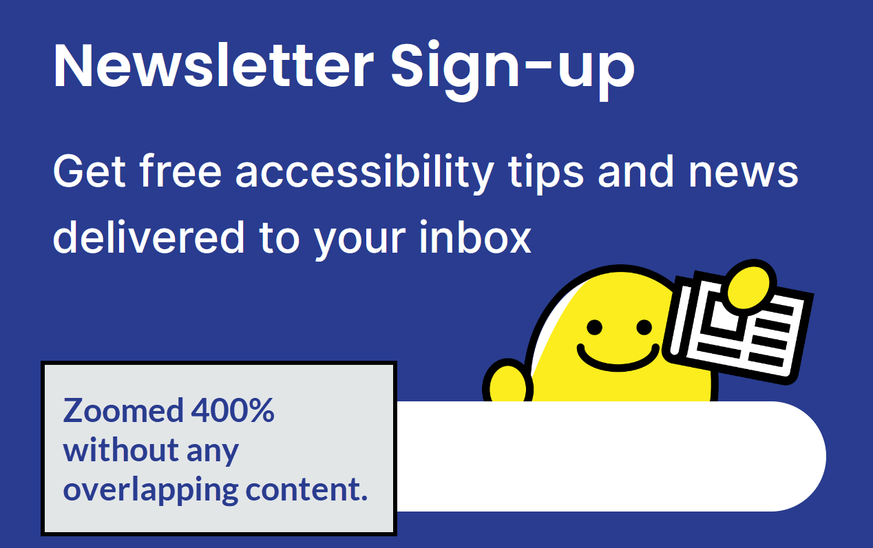
At the bottom of the page, we have a newsletter signup section. However, when we zoom in, Knomo, our mascot, overlaps with the text that says, “Get free accessibility tips and news delivered to your inbox.”
How much should someone be able to zoom a page? According to the Web Content Accessibility Guidelines (WCAG) Success Criterion 1.4.10 Reflow, those users should be able to zoom to a point where the width is the equivalent of 320 pixels.
The equivalent of 320 pixels means that if your browser width is 1280 pixels, you should be able to zoom by 400%.
The following video explains and demonstrates.
Here’s how we tested this:
- Set the zoom rate to 100%.
- Set the window width to 1280 using Window Resizer, a Chrome extension.
- Zoom the page by 400%.
We look for any loss of information. Knomo overlaps with the text, which makes it hard to read.
After applying the fix, the character image and the text no longer overlapped. Now, the user can read without any overlapping content.
How to fix the reflow accessibility issue
Every solution will be different based on the code and design. Before we fixed the issue, the vertical blue line (<div class=”line”></div>) connecting the numbers had a position: relative for the whole container (<div class=”our-process”>).
Before the reflow fix
Here’s the HTML.
<div class="our-process"> <!-- Line container -->
  <h2>Our accessibility auditing process</h2>
  <p>Our auditing process follows careful steps:</p>
  <button onclick="expandAllItems()" id="expand-all" aria-expanded="false" aria-controls="item-1 item-2 item-3 item-4 item-5 item-6 item-7">Expand All</button>
  <ol class="list">
      [...]
  </ol>
  <div class="line"></div> <!-- line element -->
</div> <!-- End of line container -->
Here’s the CSS.
.our-process {
  [...]
  position: relative; /* Used as reference when using position absolute on child elements */
}

.our-process .line {
  [...]
  position: absolute;
  top: 290px;
  bottom: 164px;
  left: 210px;
}
After the reflow fix
The position: relative should be moved to a new div that only has the ol and line element.
Here’s the revised HTML.
<div class="our-process">
  <h2>Our accessibility auditing process</h2>
  <p>Our auditing process follows careful steps:</p>
  <button onclick="expandAllItems()" id="expand-all" aria-expanded="false" aria-controls="item-1 item-2 item-3 item-4 item-5 item-6 item-7">Expand All</button>
  <div class="list-container"> <!-- New container -->
    <ol class="list">
      [...]
    </ol>
    <div class="line"></div> <!-- line element -->
  </div> <!-- End of new container -->
</div>
Here’s the CSS for the fix.
.our-process .list-container {
  position: relative; /* Setting a new reference on child elements with position absolute */
}

.our-process .list-container .line {
  [...]
  position: absolute;
  top: 100px;
  bottom: 110px;
  left: 60px;
}
Now you can zoom in without any content hiding behind other elements.
Focus Visible
For all audits, we test the accessibility of navigating a website using only the keyboard. Not everyone uses a mouse. Many people rely on the keyboard. They press the Tab key to navigate through interactive elements. Instead of a mouse click, they use Enter or Space to activate the element.
In this scenario, we navigated Equal Entry’s accessibility services using only the keyboard. When you scroll down, there’s a section describing our six-step auditing process. Each step is clickable, and there’s also an “Expand all” button to reveal all the steps.
For keyboard users, it’s crucial that the current focus is always visible. This lets them know where they are on the page.
Here’s the problem. As we Tab through the buttons, the focus is visible on the steps. But when you land on the “Expand all” button, the focus indicator disappears. The following video demonstrates the focus visible problem. Instead of being visible, it’s invisible.
You can still activate “Expand all” with the keyboard. However, you have no idea where the focus went. This fails Web Content Accessibility Guideline (WCAG) 2.4.7: Focus Visible. This criterion requires a clear focus indicator on a keyboard-operable interface.
How to fix the focus visible accessibility issue
We fixed the focus visible by adding a visible focus rectangle to the “Expand all” button. Now, it’s consistent with the other interactive elements.
Before the focus visible fix
Here’s the before where the CSS showed no indicator for focus.
#expand-all:focus {
  border: none;
  outline: none; /* Removes default browser visual indicator */
}
After the focus visible fix
Here’s the after where we added the visual indicator in the CSS.
#expand-all:focus {
  border: none;
  outline: none;
  box-shadow: var(--focus-border); /* Added custom focus visual indicator */
}
Try it out! Here’s the accessibility audits page. Press Tab until you get to the “Expand All” link. Then, press the spacebar or Enter key.
The importance of fixing accessibility issues found in auditing
Finding accessibility issues is only the first step. Fixing them is what protects users and your organization. When reflow breaks, users lose access to content. When focus indicators disappear, navigation turns into guesswork. These aren’t minor problems. They’re barriers that exclude people and hurt the user experience.
Unresolved issues can lead to legal exposure, brand image damage, and lost trust. But when you fix them, you show users that their experience matters. You reduce risk, improve usability, and build credibility with every resolved barrier
That’s why our audits don’t stop at identification. We work with clients to fix what’s broken and explain why it matters. Because accessibility is more than compliance. It’s respect and better user experiences for everyone.
Ready to strengthen your accessibility efforts and compliance?
Whether you’re updating your VPAT, reviewing your ACR, or tackling WCAG conformance, we’ve got you covered. We specialize in accessibility audits and VPAT reviews that go beyond checkboxes: Reducing risk, improving usability, and respecting your users.
Not sure where to start? Let’s chat.
