Summary

I am Rhea Althea Guntalilib, a totally blind digital accessibility ninja. I conduct accessibility and usability tests for different web and mobile products and services. With my fingers and my keyboard, I endlessly push to make the digital world a more accessible place for all.
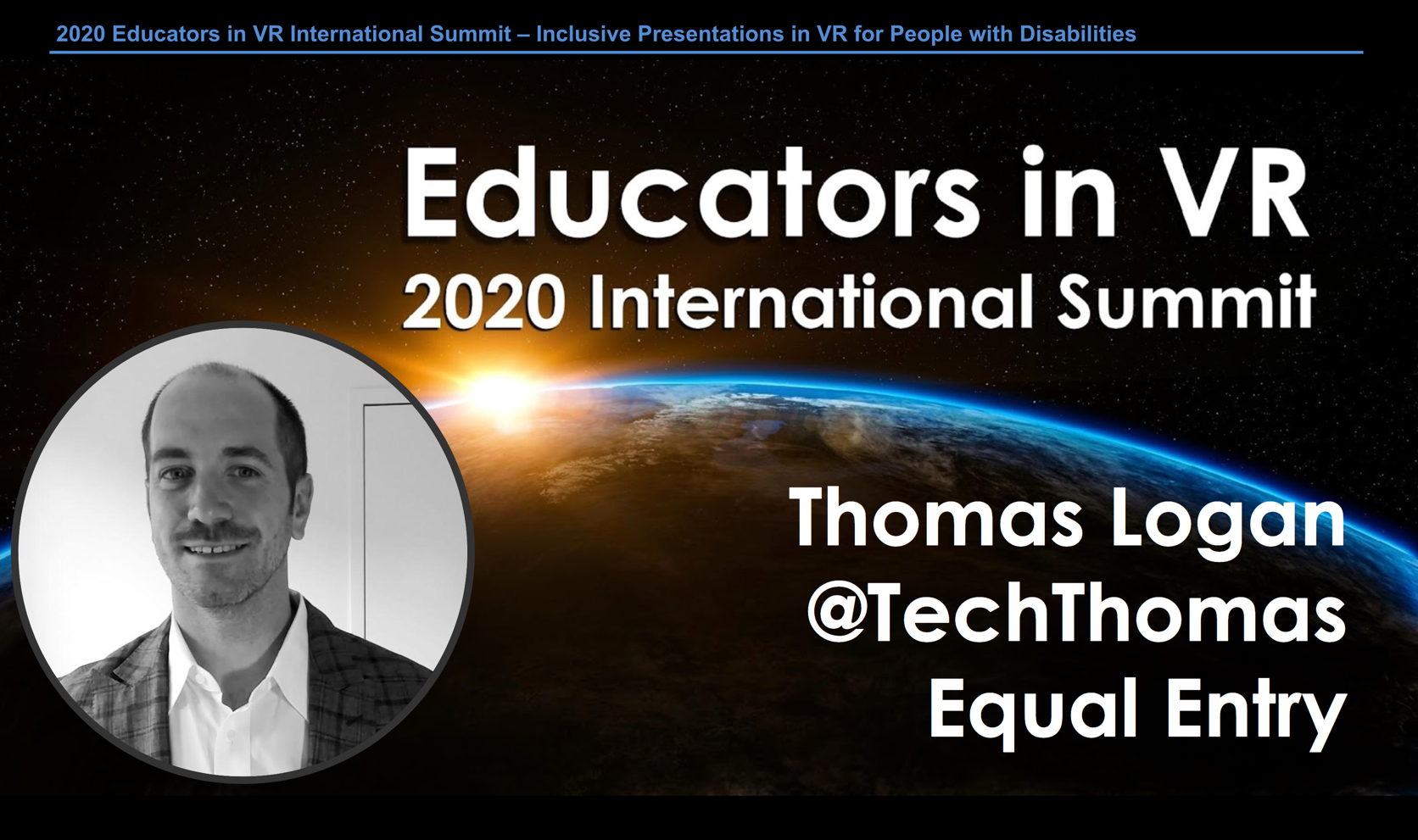
On February 18, 2020, Equal Entry CEO Thomas Logan presented a virtual lecture at the 2020 Educators in VR International Summit. The event brought together educators, learners, researchers, and experts in VR, AR, and XR to share their passion for integrating immersive technology in education. Thomas presented Inclusive Presentations in VR for People with Disabilities to a large group of virtual attendees from around the world.
Enjoyed virtually attending talk by @TechThomas of @Equal_Entry on “Inclusive #VR: #Disabilities” in #educatorsInVR summit #2020edinVR #edinVR #a11y pic.twitter.com/UeXHy53ply
— Bill Curtis-Davidson (@BCurtisDavidson) February 18, 2020
As a screenreader user, we decided this event would be the perfect occasion for me to test the accessibility and usability of AltspaceVR as well as a similar application, Mozilla Hubs. Here are my first impressions.
AltspaceVR & Mozilla Hubs Overview
AltspaceVR is a social VR platform owned by Microsoft. It provides meeting spaces in virtual reality where users can socialize, play games, watch videos and browse the internet in a designated virtual room.
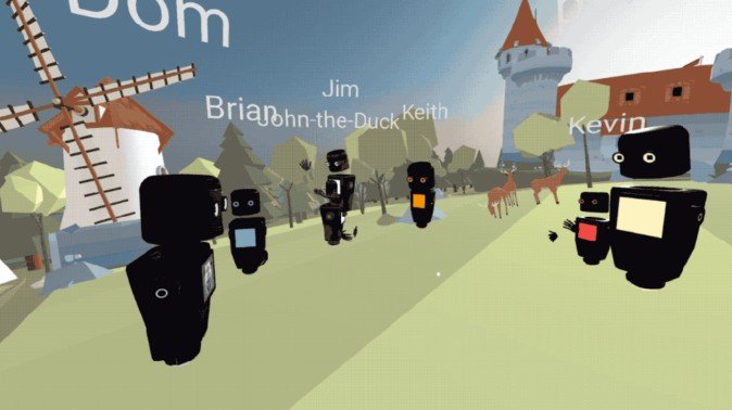
Similarly, Mozilla Hubs is a new way for people to get together online. It is a social browser-based web VR platform. As part of Mozilla’s vision of making the browser a core facet of virtual reality, they developed Hubs to give their users an immersive social experience.
Hubs, as it is more commonly known, is Mozilla’s counterpart for Microsoft’s AltspaceVR social platform. It offers capabilities such as interacting with friends, playing games, watching movies, viewing 3D objects and browsing the internet in a virtual reality space.
Using AltspaceVR with a Screen Reader
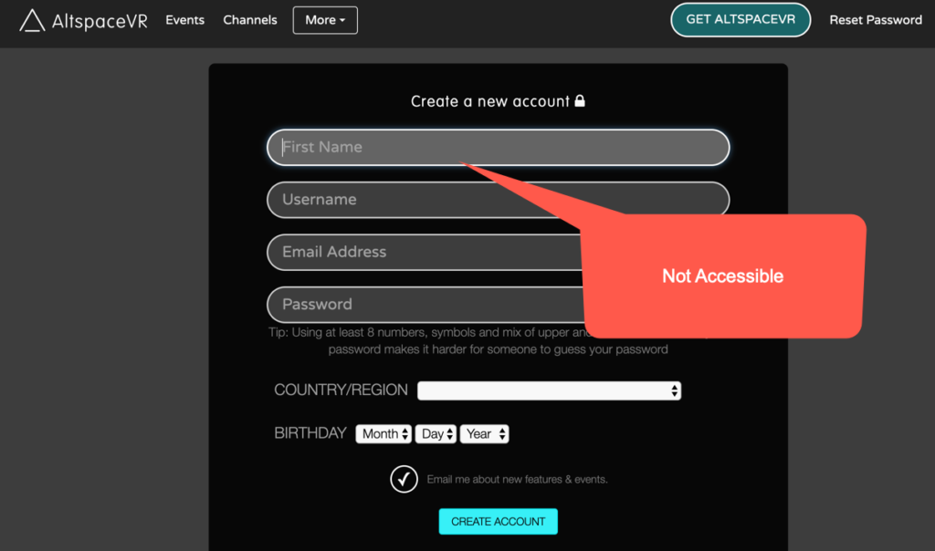
The very first thing I did was to create a user account. A link to the account’s creation page was provided. The process is easy enough to understand because of its straightforward nature. I had to fill out the form and I was able to do so with ease because the fields are accessible. They are labeled accordingly. What I noticed though is the absence of a notification message that should have let me know that I had successfully created a new account.

After the account creation, the interesting part began. An interface appeared for the downloading and installing of updates. In this segment, the audio announcement of the progress bar was inconsistent. As a result, I couldn’t reliably check the status of the update. Visually, a specific number related to the downloading files was displayed, but I wasn’t able to read this part.
When the update was complete, I found the actual interface to be completely inaccessible. I could only hear the title being announced, but the contents were not read at all. At this point, I was stuck and couldn’t proceed to navigate or explore the interface. The only audible sound was the background music from the application, which in all honesty, didn’t make any sense to me and was not at all helpful. In fact, I initially thought that it came from the background of another person I was talking to in another application.
The main purpose of this test was to see if I can participate and attend virtual lectures on this platform. I was supposed to attend Thomas’ Educators in VR International Summit presentation. I viewed the list of events to check out the schedule of presentations and to read more details about each topic. However, in the actual list of events, the experience was not as usable as I expected. The details of the presentations were presented by heading and didn’t appear as interactive elements, meaning I couldn’t activate the event that I planned to view. The workaround was to browse from top to bottom and search for the link counterpart of the event title. Once I found the event details, I was able to declare my interest in attending through the “RSVP” button and managed to add the event to my calendar.
After completing the RSVP and adding the event to my calendar, I was still clueless about how to join the meeting room. An hour before the scheduled event, I received a notification in my email. I opened the event and saw that there was a “jump to VR” link. I clicked this link with the hopes of being redirected to the actual room, or at least be given additional instructions on how to join, but still failed to successfully enter the room, thus missing Thomas’ presentation.
Test Driving Mozilla Hubs
After my less than successful experience with AltspaceVR, I was eager to try out Mozilla Hubs. To test Hubs, I was provided with a joining url. Before opening this link, I expected to go through a process of account registration, signing in, and the usual introduction processes of any social platform. However, I was gladly surprised that no initiations were necessary. I simply opened the link and was automatically redirected to my designated meeting room.
I conducted this assessment on the phone while Thomas was on the other line. When we got the platform working and I successfully entered the meeting room, we started to test the VR features and capabilities of this application. The sound cue is helpful for me as an alert that I am already in the room. I also appreciate the absence of background music as there’s no distraction or cause for confusion. I was able to clearly recognize the shifts of location from Thomas’ voice.

The only problem I’ve encountered is that when it was my turn to try the voice location shifts, I failed to do this with my screen reader turned on. Supposedly, I should be able to shift my voice through the arrow keys or through the QASD keys. When I turned off my screen reader, the voice shifting worked.
I also tried creating a public room. I went to the website and the interface is very user-friendly. I simply activated the ‘create’ button and a room instantly became available. I activated the ‘share’ button and then the share link appeared. A ‘copy’ button was available and the copy link appeared. The process is plain, simple and straight-forward.
Final Thoughts
In general, my entire experience with AltspaceVR was not very smooth. It needs improvement not only with the accessibility of the web elements, but also with the usability of the entire application.
By contrast, the process of setting up Hubs is very simple. It is designed to meet the ease of access that VR requires. There are no gate keepers, no installation processes–just a click to the share link and you are in your virtual room. Most importantly, the entire interface is highly accessible. I didn’t encounter any difficulties in accessing the web elements. It is user-friendly and very easy to understand and use. I was very happy. In contrast with AltspaceVR, Hubs is far more accessible and usable.
Thank you for the great feedback. I will pass this onto AltspaceVR and Mozilla Hubs, our partners in the Educators in VR International Summit. If you would be interested, we’d love to learn more about accessibility in VR and maybe have you or someone you recommend present a workshop on that soon. Accessibility is critically important, and so often misunderstood, and we’d appreciate an opportunity to expand upon this topic with our members. Thanks!
Thank you for your interest to learn more about accessibility. We highly recommend our CEO, Thomas Logan to present or facilitate workshops regarding this subject. I am also interested to present or do a demo alongside Thomas during said presentation. this is to show a firsthand experience from someone who is totally blind and is using a screen reading software.
Ah, I forgot to add, the challenge with RSVPing an individual event during the International Summit is totally our responsibility. We worked with the AltspaceVR events team and found a compromise on scheduling almost 100 events on AltspaceVR by placing them into 1-3 hour blocks of time. You could only RSVP on that block of time, not for the specific speaker session. We learned many valuable lessons from that, and we won’t be doing that often in the future. The idea was to not flood the public calendar with our events, and encourage people to see other speakers in addition to the one they were interested in. It worked, but people had trouble finding the key event they were interested in and only that speaker. So don’t blame them! 😀
noted! now it makes sense. thanks for explaining what happened. 🙂