Summary
Slack created Simplified Layout Mode to make the workspace easier to navigate for people who benefit from simpler, more predictable interfaces. It replaces busy multicolumn screens with single‑column views, uses larger targets, and removes hover‑only menus. These changes support people who use eye tracking, head‑mouse technology, or screen readers by reducing fatigue and improving orientation. The cleaner layout also helps people with ADHD or dyslexia stay focused with fewer distractions. Through testing with disabled and neurodivergent users, Slack shaped a flexible design that gives people more control over how they work.
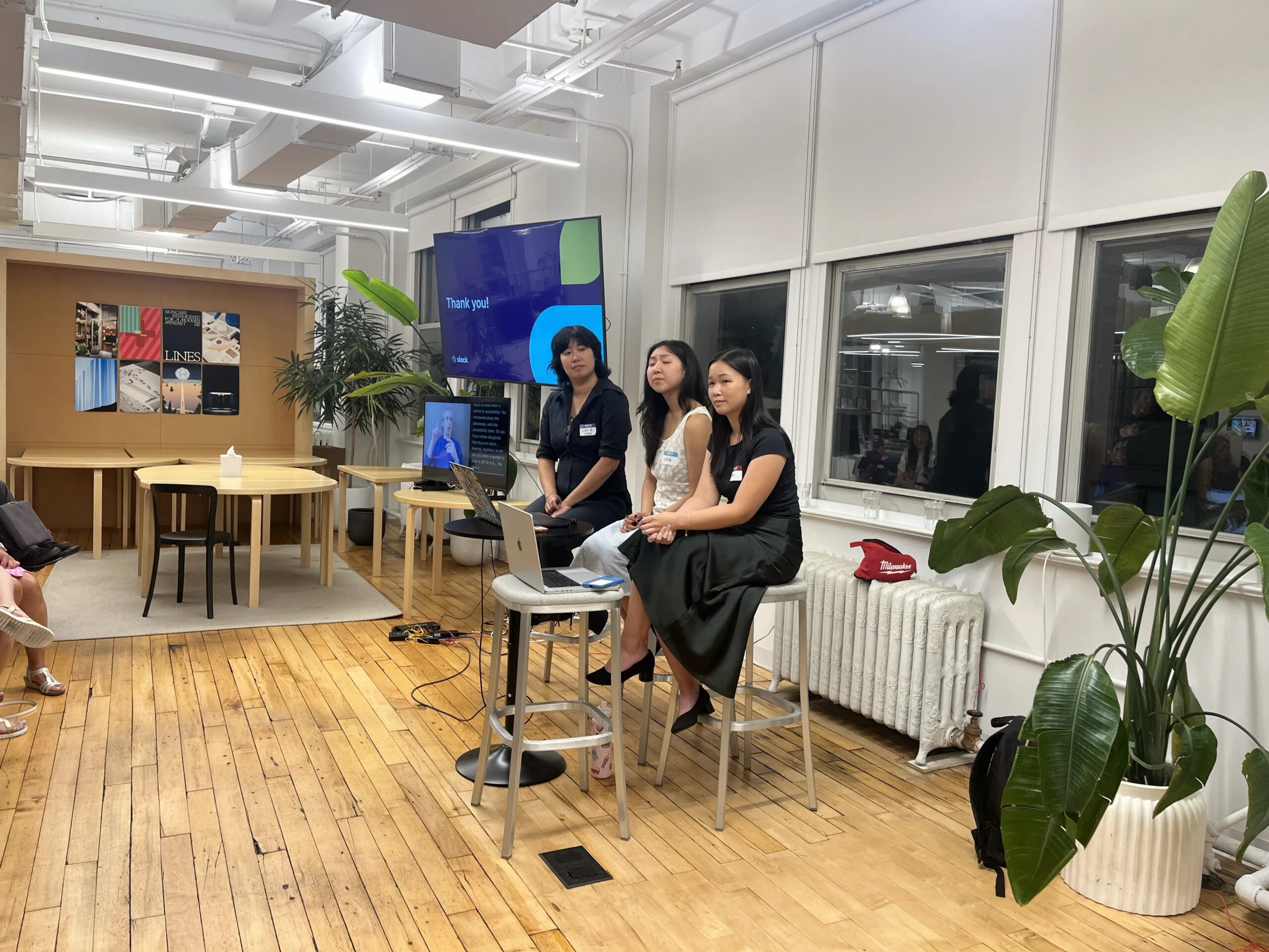
This article is based on a presentation at Accessibility New York City (A11yNYC) by Lena Wang, Kaili Liang, and Chris Xu.
Digital workspaces often present more information than people can comfortably process at once. Many tools rely on multicolumn layouts, hover-based interactions, and small controls that assume precise mouse use. The initial barriers identified for this redesign came specifically from people who use eye tracking and head‑mouse technology, because the work began in anticipation of the needs within the ALSTogether community. These users highlighted how dense layouts, hidden actions, and precision‑based interactions created unnecessary strain.
A complex interface can make it difficult to stay oriented. When several sections scroll independently, it becomes easy to lose track of where you are. Hover-only menus add another layer of difficulty. They require precise movement and can disappear before someone has time to act. These challenges show how traditional workspace design can unintentionally limit autonomy for many users.
Simplified Layout Mode was created to address these issues by rethinking how navigation, content, and controls appear on screen. It offers a single-column structure, larger targets, visible actions, and predictable movement patterns. These changes support people with physical, visual, and cognitive needs while also benefiting anyone who prefers a cleaner workspace.
Through further user testing, it was revealed that Simplified Layout Mode also delivered improvements for screen reader users and neurodivergent people. This led the team to build more functionality specifically for these user groups and expand the impact of this feature.
Rethinking workspace complexity
Many communication platforms rely on dense layouts that place several panels side by side. Slack’s standard interface includes a workspace switcher, a tab rail, a channel list, a message list, and a thread pane. Each area scrolls independently, and each contains its own set of controls. This design gives experienced users quick access to many tools, but it also creates cognitive load and physical strain for people who rely on assistive technology.
Hover-based actions add complexity. Message actions such as adding reactions or starting threads appear only when someone hovers over a message. For eye-tracking or head-mouse users, this movement is hard to perform with accuracy. Small targets require more precision than these tools can reliably provide. Hidden controls cause people to search for them. This increases fatigue and slows down daily work.
A simpler structure helps reduce these barriers. Showing one content area at a time allows people to focus on the task in front of them without scanning across multiple columns. Larger targets reduce the precision required to activate controls. Visible actions remove guesswork and support consistent interaction. These changes create a more predictable environment that supports autonomy and reduces strain.
Designing for predictable interaction
Creating a more accessible layout required clear principles for spacing, visibility, and interaction. The team established a minimum target size of forty-by-forty pixels with generous spacing around each control. This size supports eye tracking and head-mouse technology by reducing the precision needed to activate buttons. It also benefits people who prefer larger targets.
Visibility was another core principle. All essential actions needed to be available without hover. This meant moving message actions into a persistent menu that could be opened with a single click. It also meant ensuring that navigation elements remained stable and easy to reach. These changes reduce the cognitive effort required to locate controls and support more reliable interaction.
Feature parity was a non-negotiable requirement. People using assistive technology need access to the same capabilities as everyone else. Creating a limited interface would restrict participation in workplace channels and workflows. By maintaining full parity, the simplified layout supports equal access and ensures that people can complete all tasks without switching modes.
Engineering choices that support long-term accessibility
Building a separate interface would risk falling out of sync as new features were added. Instead, the simplified layout uses the same underlying components as the standard workspace, arranged in a single-column structure. This approach keeps the experience maintainable and ensures that updates flow naturally into both modes. It also allows teams to refine the layout without creating parallel systems.
The first working prototype demonstrated how existing components could be reorganized into a simpler structure. Over time, the design was polished to improve spacing, corner radius, and visual clearness. This iterative process helped ensure that the simplified layout felt familiar while still offering meaningful improvements. The final structure balanced accessibility needs with long-term maintainability.
What user research revealed
User research played a central role in shaping the simplified layout. Early testing with people who use eye tracking and head‑mouse technology provided the initial guiding principles. This included the need for larger targets, predictable placement, and visible actions. These users also described how hover‑based controls were difficult to access with their tools.
Later rounds of testing with the same group confirmed that the changes made in the simplified layout meaningfully improved their experience. The insights reinforced the importance of reducing precision requirements and removing hover dependencies.
Screen reader users reported that fewer on-screen elements improved orientation and responsiveness. With less content to traverse, screen readers could move through the interface more efficiently. However, users needed clearer ways to understand where they were in the navigation stack. This feedback led to the addition of a breadcrumb bar that provides immediate context and quick access to previous steps.
Screen magnification users identified areas where layout changes conflicted with their assistive technologies. This feedback didn’t lead to additional changes specific to that group. Their experience showed that some structural adjustments didn’t align well with external magnification tools.
The later refinements to max width and the challenges related to scanning across wide screens came from feedback shared by neurodivergent users. They described how the distance between the messages and their associated actions made navigation harder.
Narrowing and centering the content created a more predictable focus area for these users. Custom zoom settings continued to support people who needed different magnification levels in simplified and standard views.
Neurodivergent users described benefits related to reduced visual clutter and improved focus. During periods of heads-down work, the simplified layout helped minimize distractions and made notifications easier to manage. These insights showed that accessible design often benefits people beyond the original target group.
Improving content structure and visual balance
Expanding content across wide screens introduced unintended scanning challenges. Messages appeared on the far-left edge while controls remained on the far right. This separation forced users to scan across empty space to reach the actions they needed. Implementing a maximum width constraint brought content and controls into a central focus area. This adjustment reduced scanning effort and created more intentional whitespace.
Channel lists also needed refinement. When expanded to fill the entire screen, they created large empty areas that created a visually unbalanced view. The shift from the spacious, custom simplified views to the much denser channel list was jarring. This was because the two layouts did not feel consistent with one another.
Restyling the channels with clearer outlines and more defined click targets helped reduce that abrupt transition. These adjustments made the channel list easier to understand at a glance and brought it into better alignment with the rest of the simplified layout.
Persistent message action menus allow people to always keep controls visible. Separate zoom settings let users maintain different levels of magnification in simplified and standard views. A dedicated breadcrumb bar provides quick access to previous steps and helps people stay oriented as they move through the workspace. These features support autonomy by giving users more control over how they navigate and interact with content.
What organizations or individuals can do next
Teams can begin by reviewing their own digital tools for hidden controls, small targets, and layouts that require precise movement. Testing with eye tracking, head-mouse technology, screen readers, and magnification tools can reveal barriers that are not obvious to mouse users. Keeping controls visible and offering flexible zoom settings helps people tailor the workspace to their needs.
Using shared components across different layouts ensures that accessibility improvements remain stable as the platform evolves. This approach eases maintenance burden and helps teams keep accessible features aligned with new releases. Involving neurodivergent and disabled users early in the process helps identify friction points and refine designs. Sharing updates along the way builds trust and encourages people to continue offering feedback.
Moving forward with accessible design
Accessible design benefits everyone. Options created for eye-tracking users also support screen reader users, neurodivergent users, and people who prefer focused workspaces.
When digital tools reduce clutter and offer predictable navigation, people gain more control over how they work. Building accessible systems requires ongoing refinement and a commitment to listening to the people who use them. A flexible, person-centered approach creates digital environments where more people can participate with confidence.
Video highlights
- Simplified Layout Mode overview
- Project origin (ALS Community Outreach)
- Design principles development
- User testing results
- Max width column adjustments
- Q&A
Watch the presentation
Resources
- Slack Community Workspace: A public community space for builders and accessibility discussions.
- Slack Accessibility Changelog: A public web page publishing monthly accessibility releases, bug fixes, and platform updates.
Bios
Chris Xu is a director of product management of Slack looking after accessibility and design systems. Outside of product management, they have had a wide-ranging career focused on how technology and communities shape each other. They live in Brooklyn, NY and hold strong opinions about fruit.
Lena Wang is a frontend software engineer at Slack working on accessibility and design systems. Outside of engineering, she’s usually mid-side-quest — whether that’s walking the entire length of Manhattan on a whim, running a Taco Bell 5k, or competing in a city-wide scavenger hunt. She lives in Manhattan, NY.
Kaili Liang is a Software Engineer at Slack, working on accessibility and design systems. In her free time, she loves chasing new eats, diving into books, trying various arts and crafts, and traveling.
FAQ
Is it possible to use the persistent action menu outside of Simplified Layout Mode?
Persistent action menus are only available within Simplified Layout Mode. The team noted that this option is not currently supported in the standard interface, though future consideration is possible.
Does using Simplified Layout Mode create communication gaps between team members?
Both modes share the same features and underlying structure, so people can collaborate without losing functionality. Because the simplified view is optional, users can switch between modes when needed, including during screen sharing.
Does the development team maintain separate specialists for different disability types?
The team works as a single group rather than dividing responsibilities by disability category. They rely on user research, feedback from disabled people, and guidance from external consultants to address specific needs across visual, auditory, motor, and cognitive domains.
How does Simplified Layout Mode differ from the mobile application interface?
Simplified Layout Mode is designed specifically for desktop environments. It reorganizes the existing desktop components into a single-column structure while keeping full feature parity with the standard desktop client.
How did assistive technology users learn about the new layout options?
Information was shared through Slack’s accessibility community channels and public communication spaces where people follow accessibility updates. These channels helped users learn about the new mode and provide feedback.
How long did the design process take, and what was the most difficult challenge?
The project took about two years from early exploration to full release. The most challenging aspect was maintaining long-term parity with the main client while reorganizing the interface into a new structure.
Does Simplified Layout Mode support custom workspace themes and color-related settings?
The simplified layout uses the same core components as the standard client, so theme and appearance settings remain consistent. The design relies on spatial structure rather than color alone to convey information.
Why was the minimum interactive size of 40-by-40 pixels selected?
The team chose the 40-pixel target size during early design explorations to create comfortable, predictable interaction points with enough surrounding space for assistive technology users.
How were conflicting preferences among neurodivergent users addressed?
Feedback from neurodivergent users showed that reduced clutter and focused views were helpful. The team responded by refining spacing, adjusting max-width constraints, and offering customizable options such as persistent actions and separate zoom levels.
How do standard keyboard shortcuts and navigation behave in Simplified Layout Mode?
Keyboard shortcuts remain fully supported. Navigation becomes simpler because the number of stops is reduced, making movement more predictable while preserving access to all interactive areas.
